ARDEA PARTNERS
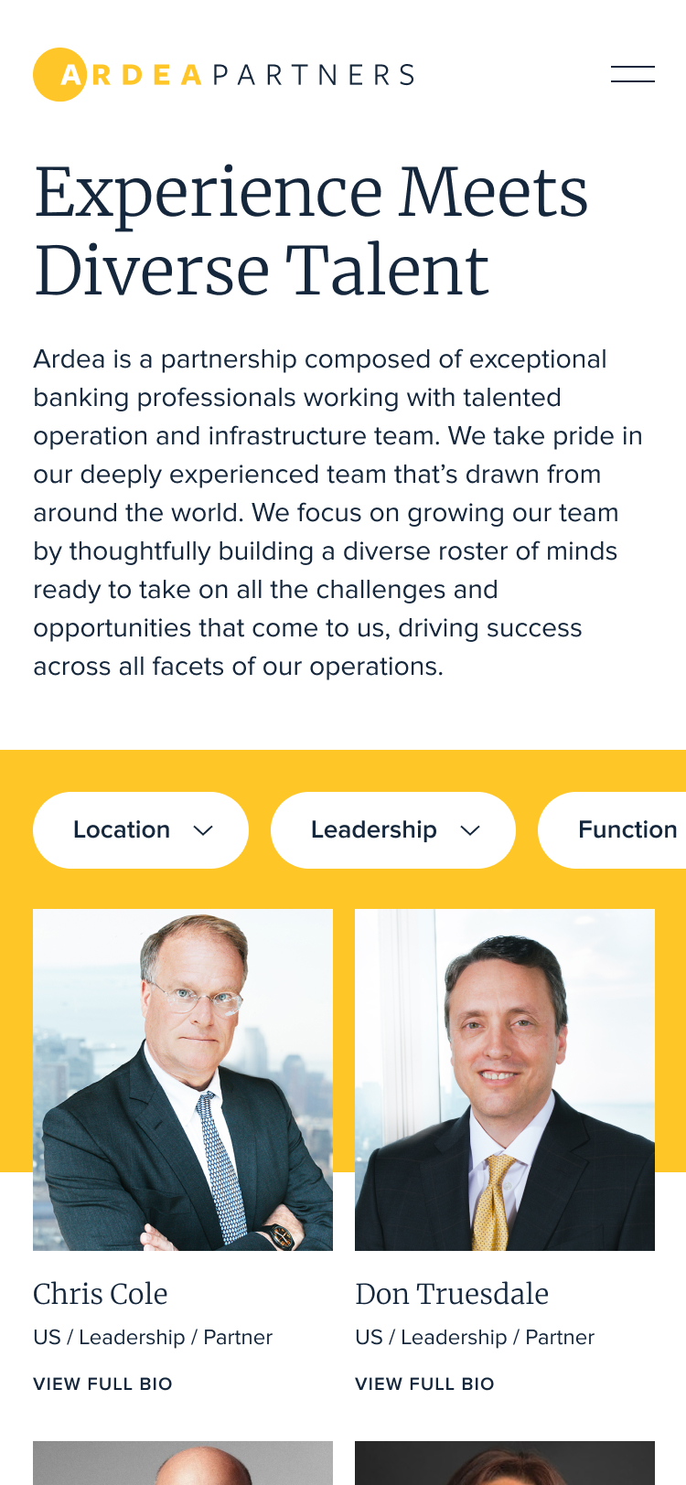
In the boutique investment space, Ardea Partners knew differentiation wouldn’t come from expertise alone. Their online presence needed to feel human—grounded in trust, partnership and long-term relationships.

Named after the heron—a symbol of perseverance, integrity, transformation and good fortune—Ardea’s new brand experience was designed to reflect the meaning behind the name.
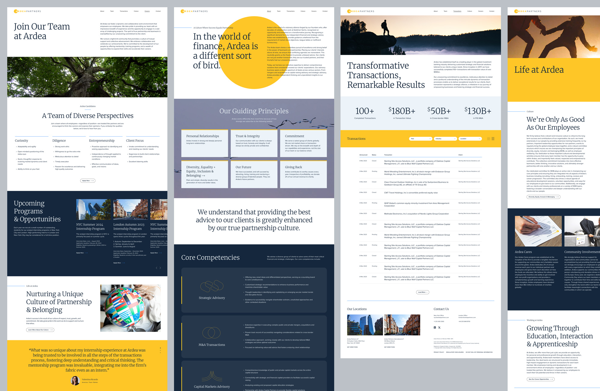
We created a modular system built for efficiency and scalability that was flexible enough to support a wide range of content while maintaining a refined, consistent aesthetic.
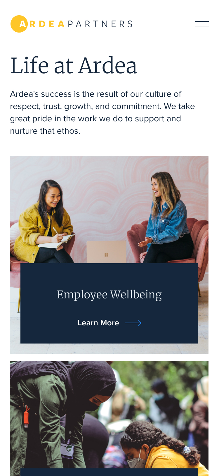
Knowing the client’s audience skewed slightly towards mobile, we made sure the site experience felt seamlessly intuitive and dynamic across all devices.
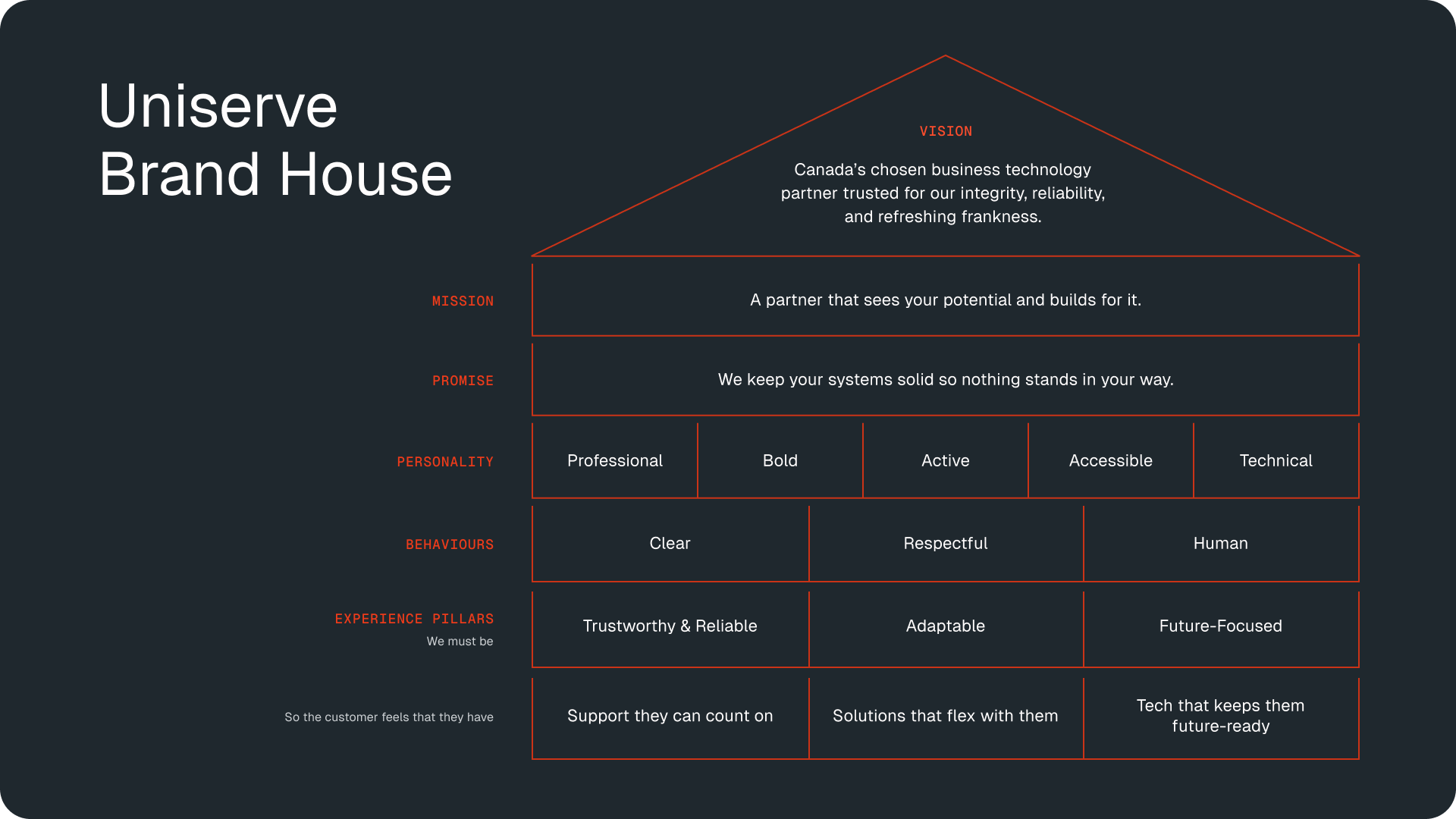
Drawing on insights from our client workshops, we created a multi-level brand house that now anchors all of Uniserve’s consumer touchpoints.
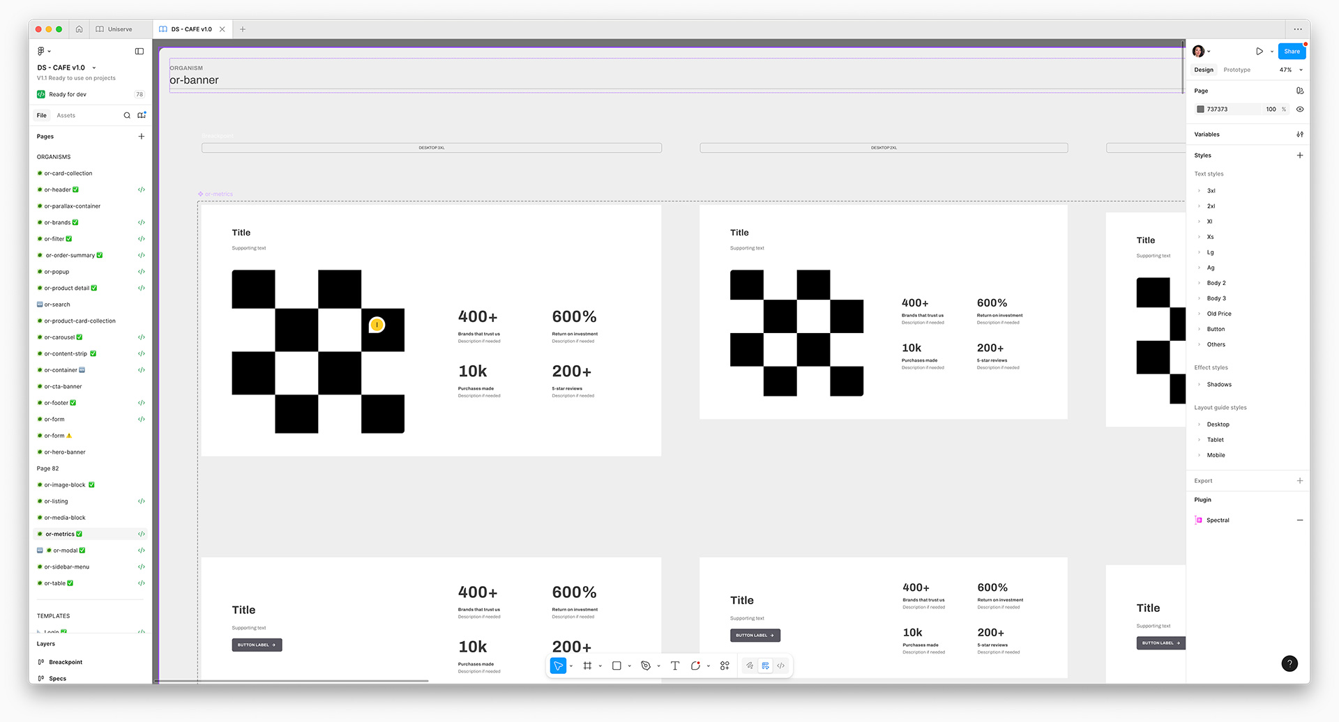
The client opted to leverage an internal pre-built component library due to time and cost restraints. However, we soon realized that expanding the atomic design system was necessary to effectively communicate specific content.
With multiple teams spanning various timezones, we flexed our collaborative strengths and still managed to enhance the library within budget.
Using our evolved component library, I shaped the creative direction for the new site by designing a streamlined homepage, and guided our development team through building and styling the internal page templates.
Working side-by-side with copywriters, we modernized the client’s online presence with a spirit of honest clarity and grounded integrity—the backbone of Uniserve’s identity.
Our goal was to bridge the tension between the visceral, human energy of live fan experiences and the often passive, solitary nature of mobile technology. To guide our approach, we defined experience principles: simple & human, unexpected & awesome, amplified & connected.
Among our proposals was the ‘Lenovo Living Ticket’—an interactive, living souvenir that captures highlights, exclusive content, and AR moments to chronicle each fan’s World Cup journey. At-home viewers can join through broadcast QR codes, transforming each fan’s experience into a dynamic, personalized and shareable highlight reel.
Our ‘Lenovo Fan Card’ concept invites fans to share and collect digital cards, unlocking threshold-based rewards and surprises throughout the World Cup. Highlights showcase the longest fan chains, the most active countries or teams, and even specific stadium sections. This spirit of friendly competition sparks engagement beyond the matches—opening doors to future partnerships and fan-driven promotion.
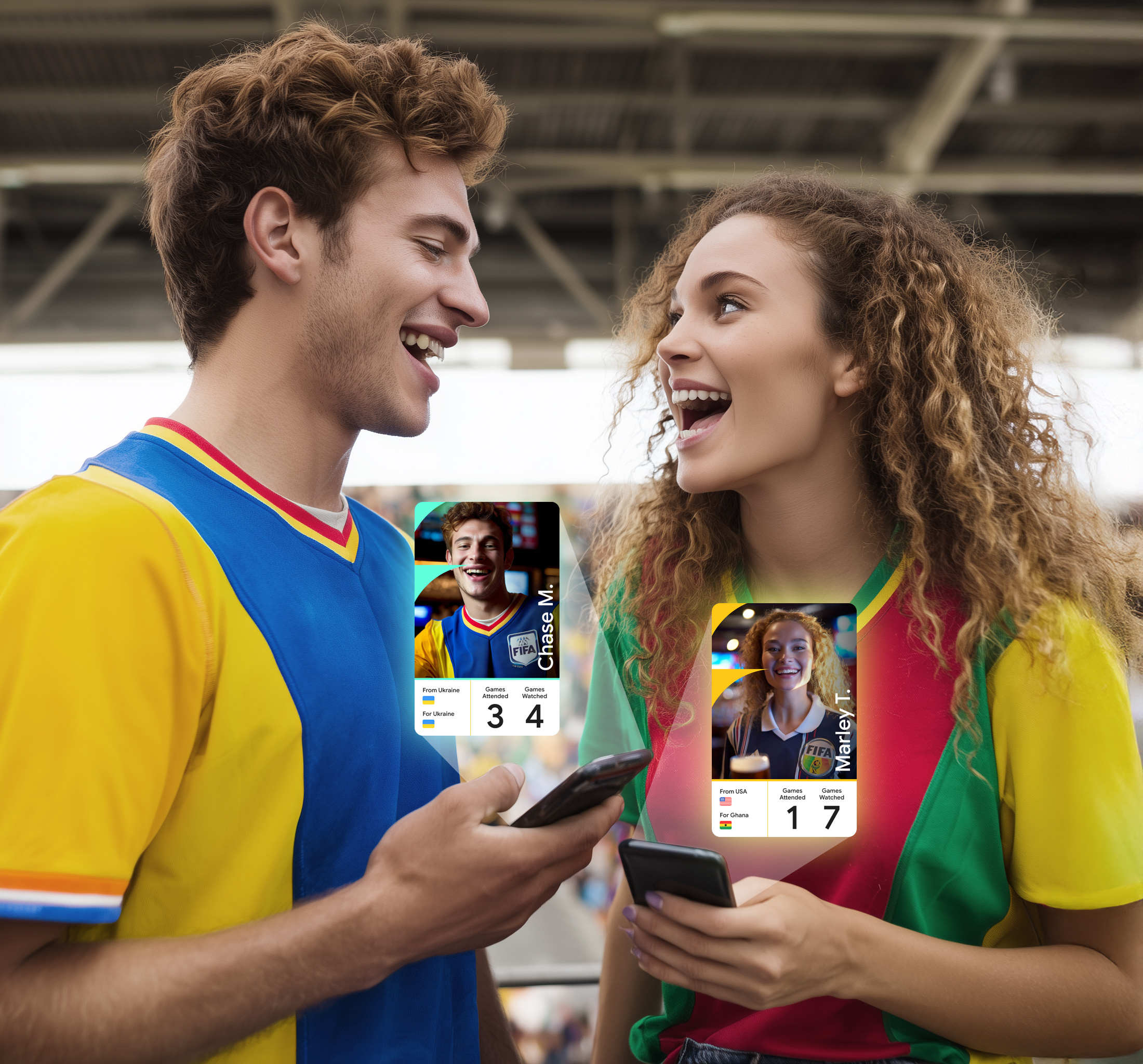
Soccer fans are among the most passionate in the world, with a love that spans oceans. ‘Love With Lenovo’ connects fans globally by matching their favorite teams, players, cuisines, music and more—sparking everything from tailgates and cheering sections to nightlife meetups, pre-game gatherings and maybe even romance.
‘Lenovo Fan Wave’ turns FIFA arenas into living, breathing spectacles with every fan wearing an AI-powered smart light band. Synced together, the bands create dazzling light shows, guide fans with haptic cues and even help friends connect in the crowd—turning a passive viewing experience into an unforgettable, participatory event. Viewers at home can join in through their phones, extending the real-time magic beyond the stadium.
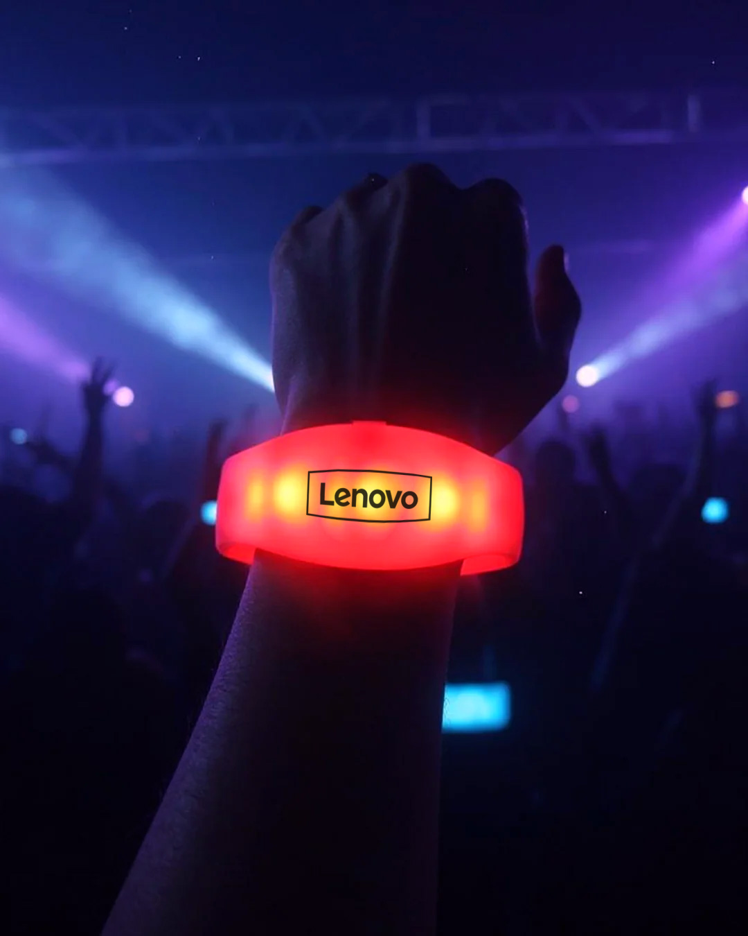
Together, these concepts aimed to reframe Lenovo’s presence at the World Cup as something living, shared and human. They showed how technology can deepen connection rather than distract from it, creating a foundation for fan experiences that can evolve long after the final whistle.
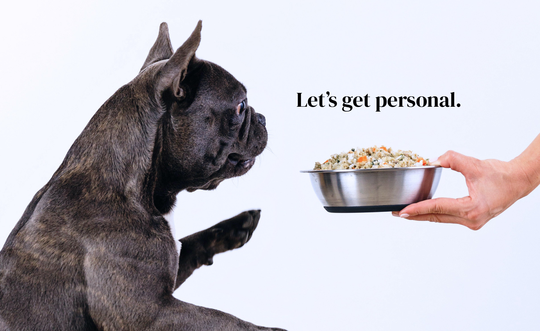
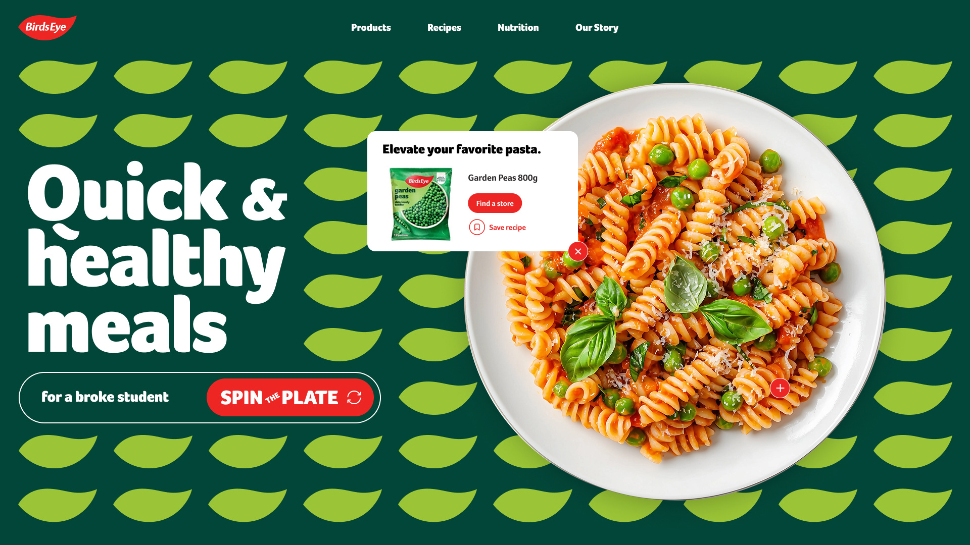
We brought the idea of ‘simple wins’ to life with our interactive plate spinner, leveraging AI to save time and money on plated food photography.
Whether you’re a busy parent with picky eaters or a college student on a budget, a quick spin served up healthy meal ideas and a chance to win coupons.
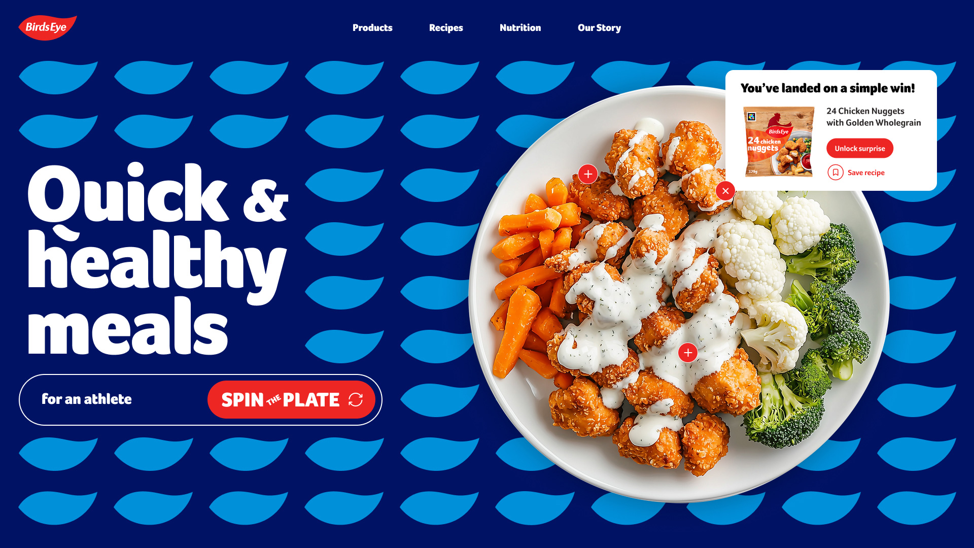
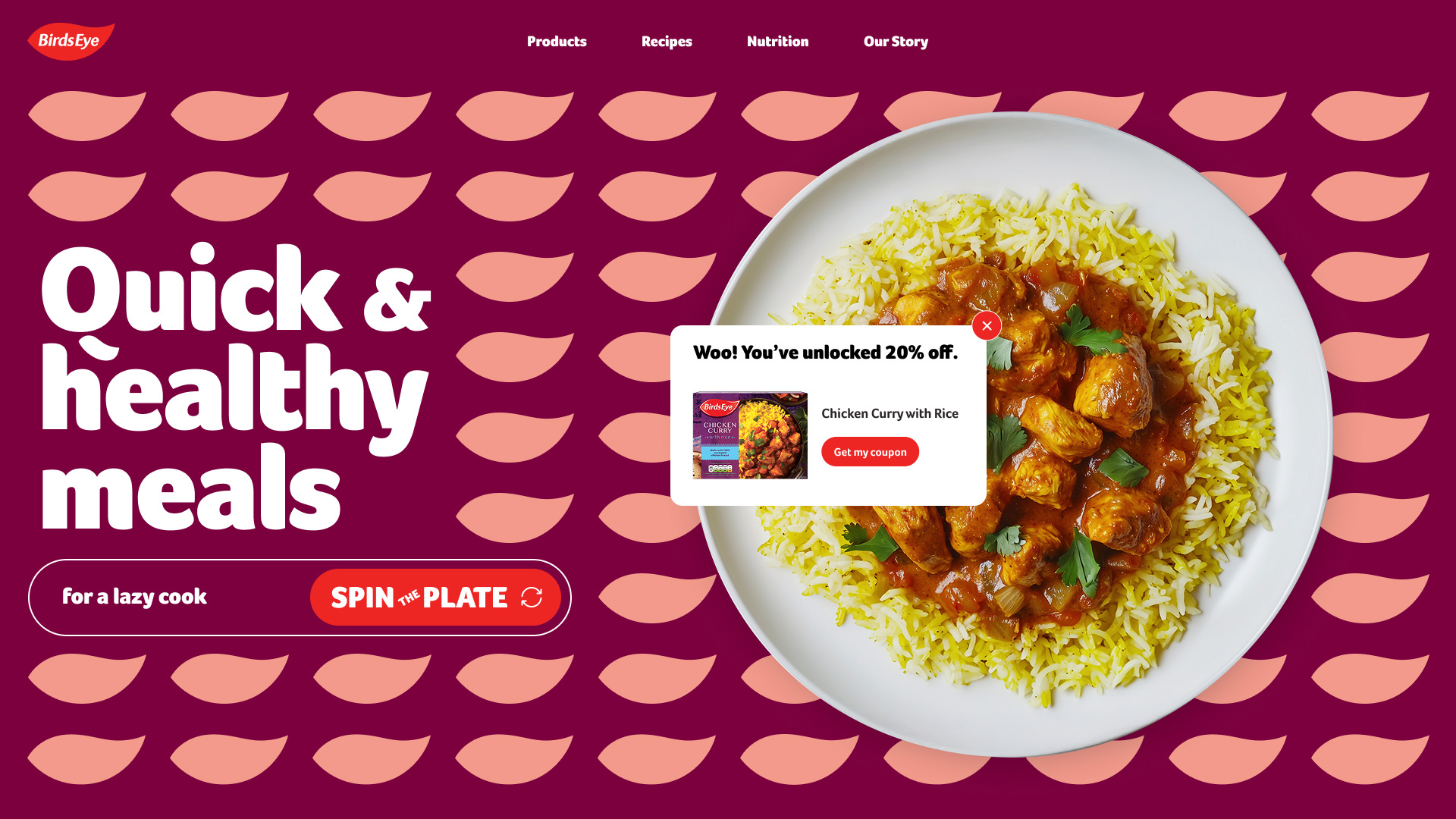
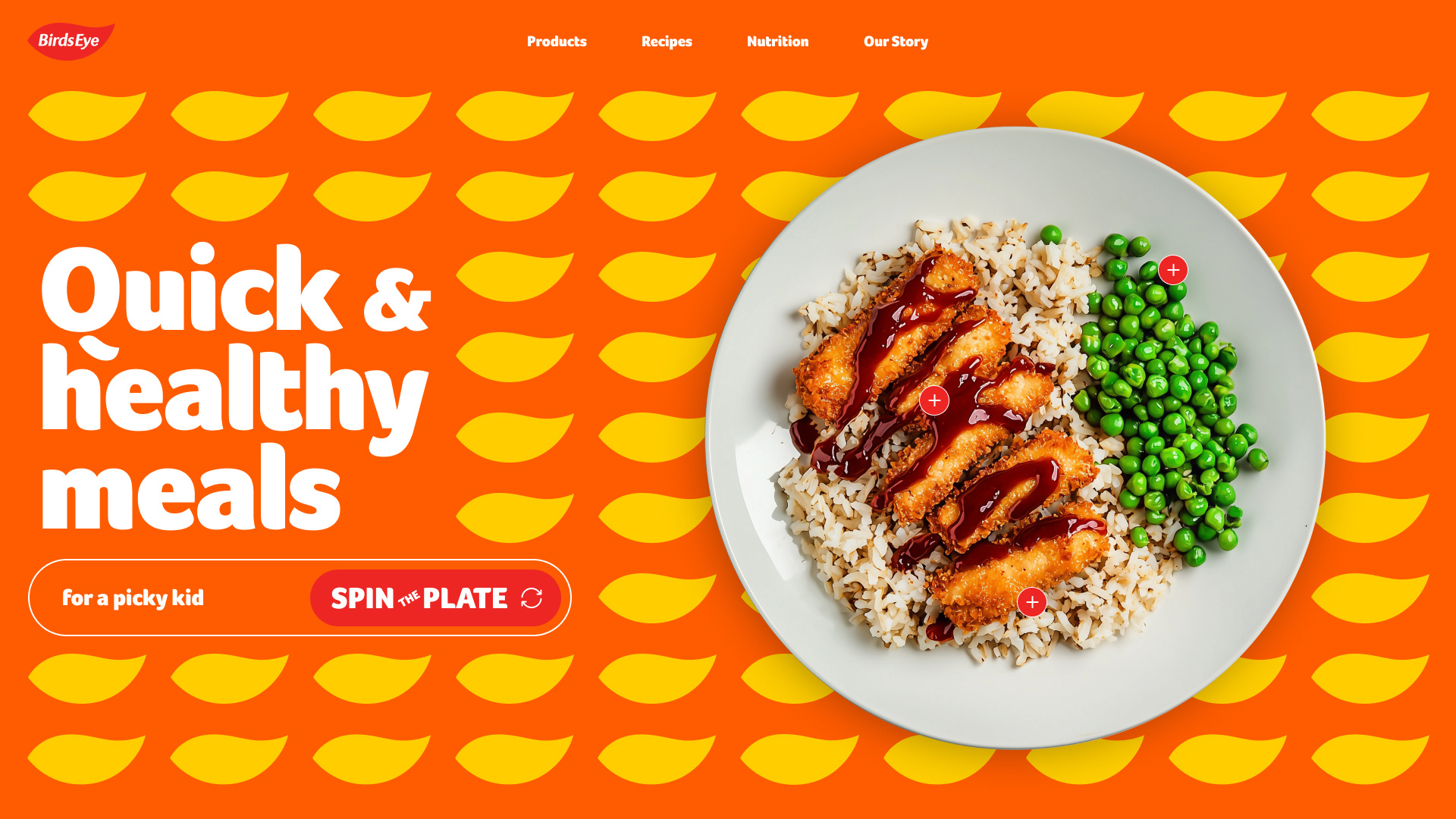
We redesigned the client’s site by turning traditional recipes into simple, step-by-step videos that match how people cook and learn online today. We also proposed AI integration for instant recipe modifications.
Community callouts and curated collections gave users more meaningful reasons to return to a frozen food site.
To spotlight Nomad’s top-selling frozen fish sticks, we also pitched a mobile ‘sauce generator’ offering quick, three-ingredient recipes. Using AI, our team built a working prototype the client could explore during and after the pitch.
What began as a celebration of ‘simple wins’ expanded into a system that strengthened loyalty, modernized discovery and created space for continuous innovation. By showing the breadth of this ecosystem, we also showed the client the depth of our commitment—designing not just for now, but for what’s next.
Stakeholder interviews clarified what tenants value most. Instead of a tedious onboarding quiz, we translated their needs into a fast, intuitive and visually driven way to define location and feature requirements.
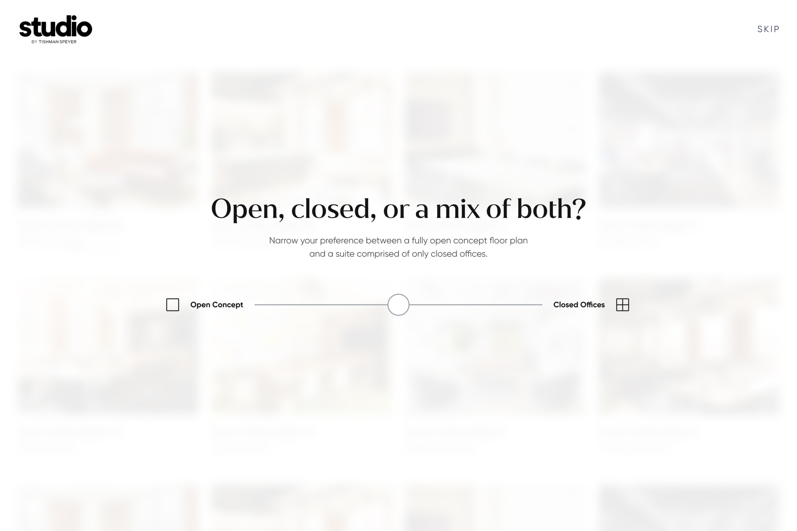
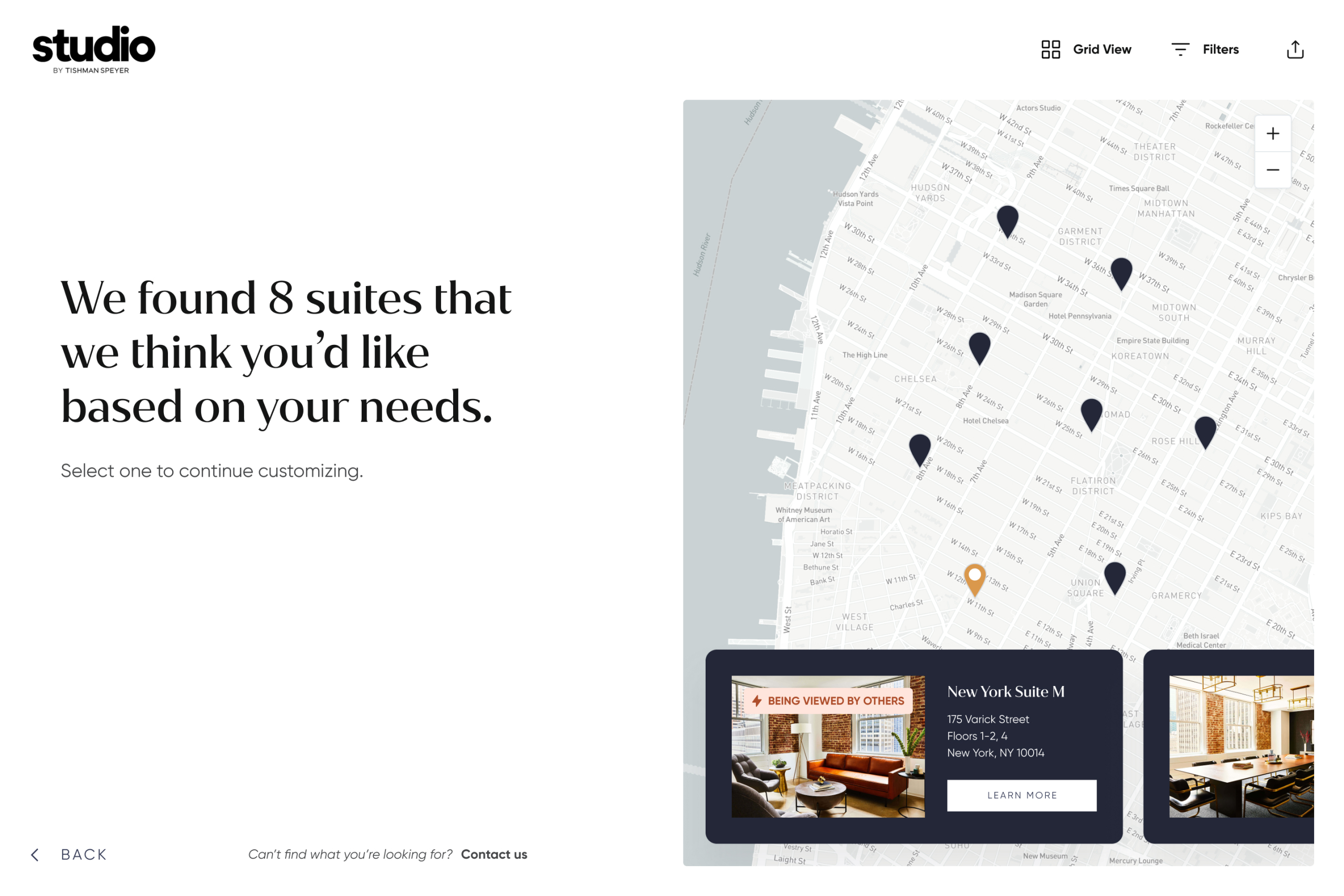
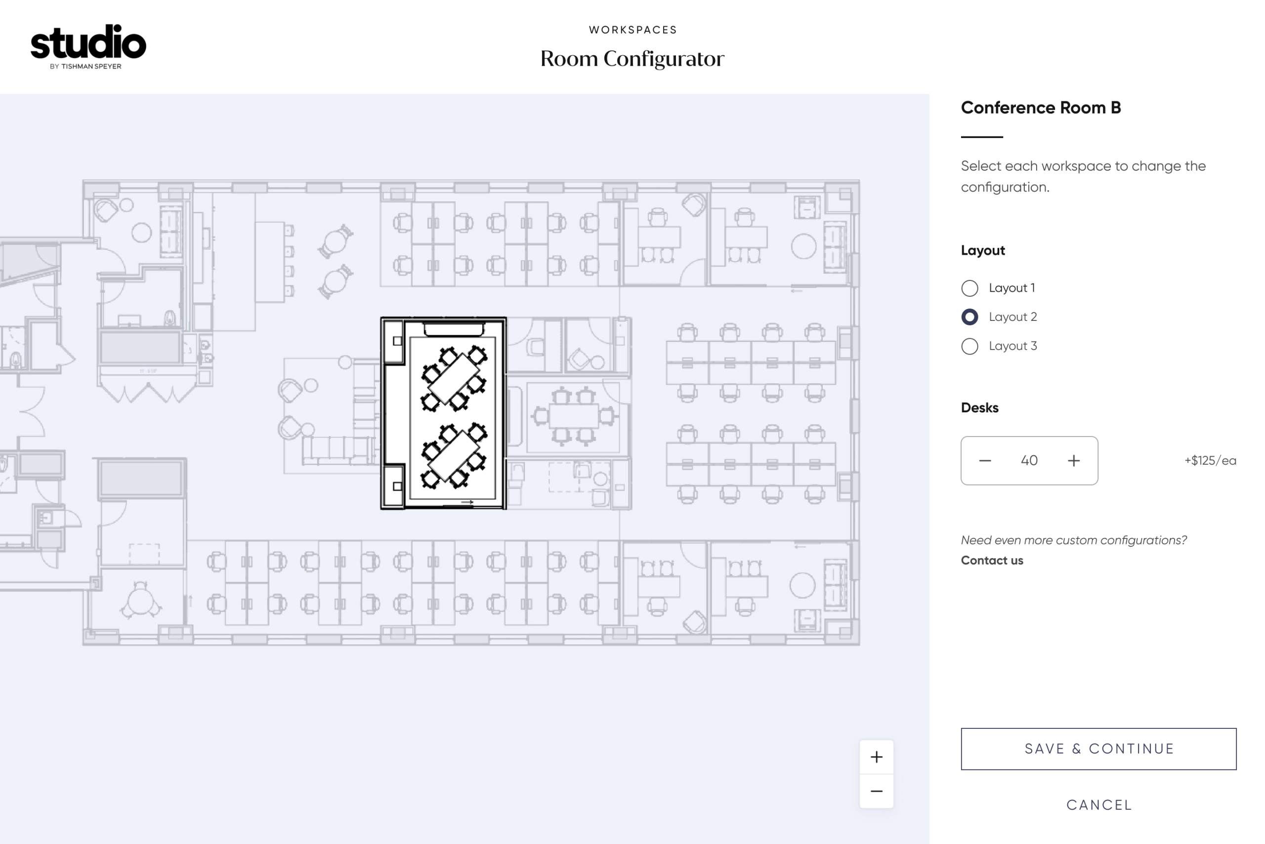
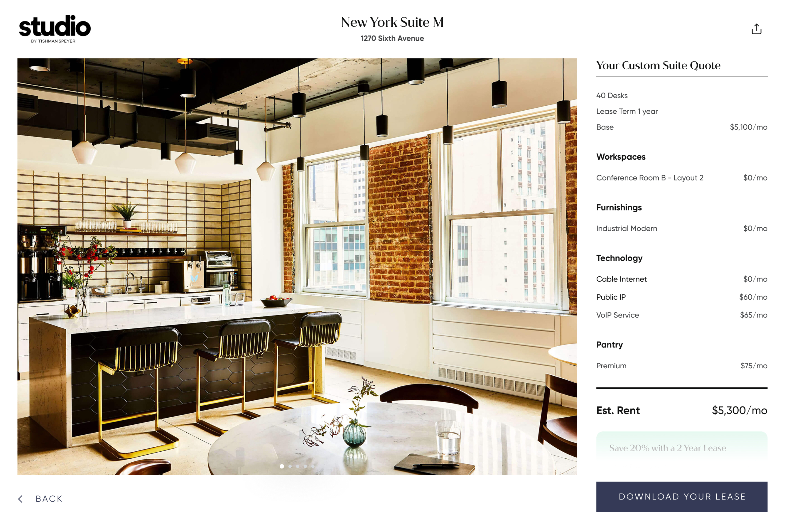
Although the configurator aimed to cut out the endless email and phone tag—a change the sales team was genuinely thrilled about—the tool still communicated the luxury, service and curation that Tishman Speyer’s clients have come to expect.
The design is minimal with vibrant accents, balancing a brutalist aesthetic that conveys the weight of the science with playful, quirky animations that celebrate the human side of expanding one’s perception box.
In one of the site’s key sections, a scroll-based shrinking background invites users to interact with their own malleable perception box.
Because Tiny Blue Dot Foundation funds extensive research with leading institutions, it was essential to design an intuitive way for users to quickly filter through projects.
By uniting the brand’s philosophy with how people actually engage the content, the site delivers a memorable experience for both curious newcomers and dedicated researchers.
With a mobile-first mindset, we ensured fans of Focus Features content could quickly find when, where and what to watch.
The new site’s modernized user experience led to increased engagement and a more integrated platform for showcasing the studio’s cinematic films and shows.
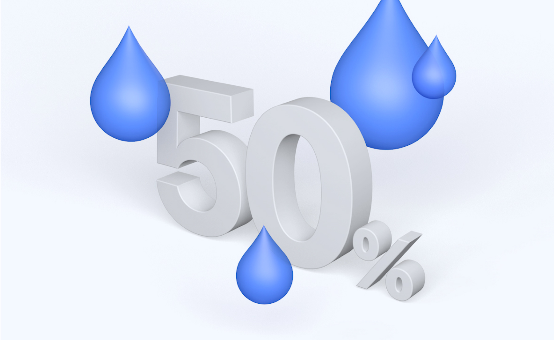
We brought statistics to life with custom 3D renders created in Cinema 4D.
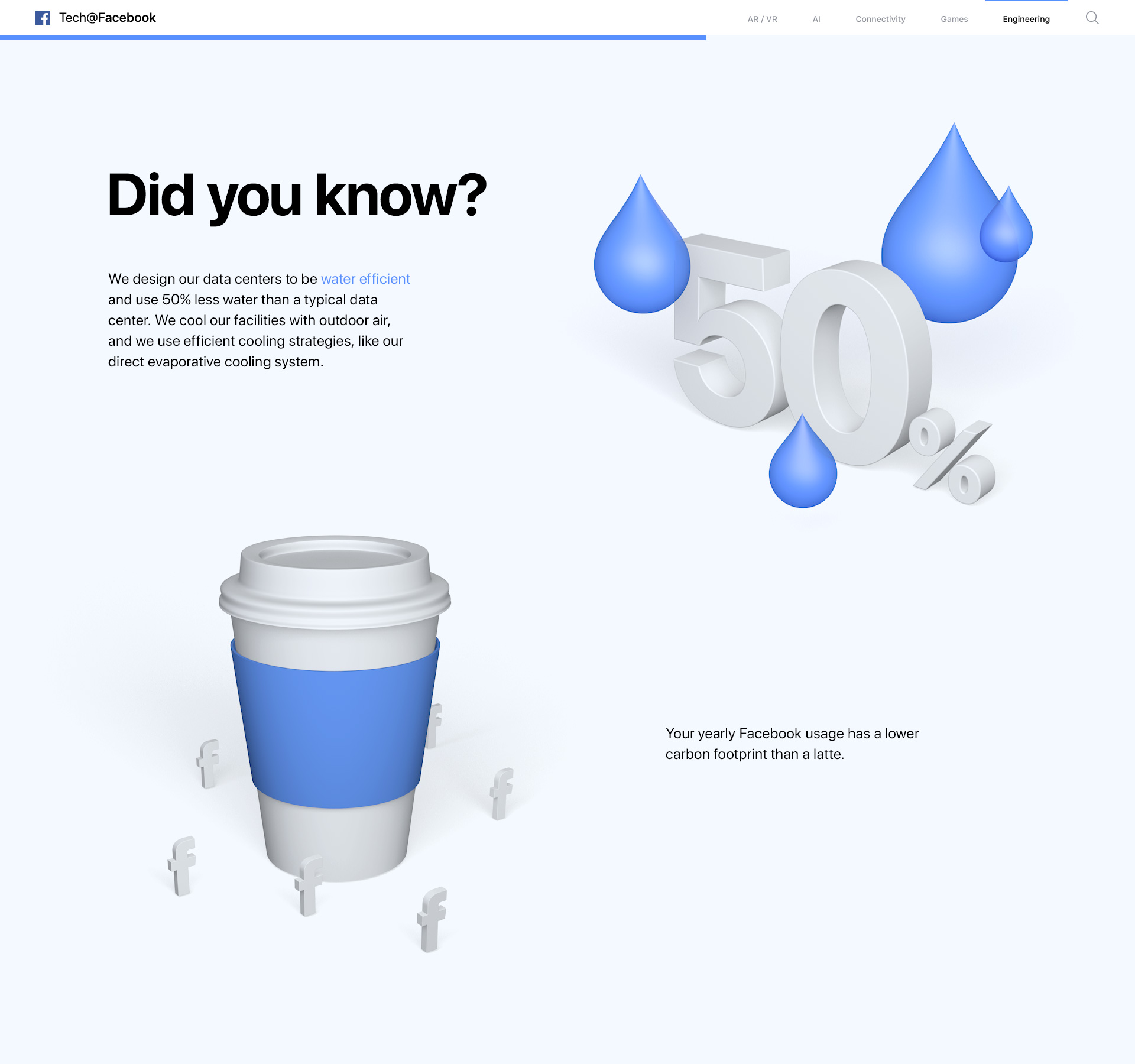
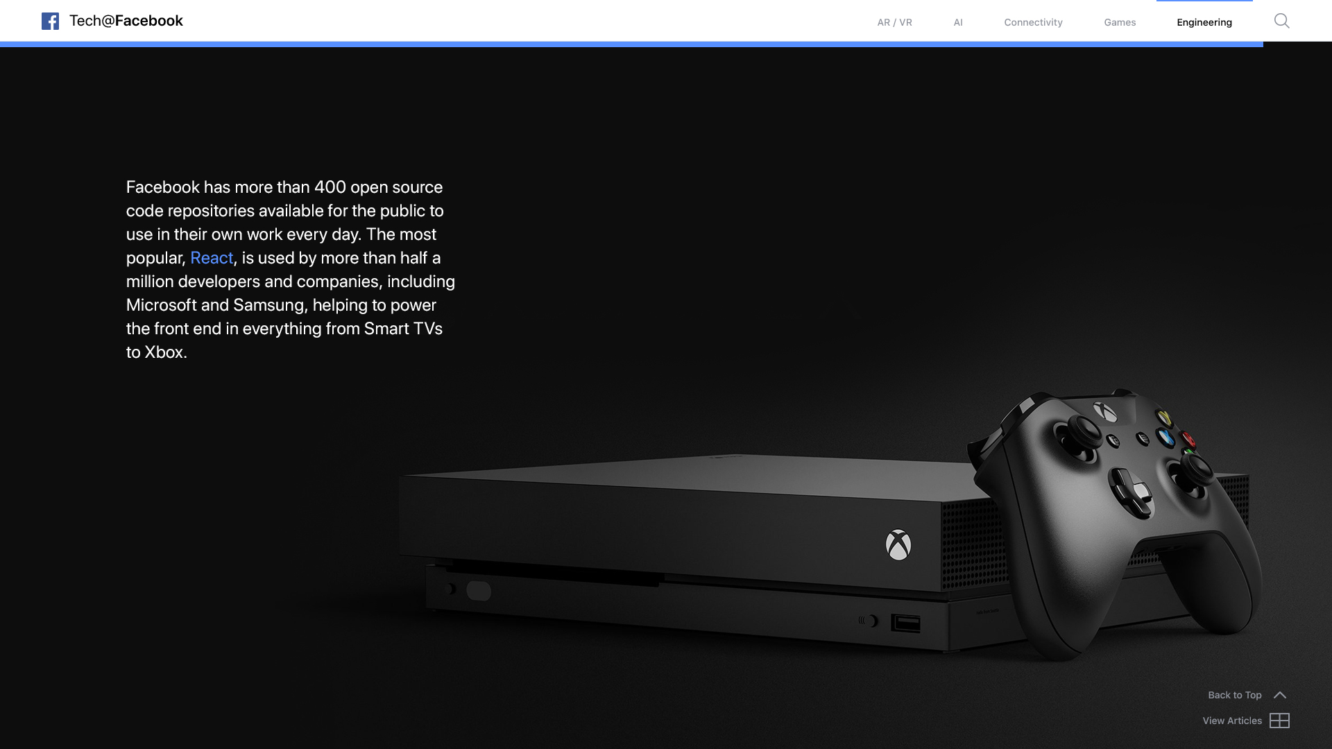
In the end, the site honored Facebook’s tradition of pioneering the intersection between technology and human connection through digital storytelling.
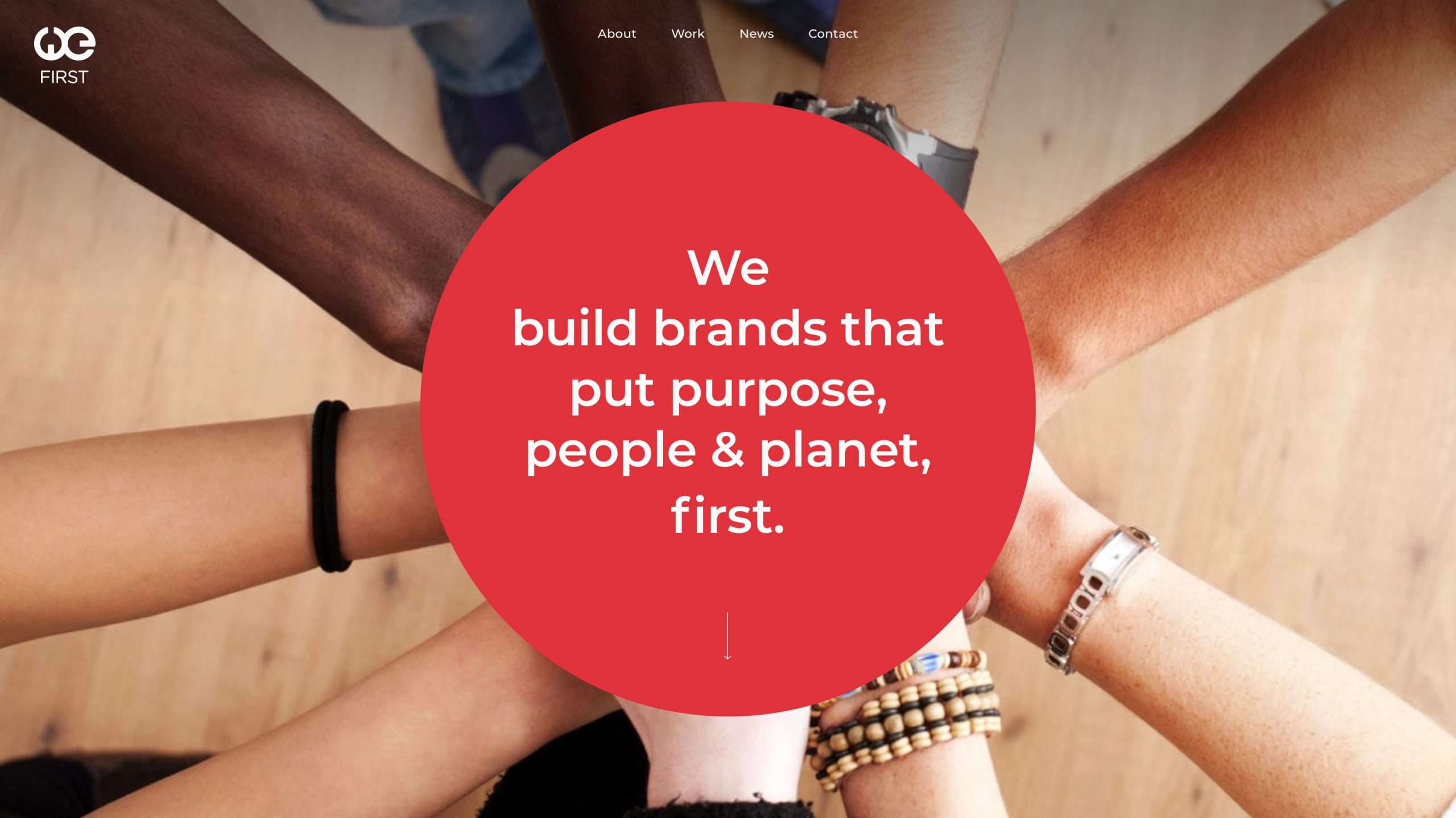
Building on the company’s circular logo, we extended the shape throughout the site as a symbol of collaboration for the common good—one of their core values. Bold, straightforward content transitions further reflect their commitment to both leadership and sustainability.
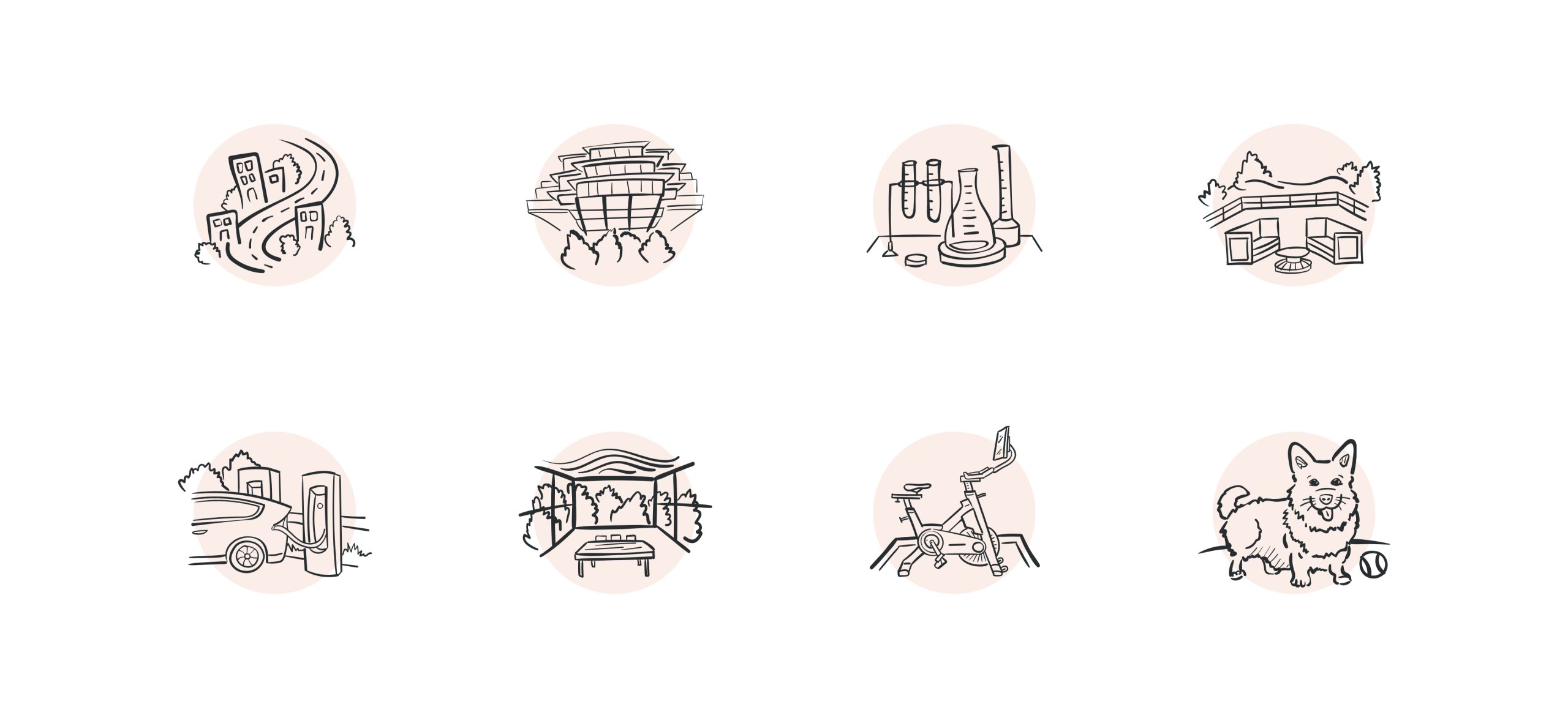
As users scroll, soft background hues gently shift to create a calming aura, while custom illustrations of the property’s amenities echo the organic flow of its indoor-outdoor spaces.
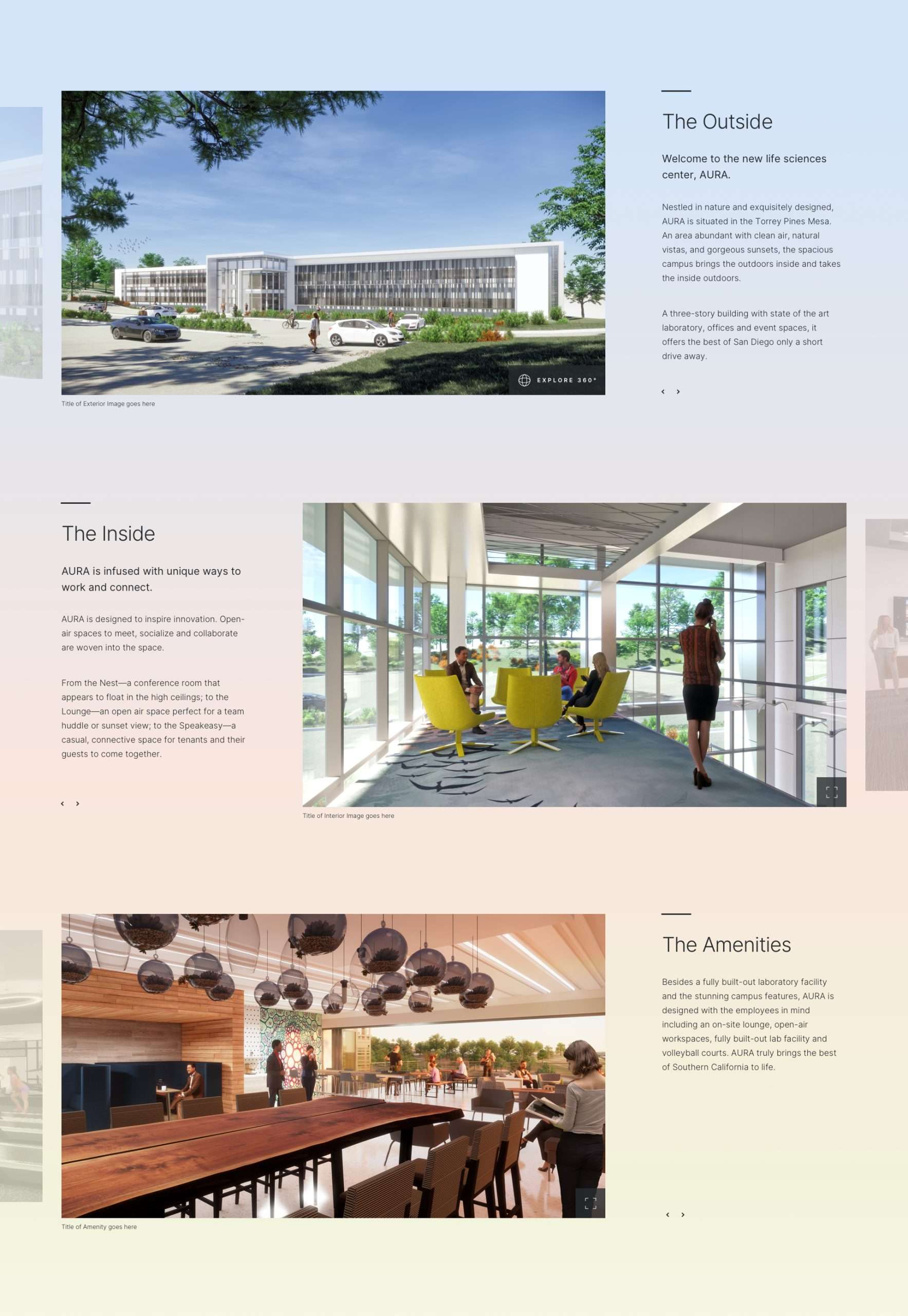
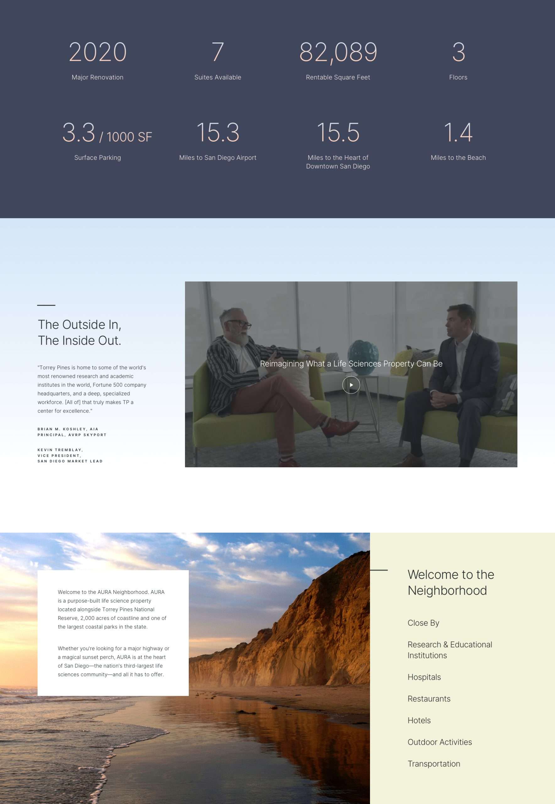
By leaning into the vibe of a luxury hotel, AURA’s online presence helped visitors reimagine what a life sciences property could be.