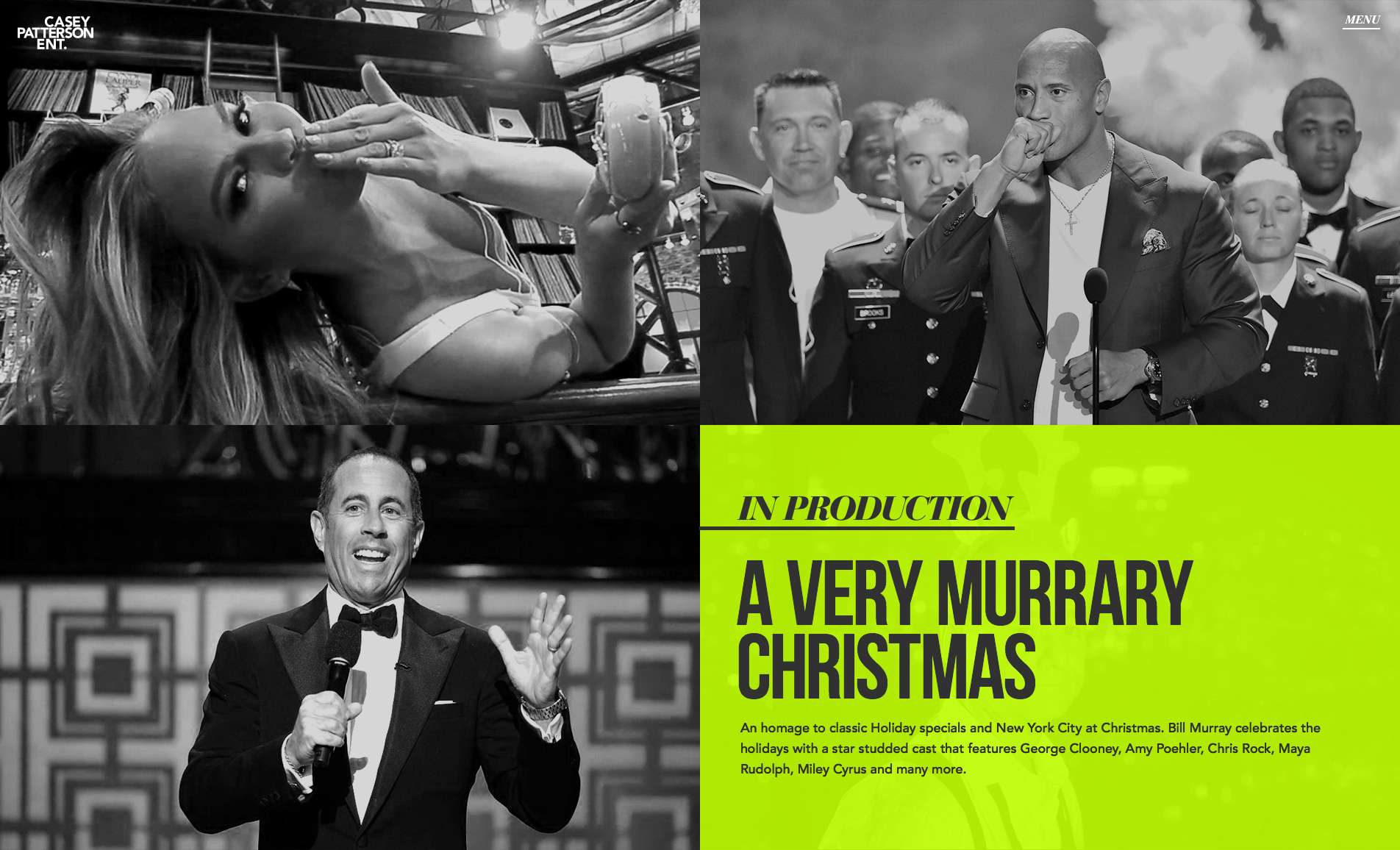
SONY PLAYSTATION

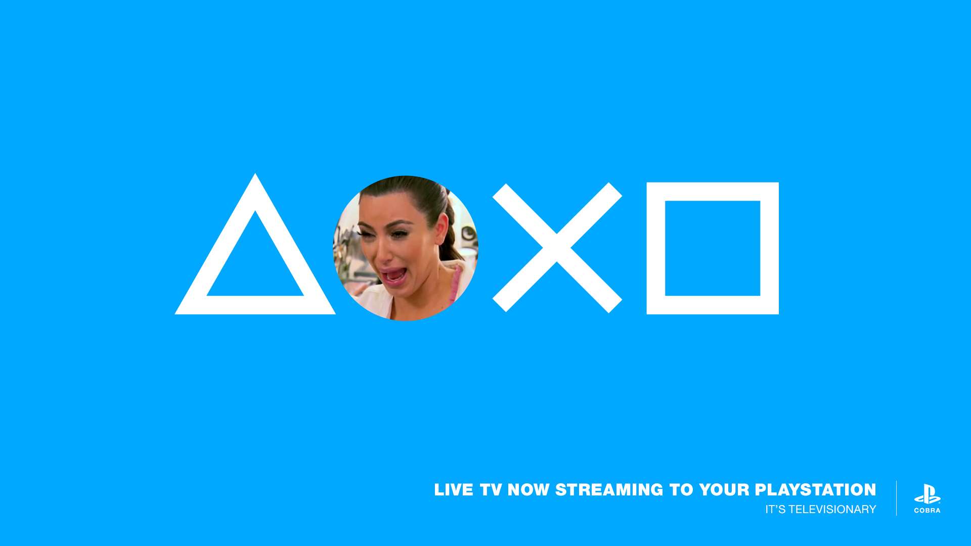
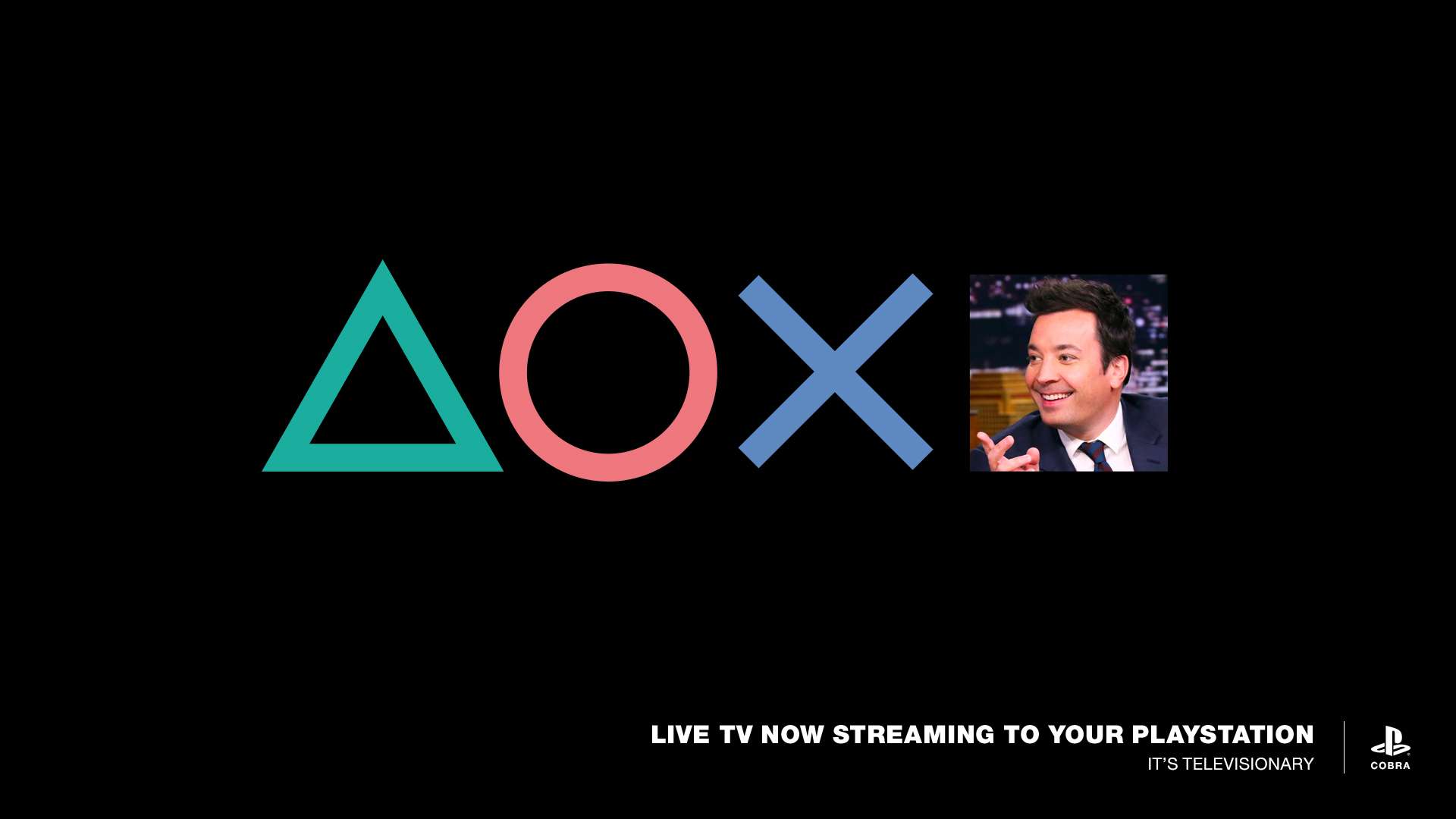
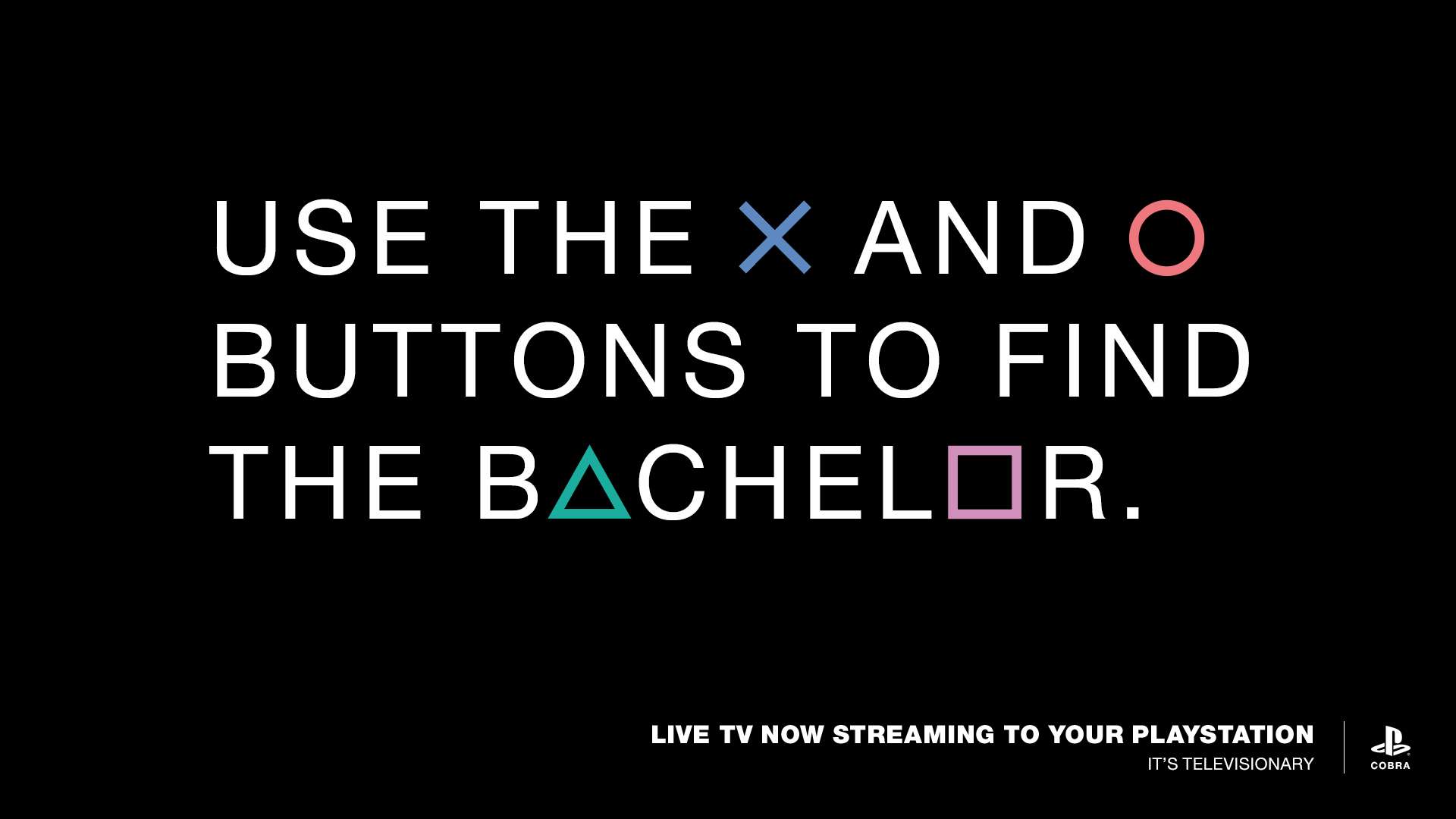
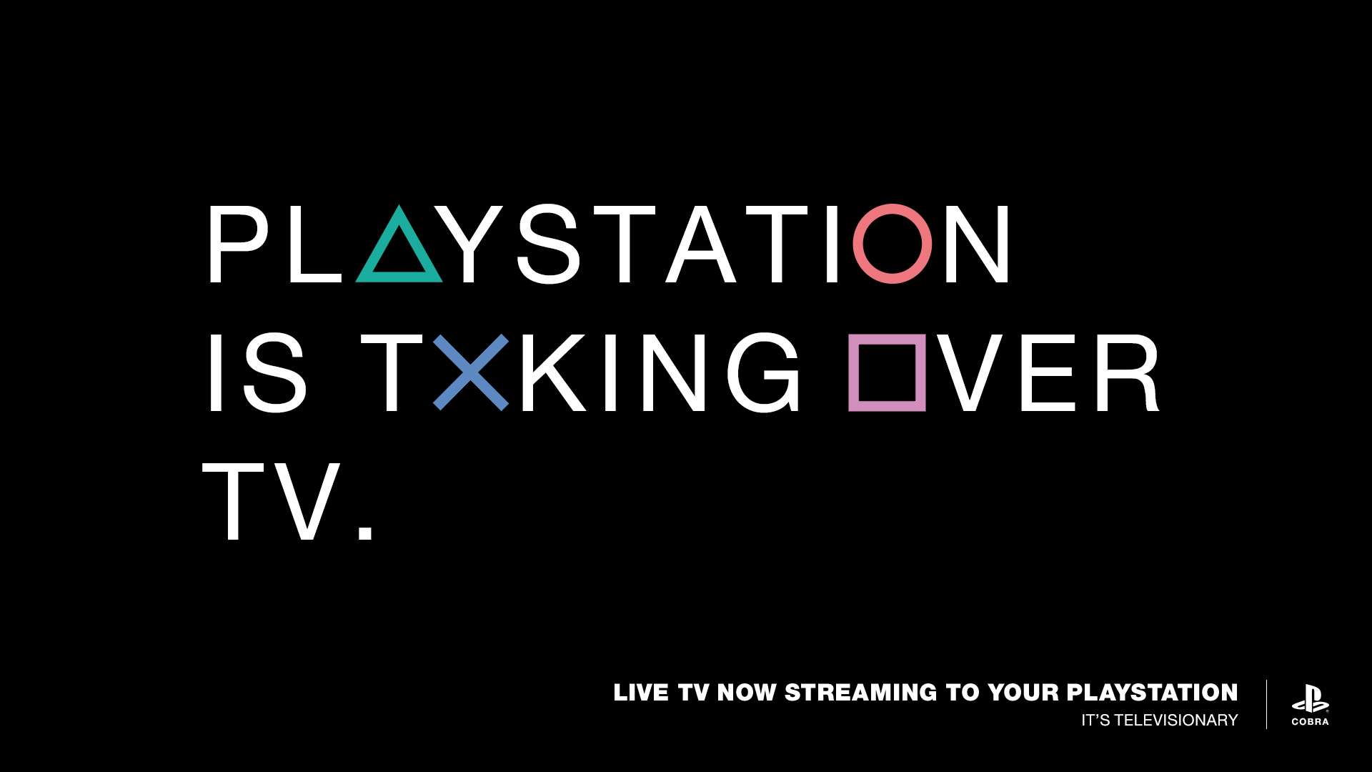
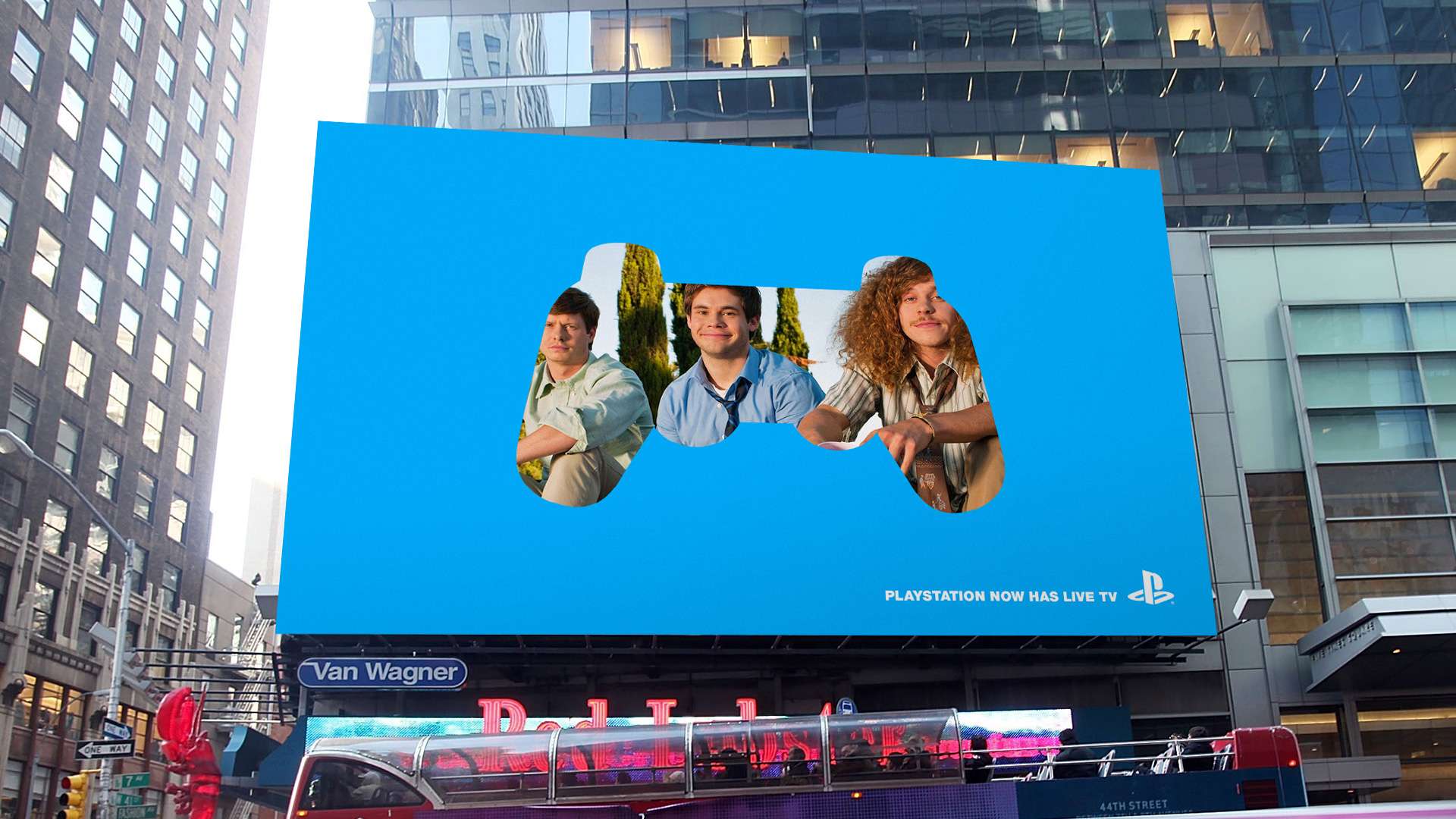
With no formal brief, Sony had a single goal: introduce the world to a revolutionary way of watching live TV through the PlayStation console. By leveraging the controller’s iconic shapes and buttons, I crafted visuals and messaging that spoke directly to gamers with a simple idea: PlayStation = TV.

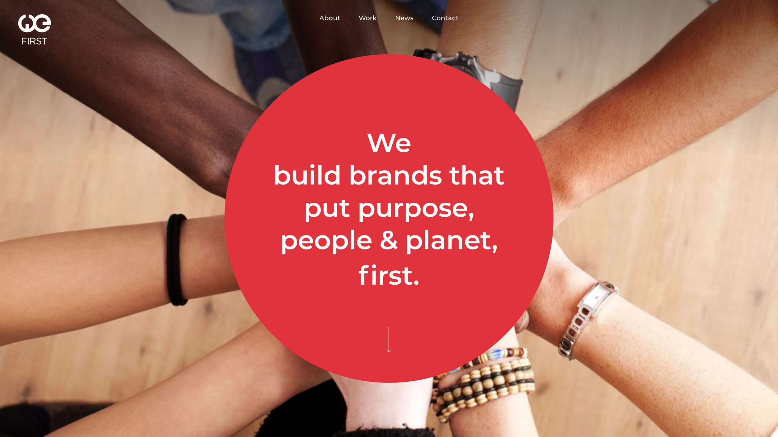
Building on the company’s circular logo, we extended the shape throughout the site as a symbol of collaboration for the common good—one of their core values. Bold, straightforward content transitions further reflect their commitment to both leadership and sustainability.

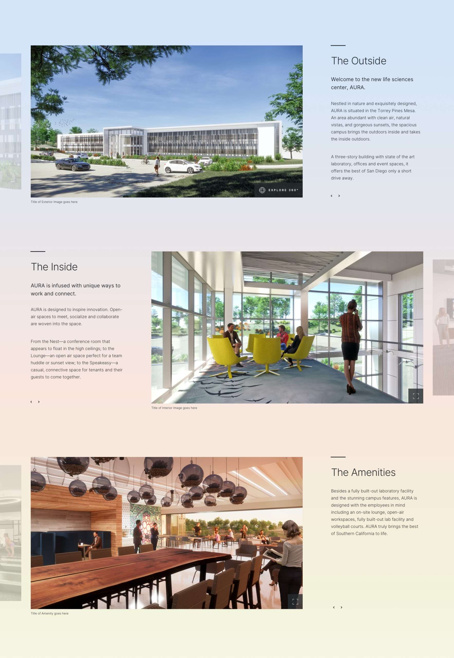
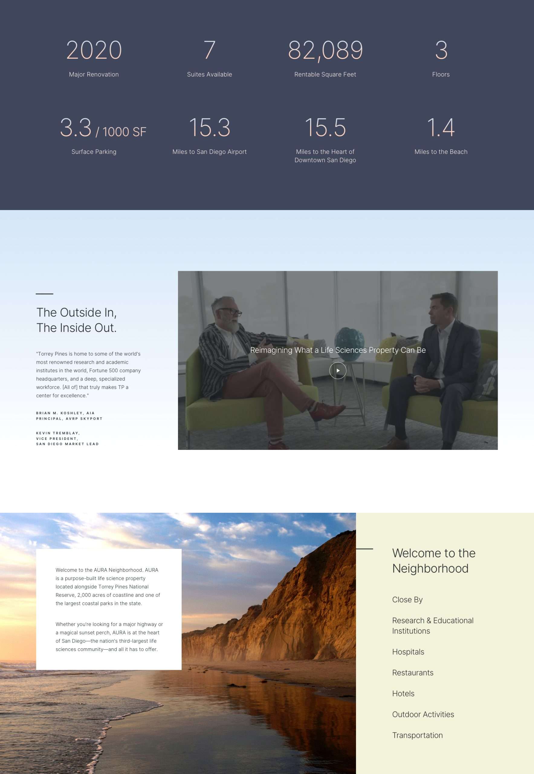
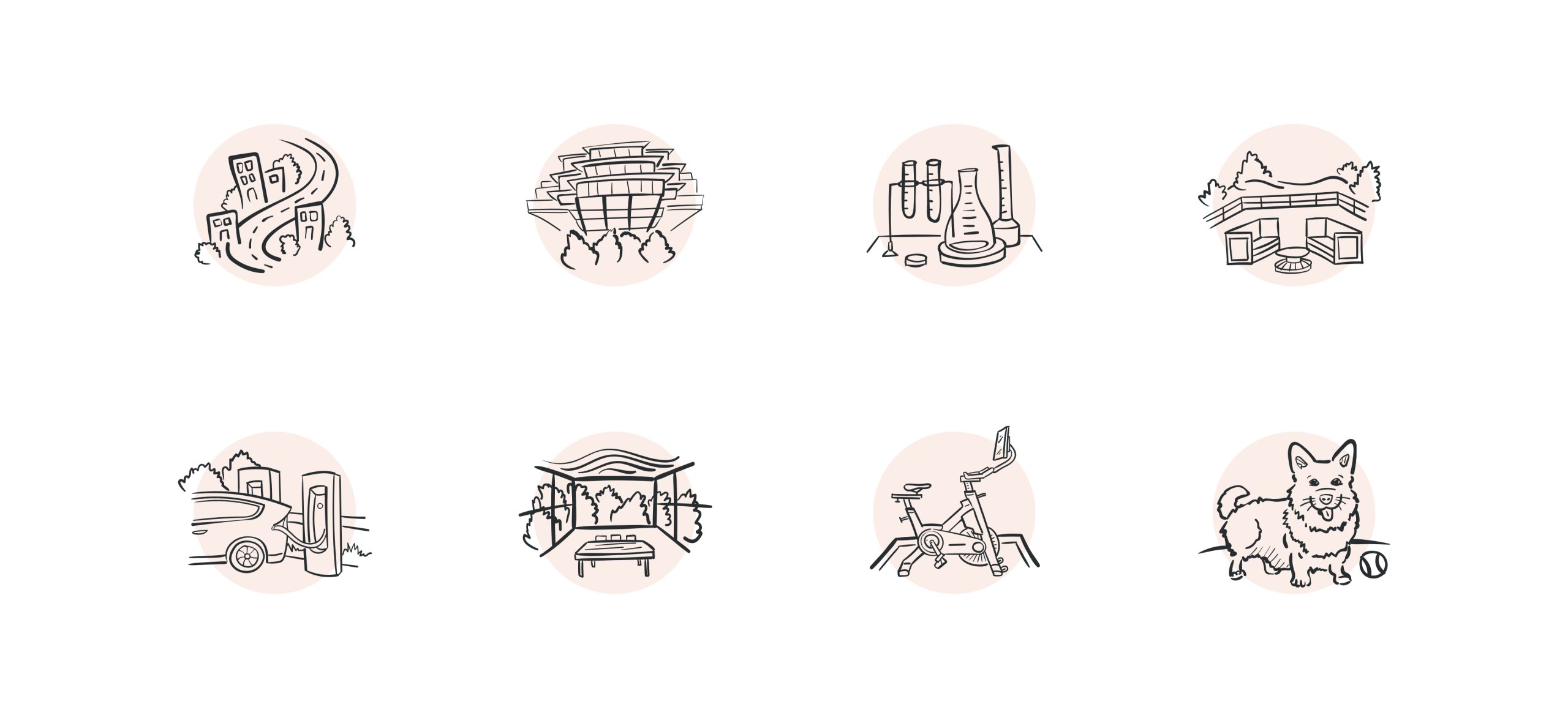
As users scroll, soft background hues gently shift to create a calming aura, while custom illustrations of the property’s amenities echo the organic flow of its indoor-outdoor spaces.

By leaning into the vibe of a luxury hotel, AURA’s online presence helped visitors reimagine what a life sciences property could be.

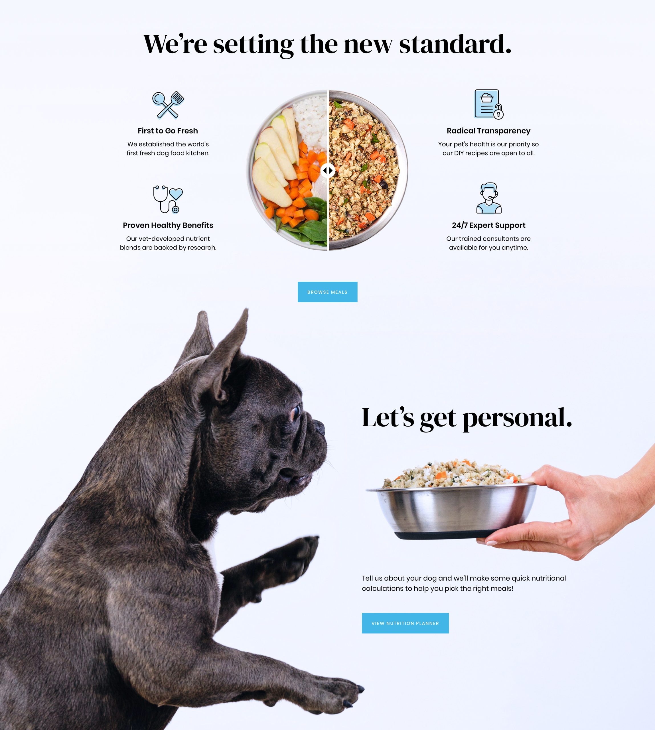
A horizontal slider lets users transform a bowl from whole ingredients to a freshly mixed meal—reinforcing that the two are one and the same.
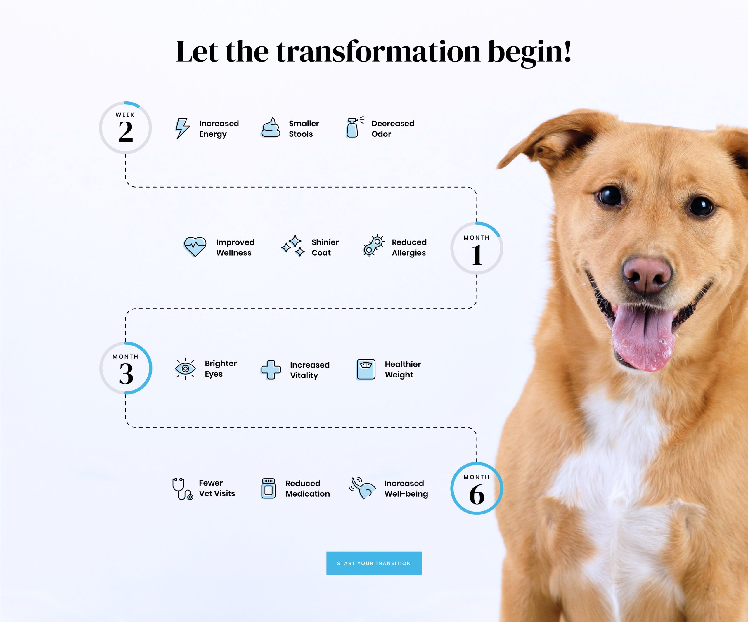
A scroll-triggered timeline showcases the health benefits of switching to the client’s unprocessed dog food.
The design bridges logic and love—informing customers while evoking everything they adore about their dogs like puppy eyes and wagging tails.

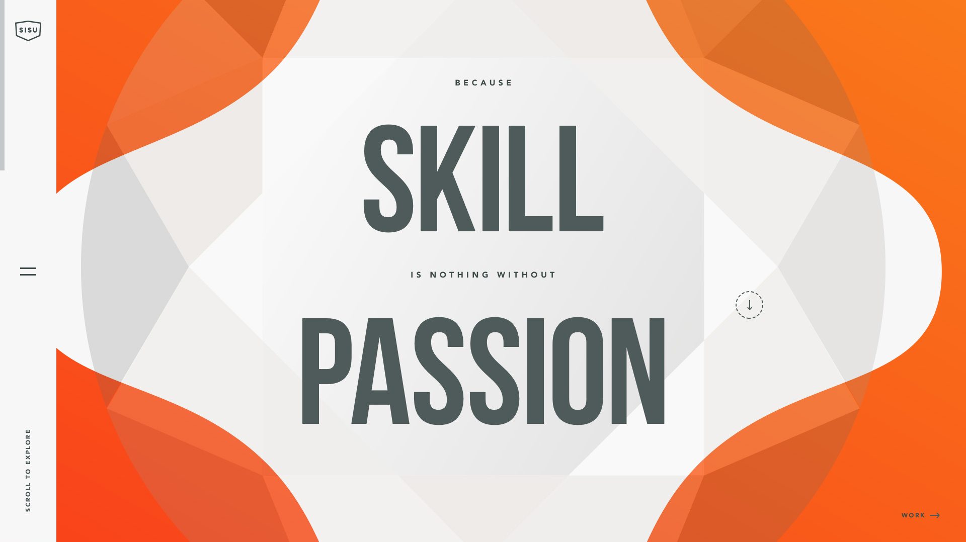
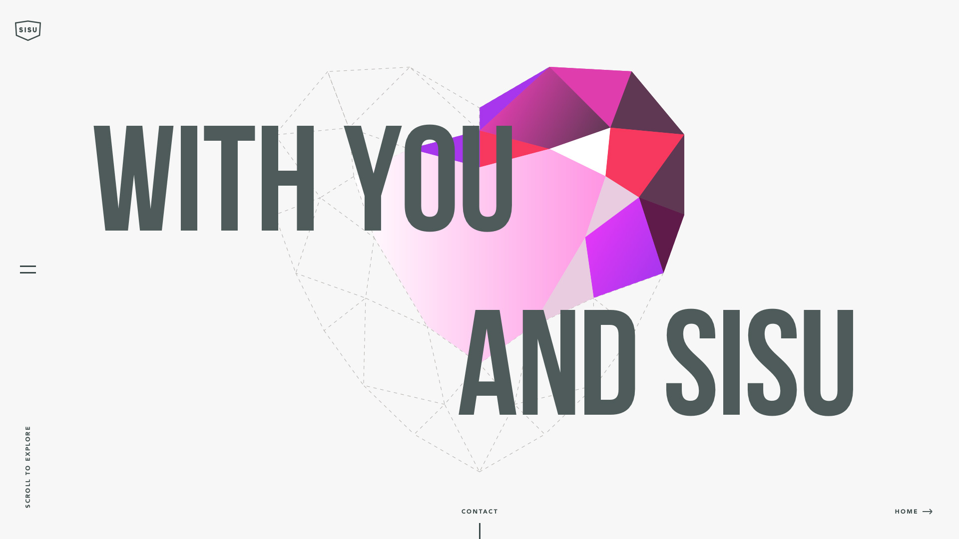
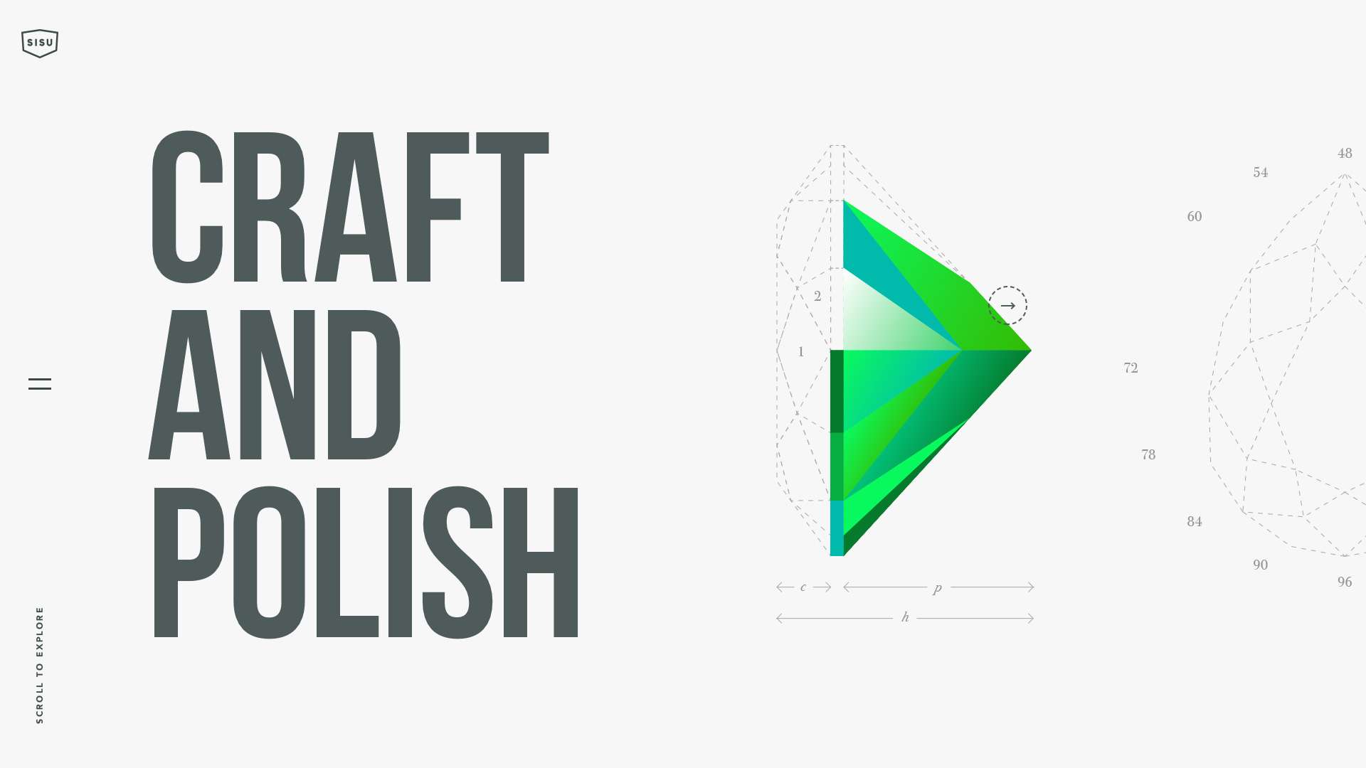
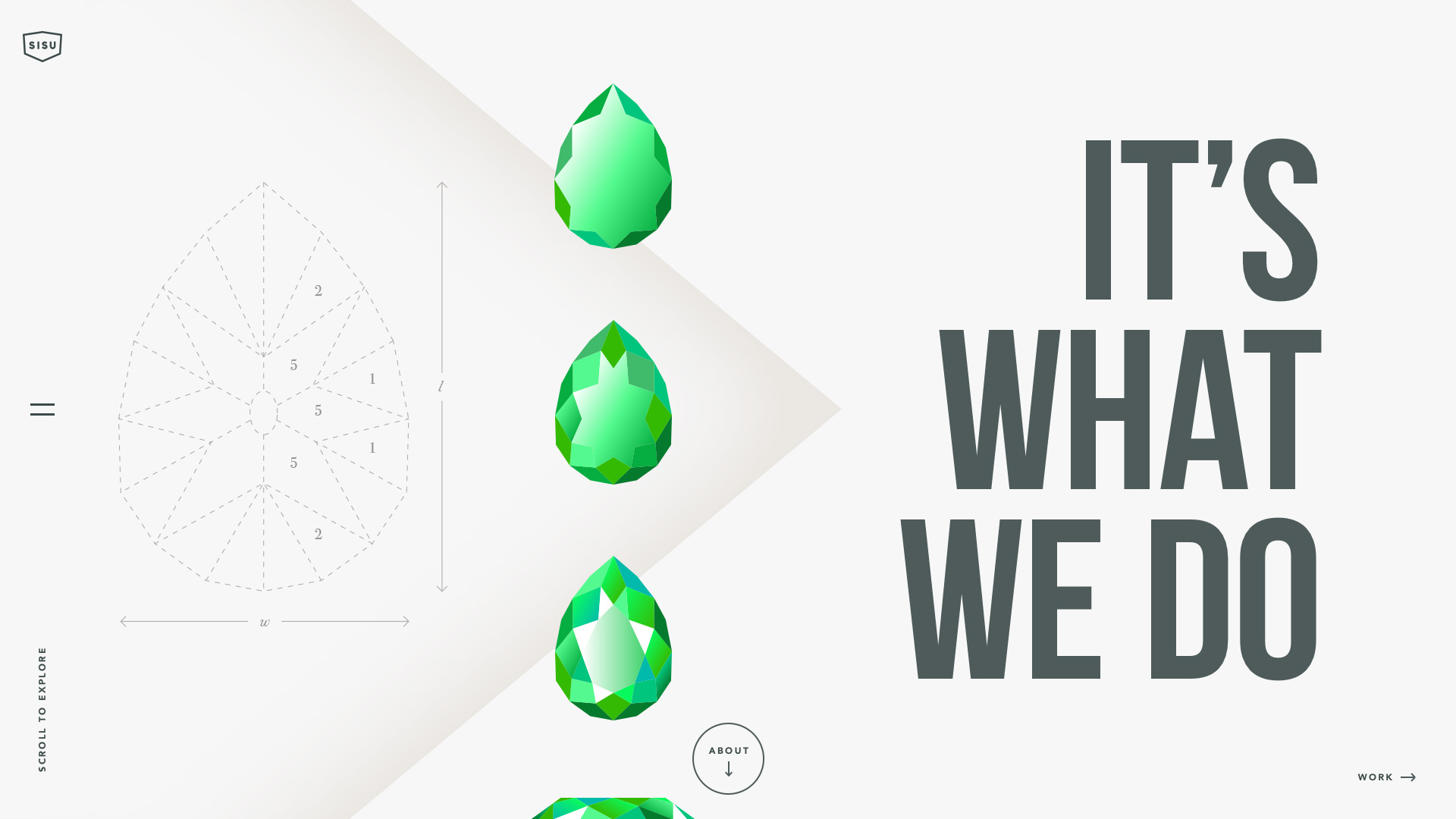
Playful, bold, curious and approachable. Sisu’s immersive site was the ultimate visual poem of the boutique studio’s authentic brand.

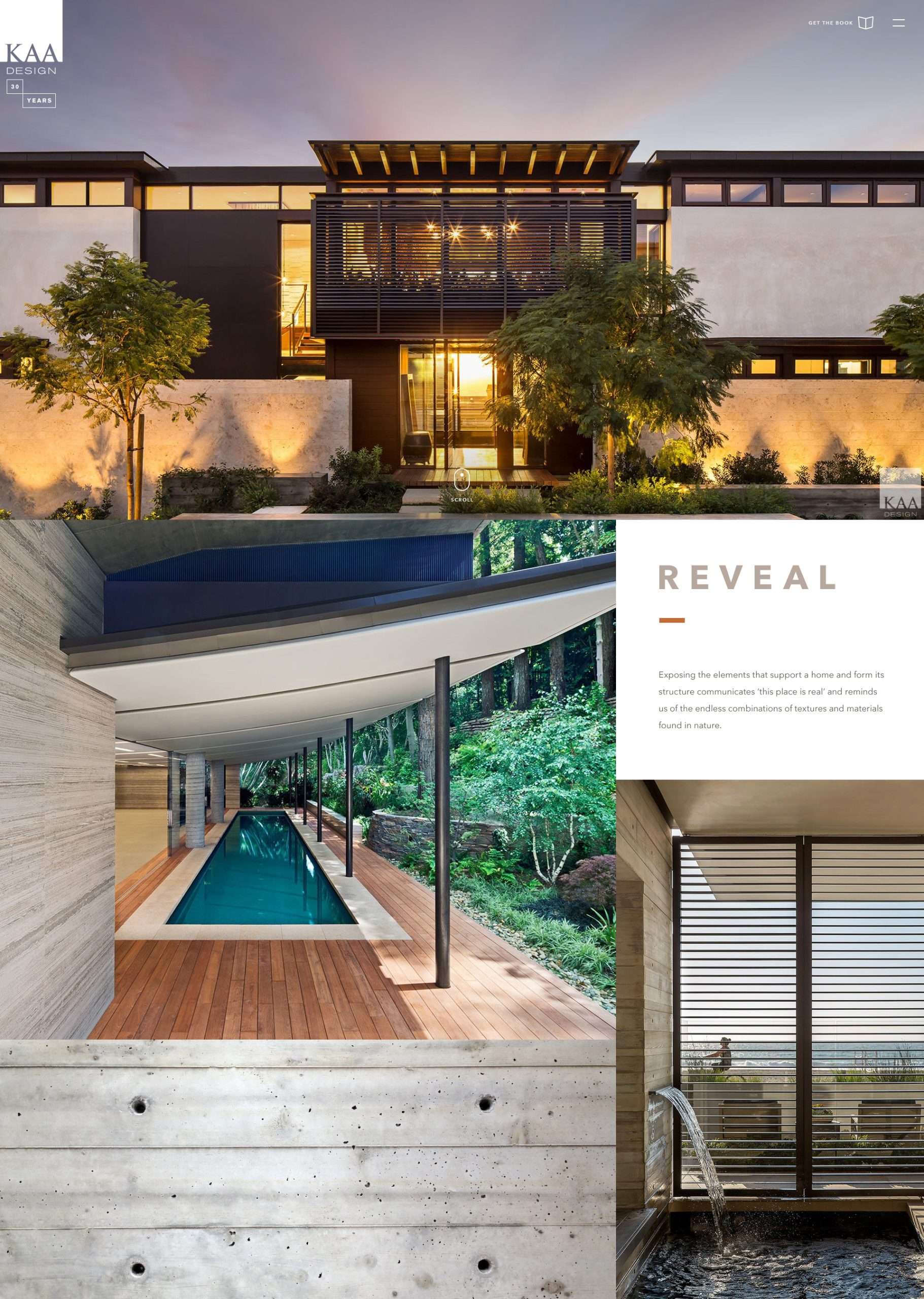
The dynamic homepage grid extends into the project detail pages, giving equal weight to narrative and luxe photography.

Infused with KAA’s California sensibility, the site feels modern, relaxed and built to timelessly spotlight the firm’s work.

Bold typography and sweeping colors capture the youthful energy of the client’s entertainment brand.