SISU BRAND EVOLUTION
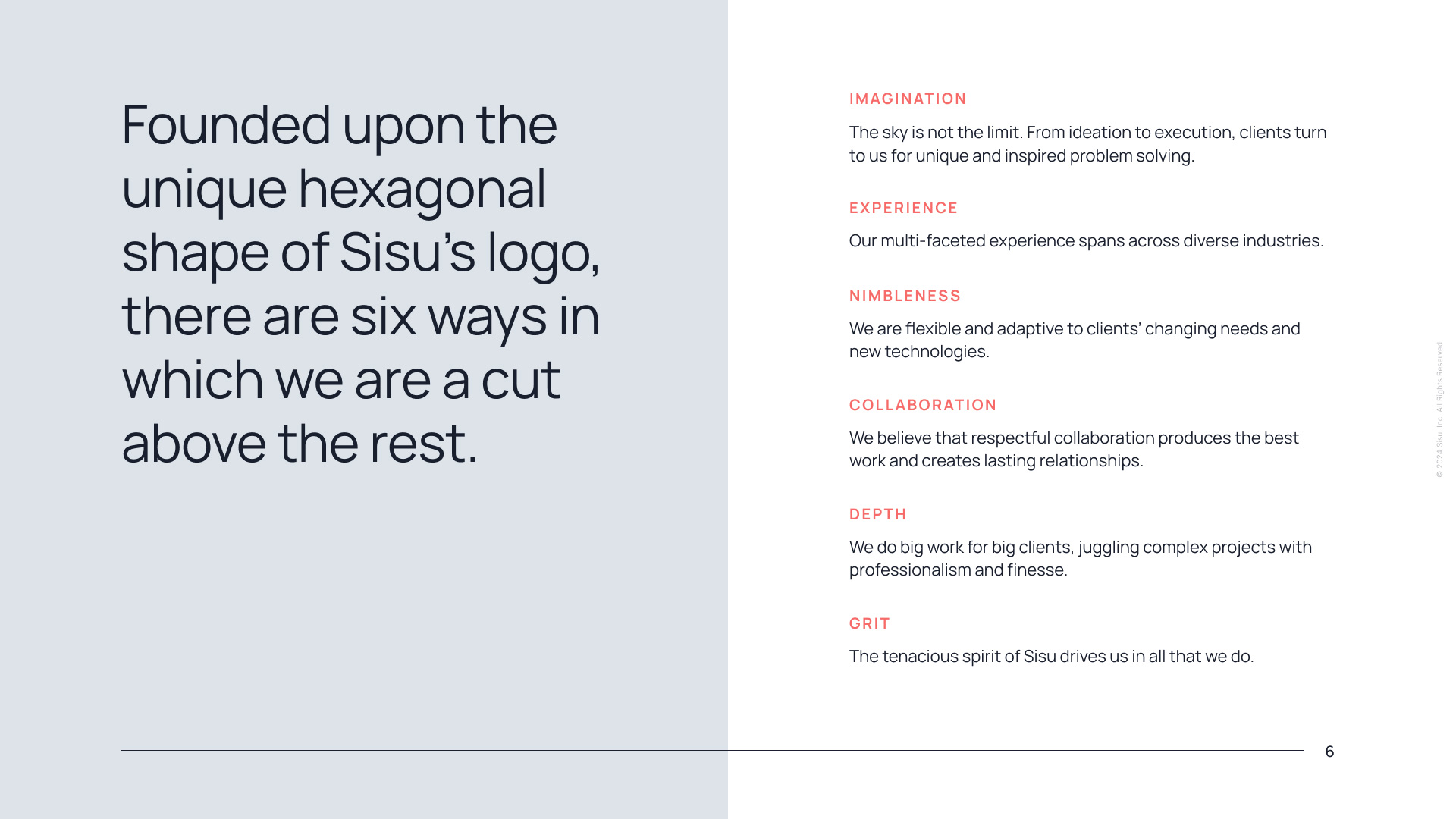
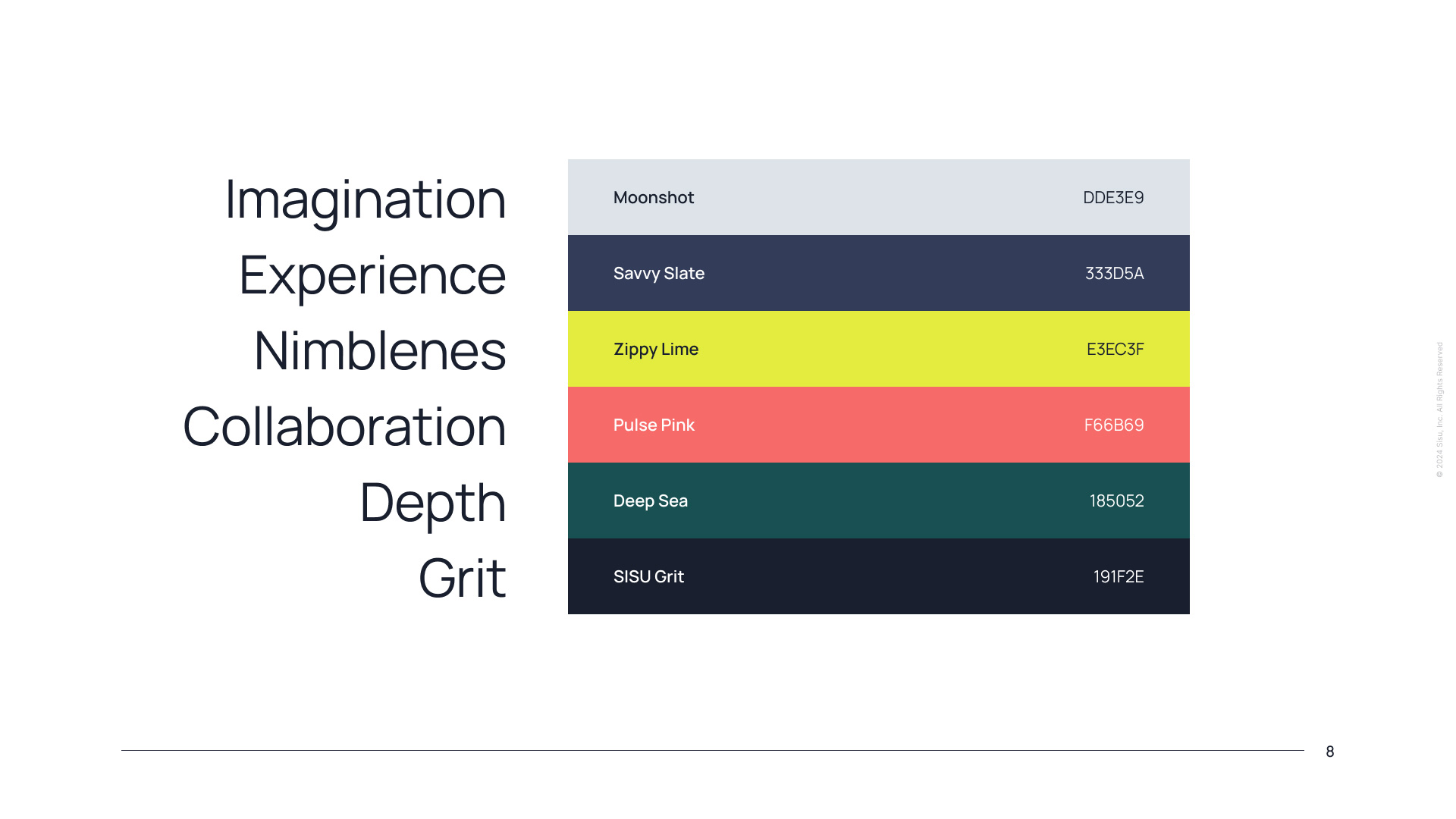
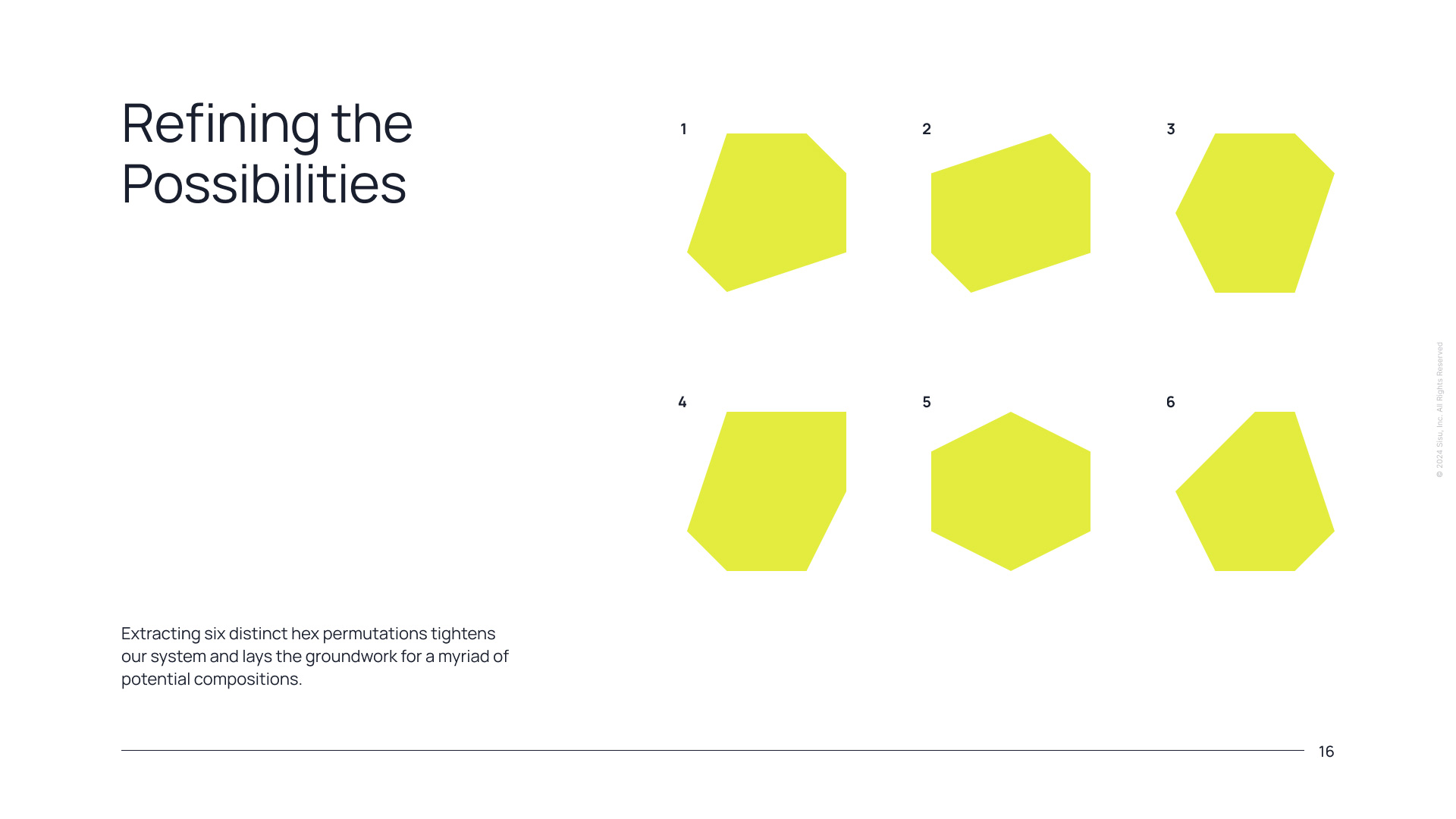
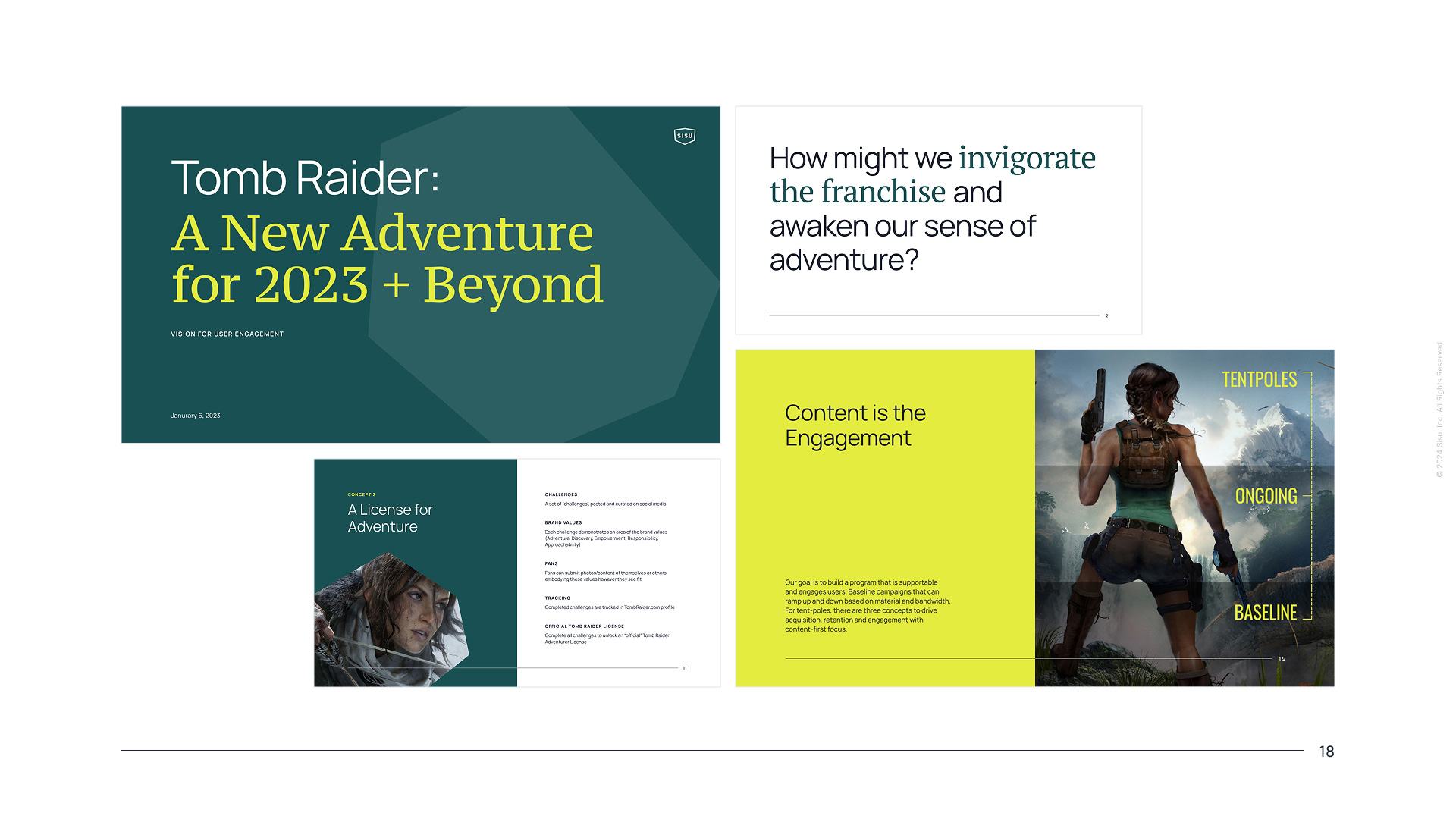
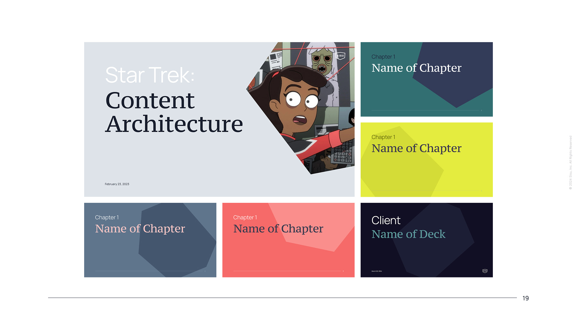
I initiated and led an evolution of Sisu's brand, simplifying the agency's narrative while creating a distinctive and flexible graphic system that transformed our presentation decks and marketing materials.
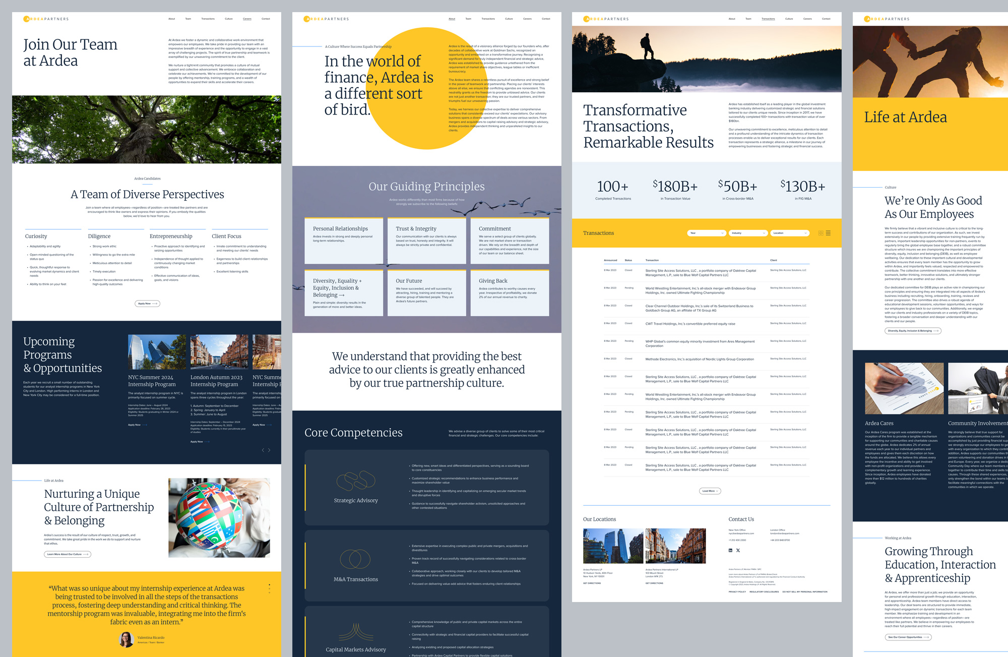
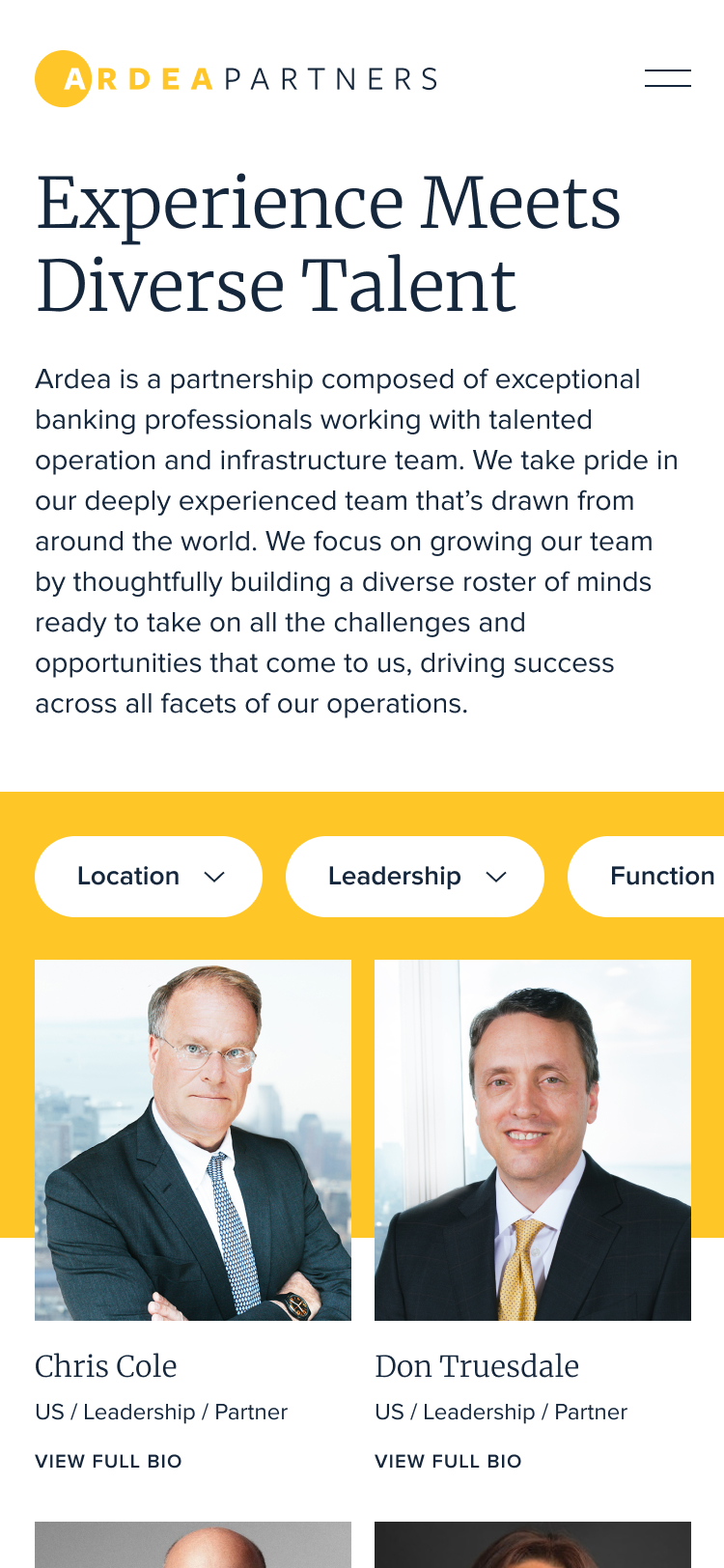
Named after the heron—a symbol of perseverance, integrity, transformation and good fortune—Ardea’s new brand experience was designed to reflect the meaning behind the name.

We created a modular system built for efficiency and scalability that was flexible enough to support a wide range of content while maintaining a refined, consistent aesthetic.
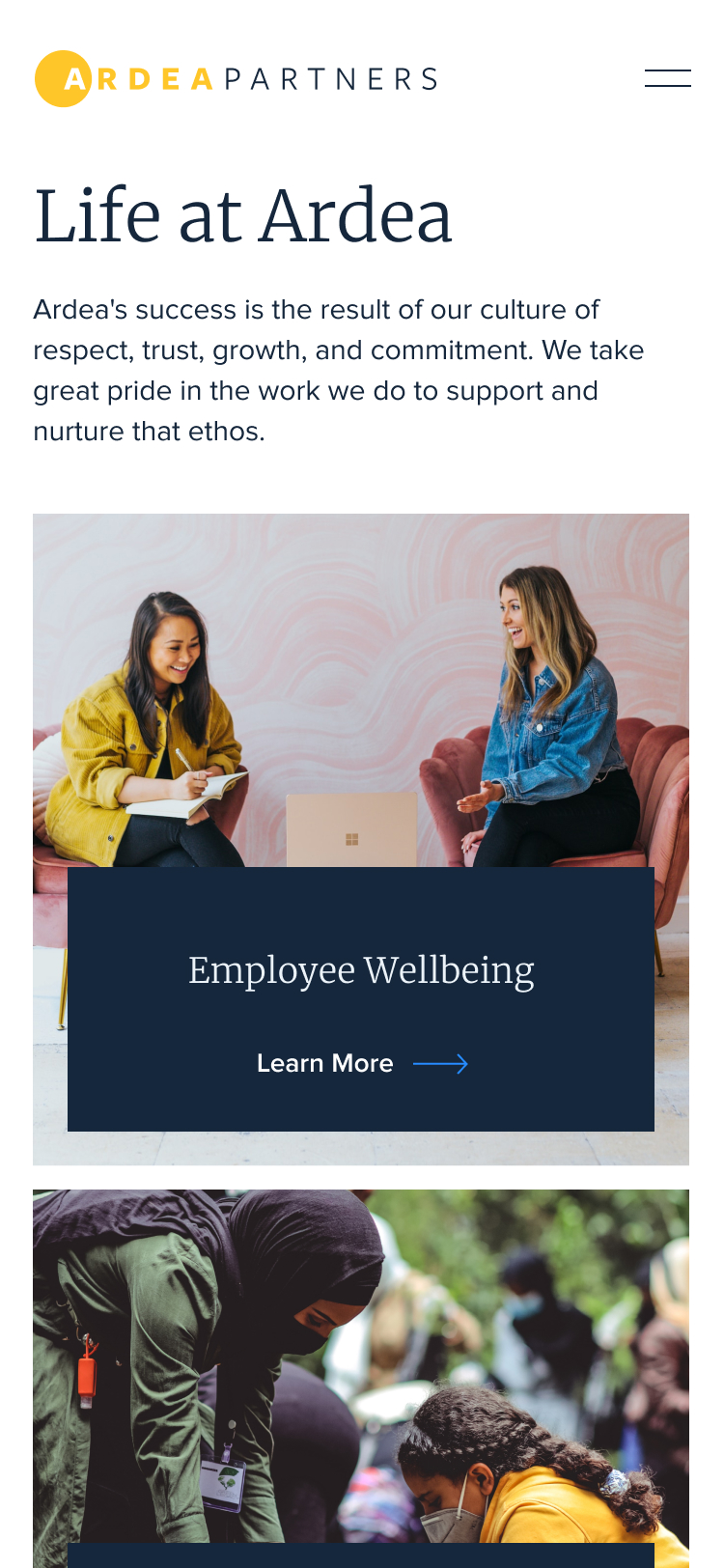
Knowing the client’s audience skewed slightly towards mobile, we made sure the site experience felt seamlessly intuitive and dynamic across all devices.


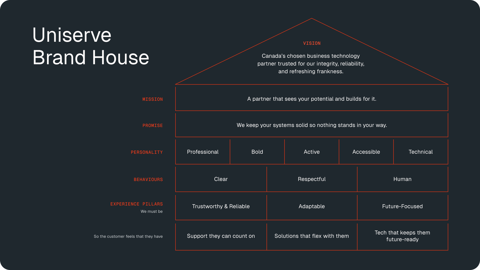
Drawing on insights from our client workshops, we created a multi-level brand house that now anchors all of Uniserve’s consumer touchpoints.
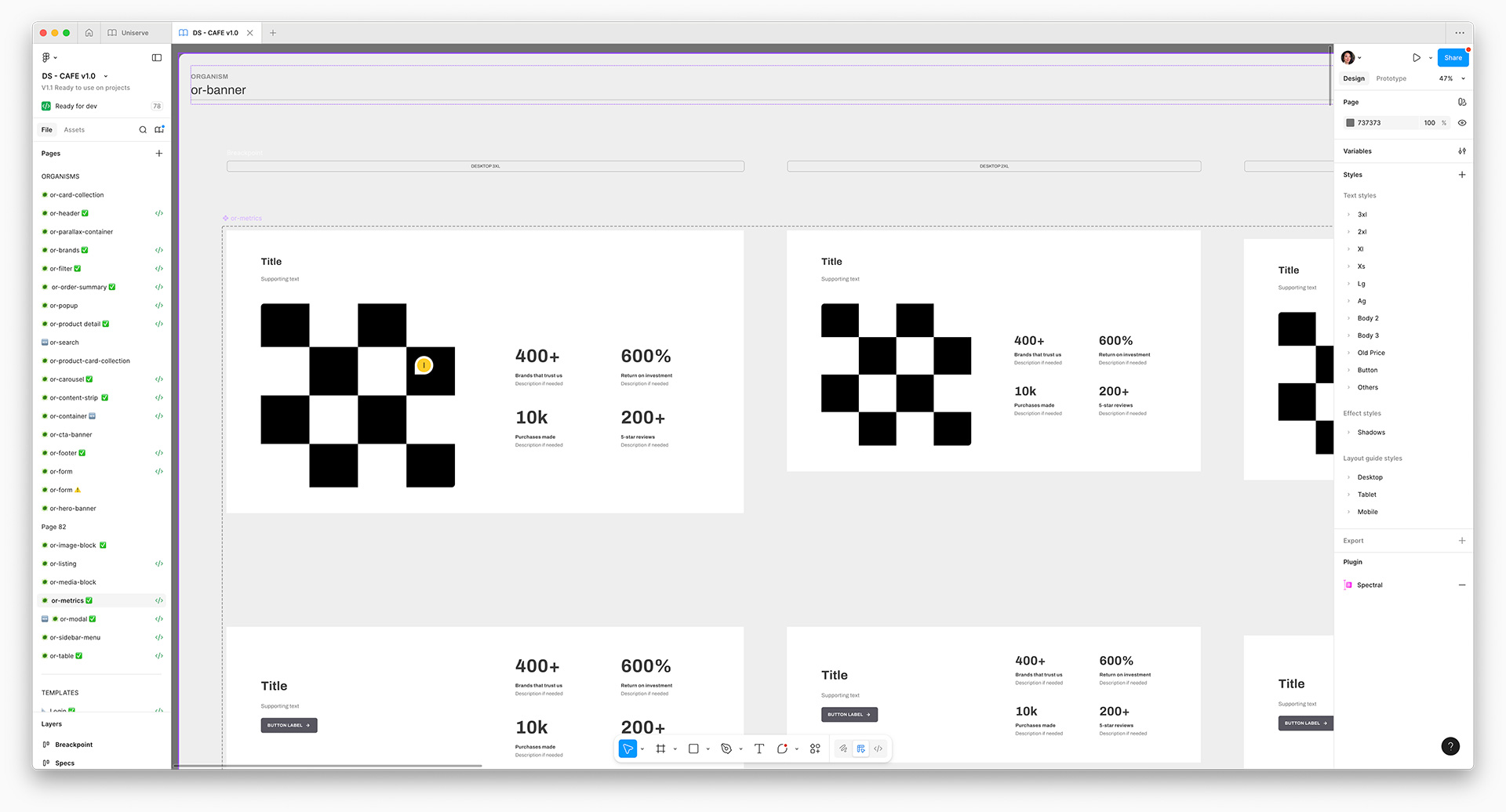
The client opted to leverage an internal pre-built component library due to time and cost restraints. However, we soon realized that expanding the atomic design system was necessary to effectively communicate specific content.
With multiple teams spanning various timezones, we flexed our collaborative strengths and still managed to enhance the library within budget.
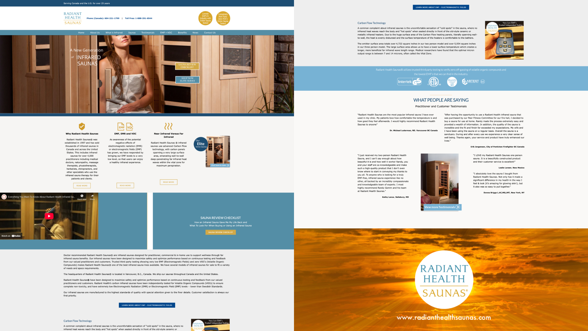
Using our evolved component library, I shaped the creative direction for the new site by designing a streamlined homepage, and guided our development team through building and styling the internal page templates.
Working side-by-side with copywriters, we modernized the client’s online presence with a spirit of honest clarity and grounded integrity—the backbone of Uniserve’s identity.
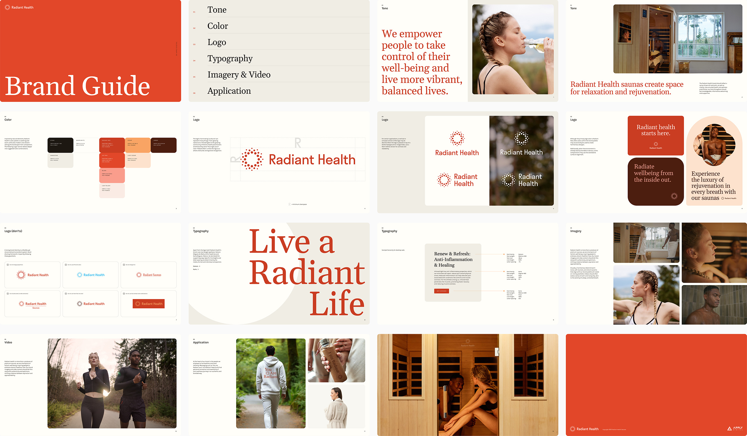
The old brand felt dated and fragmented, struggling to stand out in a crowded market. To align with the client’s vision of expanding beyond saunas, we evolved ‘Radiant Health Saunas’ to ‘Radiant Health,’ paired with a modern logo and visual identity that evokes warmth, relaxation and radiance.

Example of the old brand.

The new brand elevates Radiant Health’s story of empowering people to live brighter, more vibrant lives—a powerful message that became the backbone of the company’s social campaigns.
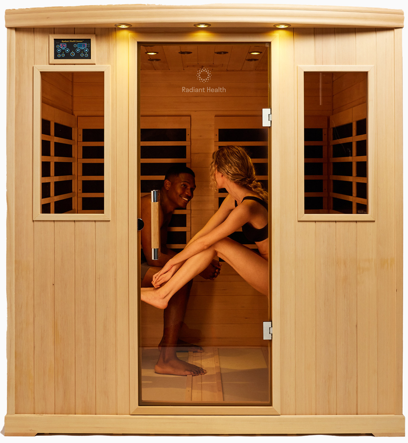
From casting to storytelling, I led the creative direction for the client’s product photography and lifestyle imagery, resulting in a cohesive branded asset library for use across digital channels.
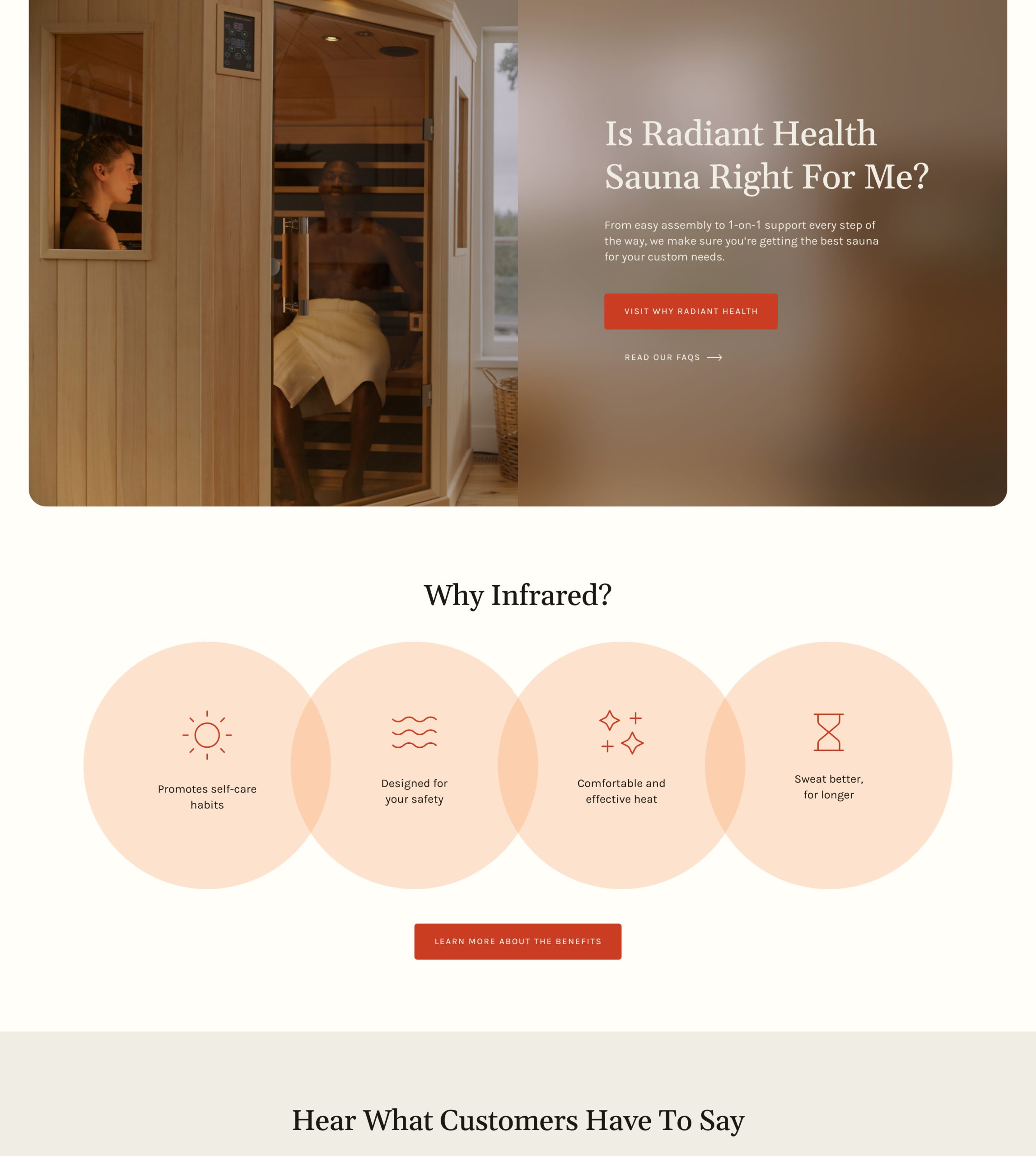
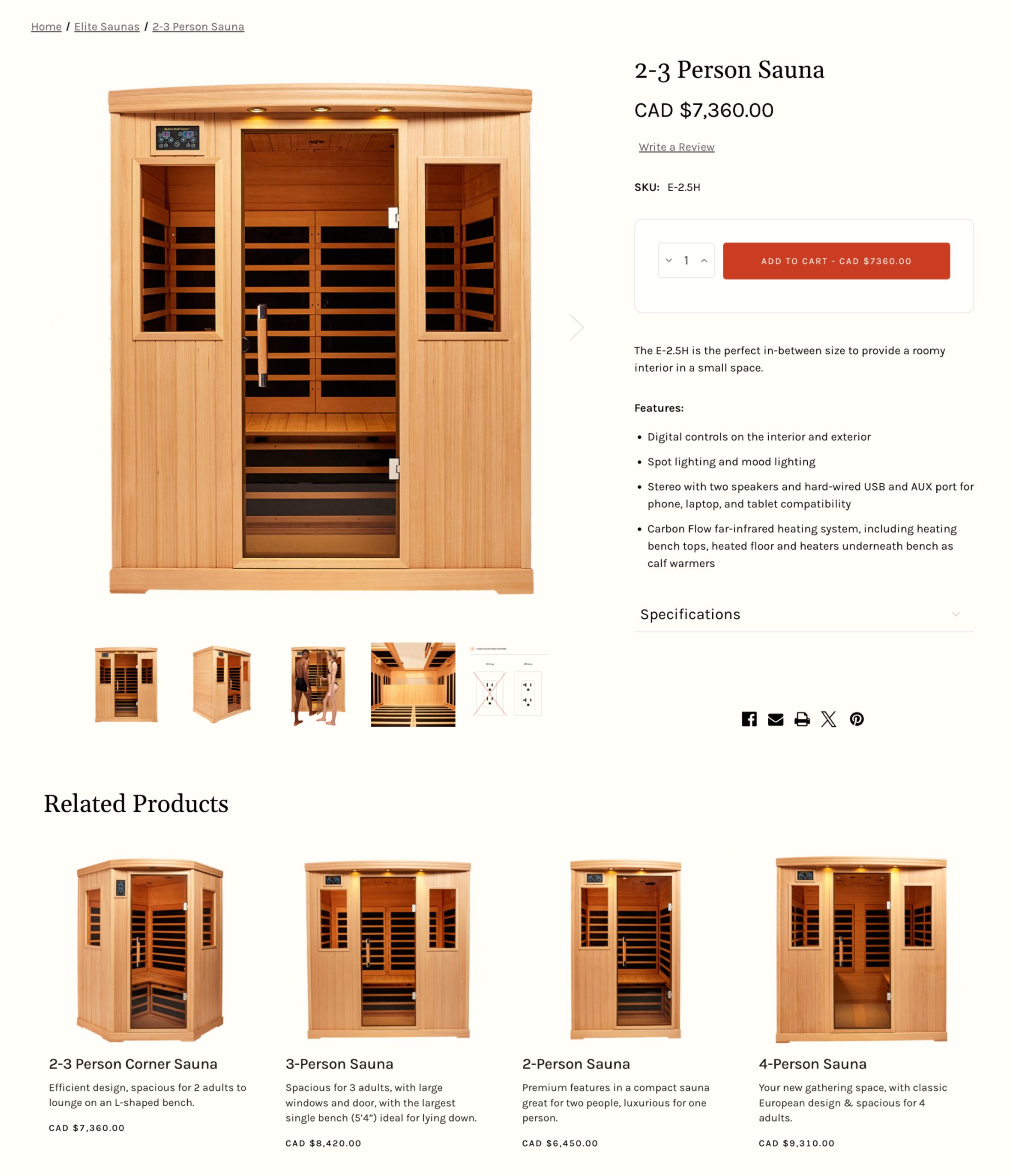
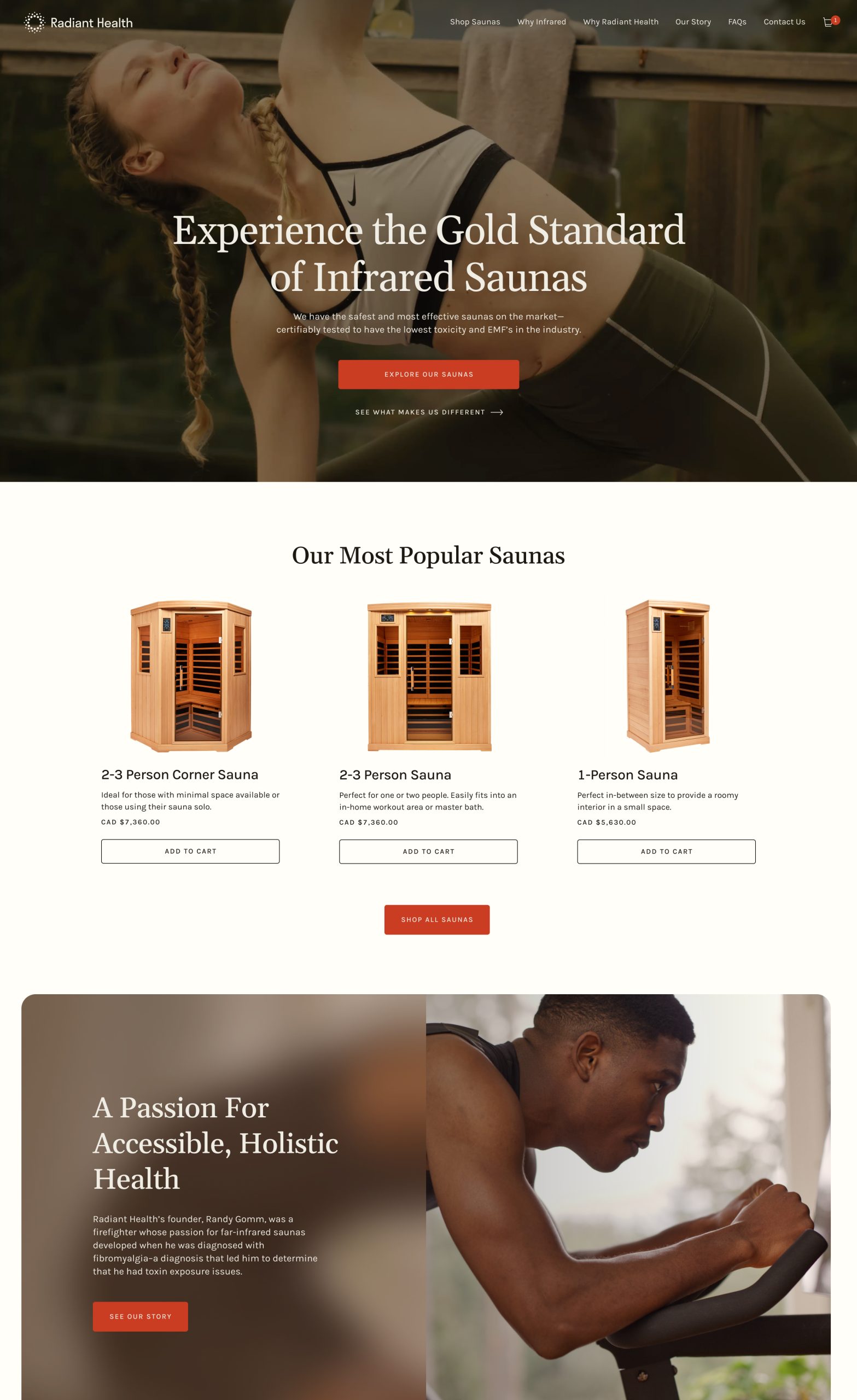
With limited time and budget, the client chose a BigCommerce template to streamline their site. Our design and tech teams collaborated to style it closely to the new brand with minimal code changes—delivering a clean, easy-to-navigate product experience that strengthens trust and loyalty.


Optimized for performance, Radiant Health’s mobile site transformed the way new and existing customers explored their products, while also paving the path for the company’s future offerings.

From the digital space to people’s homes, the revitalized brand rolled out across all sauna doors—inviting customers figuratively and literally into the world of radiant health.
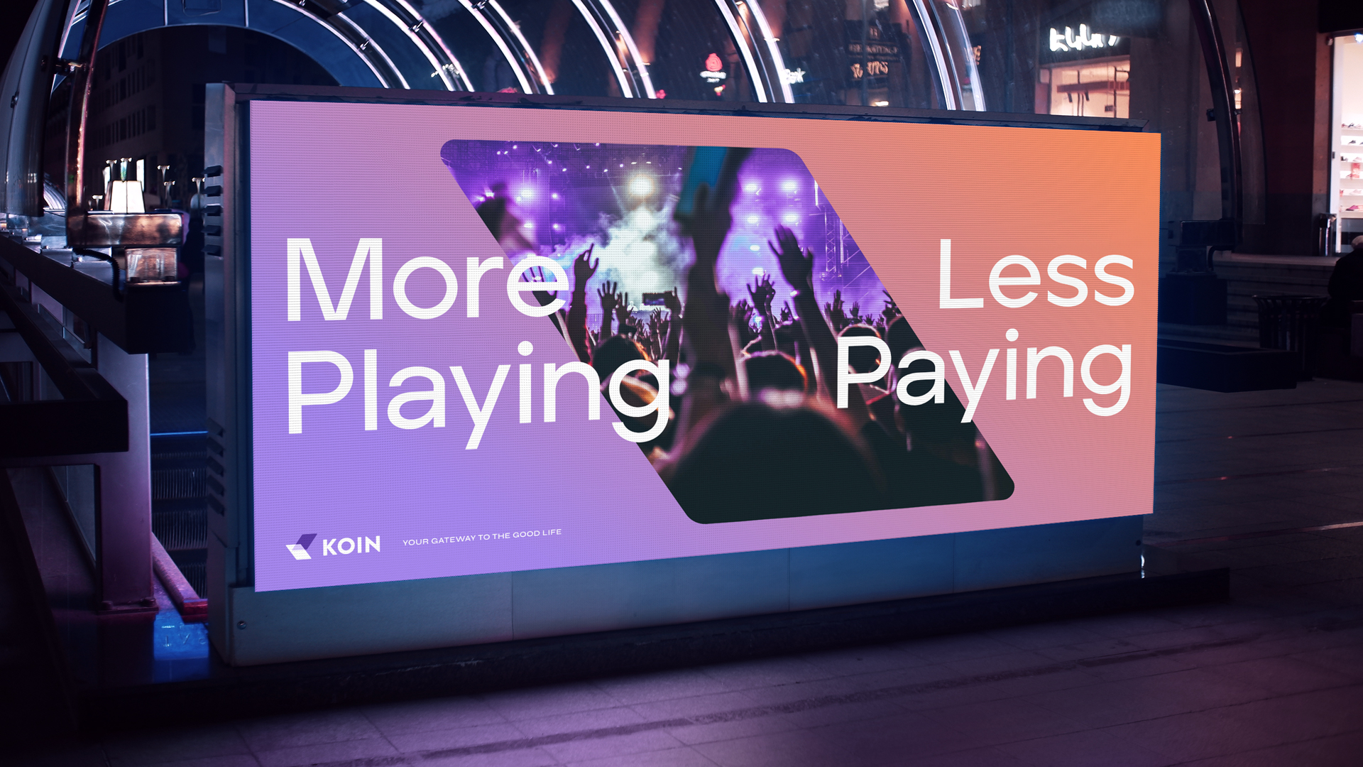
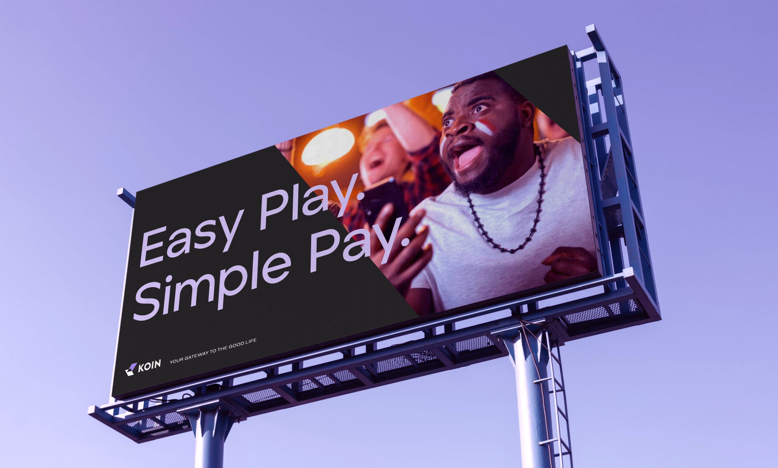
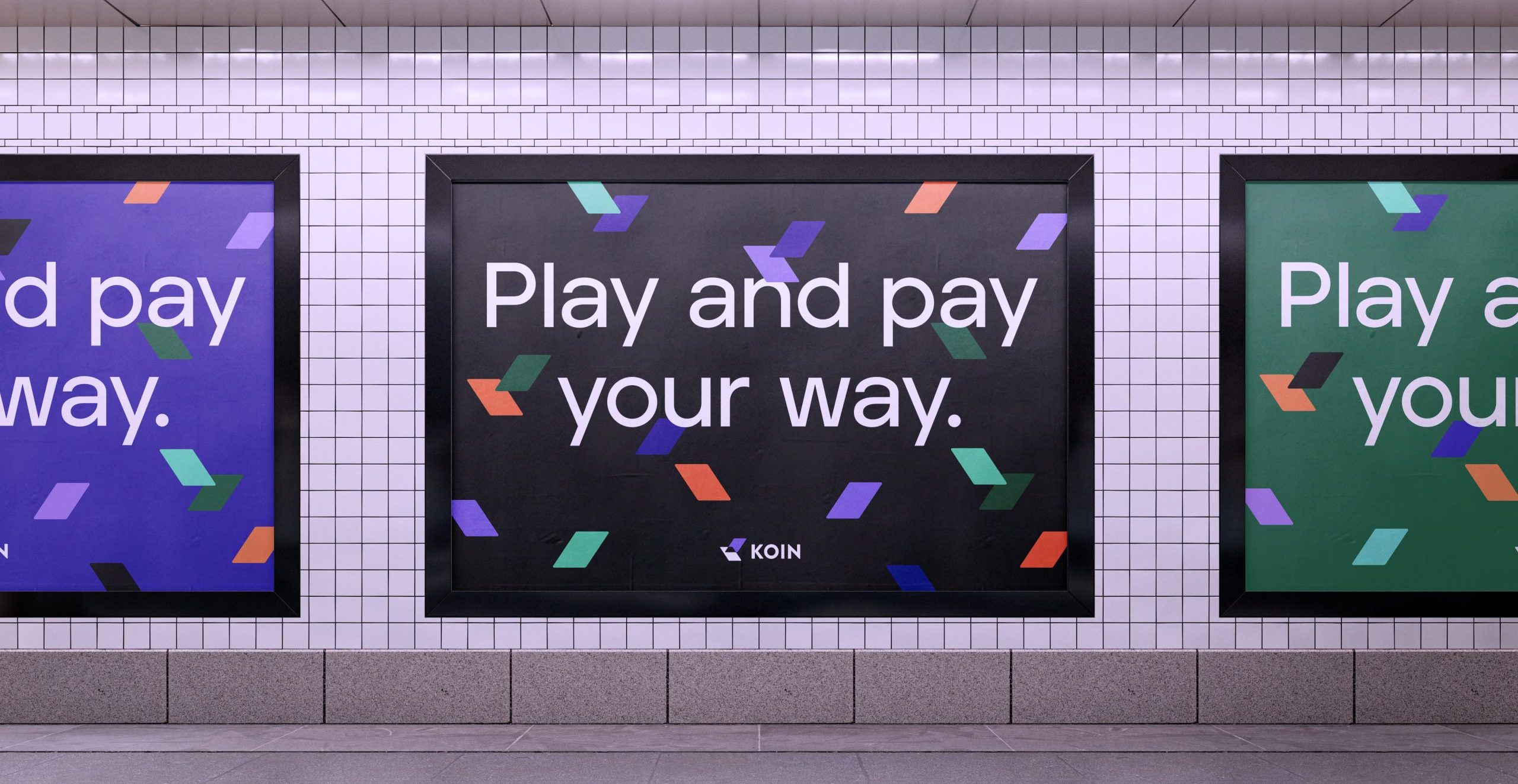
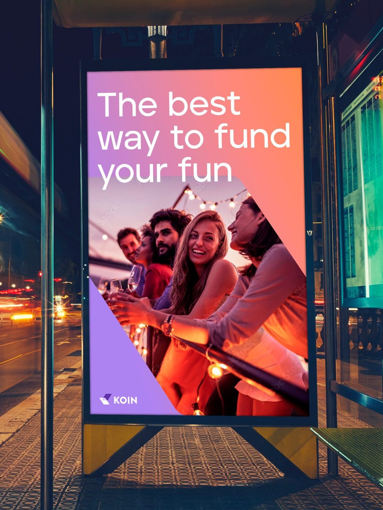
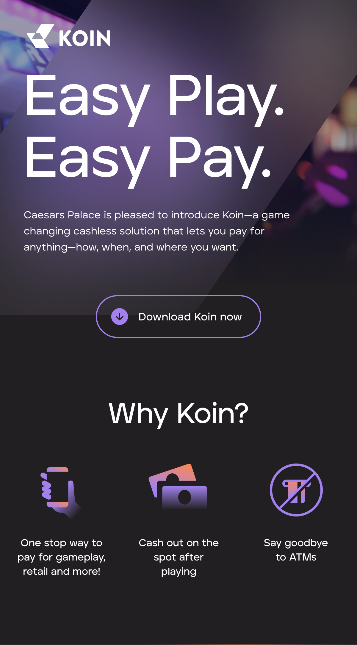
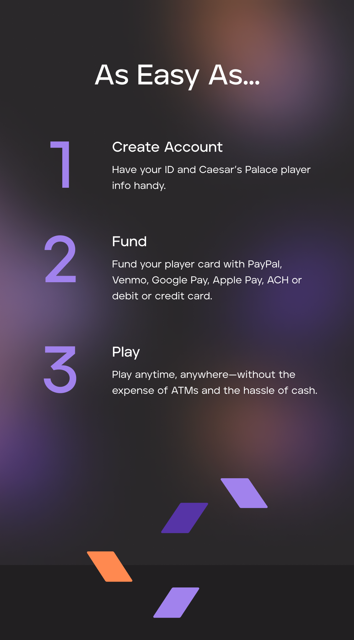
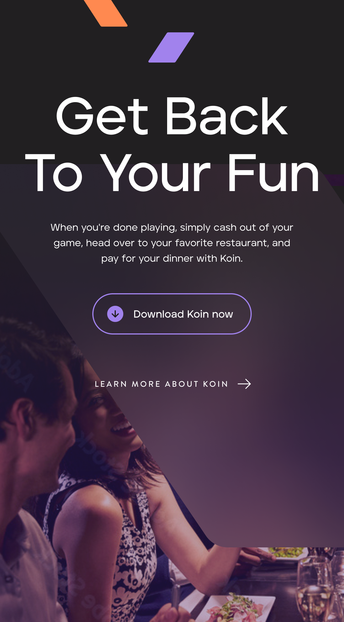
From casino flyers to marketing sites to sales decks, we carried the bold new brand through every touchpoint, ensuring a consistent and confident presence wherever it showed up.


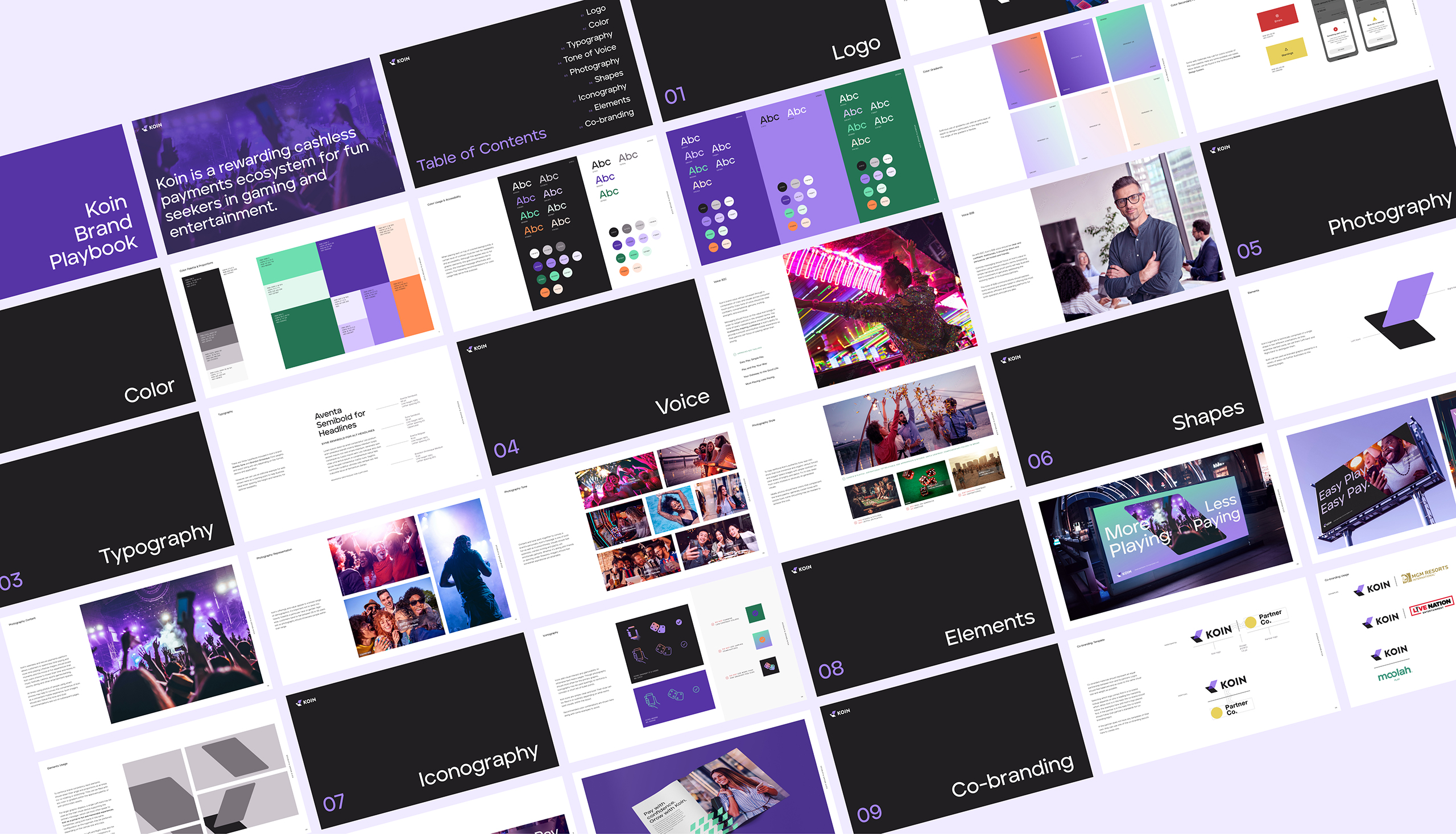
A robust yet versatile brand guide became the foundation, ensuring every future Koin product could grow with a cohesive visual style and tone.
The design is minimal with vibrant accents, balancing a brutalist aesthetic that conveys the weight of the science with playful, quirky animations that celebrate the human side of expanding one’s perception box.
In one of the site’s key sections, a scroll-based shrinking background invites users to interact with their own malleable perception box.
Because Tiny Blue Dot Foundation funds extensive research with leading institutions, it was essential to design an intuitive way for users to quickly filter through projects.
By uniting the brand’s philosophy with how people actually engage the content, the site delivers a memorable experience for both curious newcomers and dedicated researchers.
With a mobile-first mindset, we ensured fans of Focus Features content could quickly find when, where and what to watch.
The new site’s modernized user experience led to increased engagement and a more integrated platform for showcasing the studio’s cinematic films and shows.
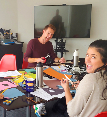
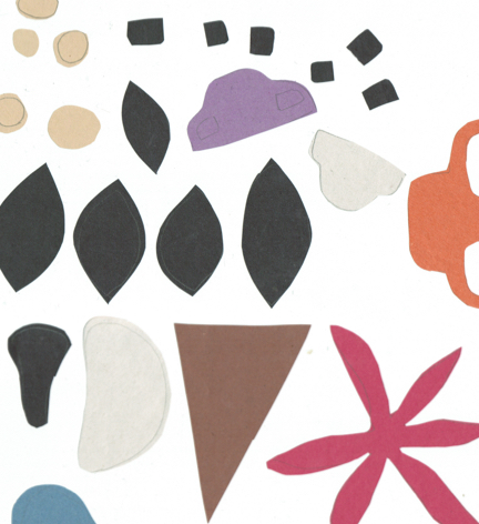
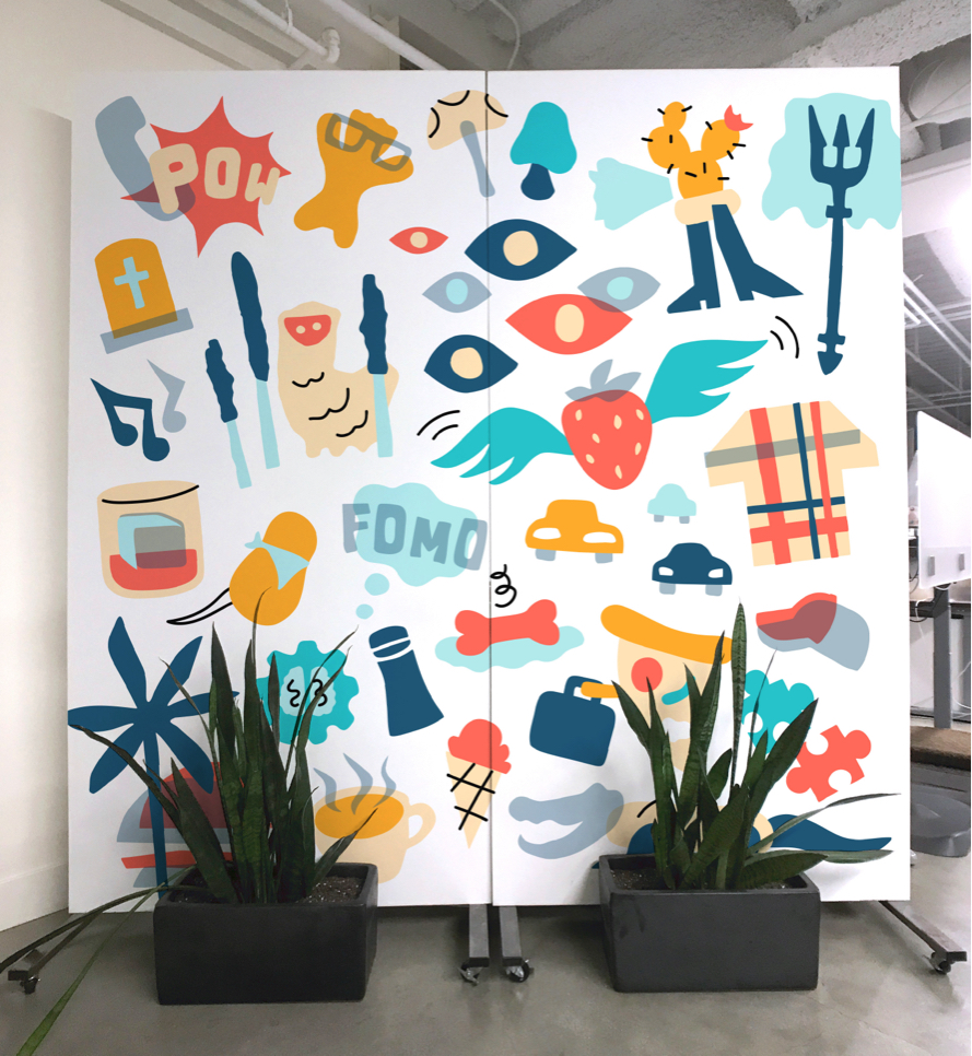
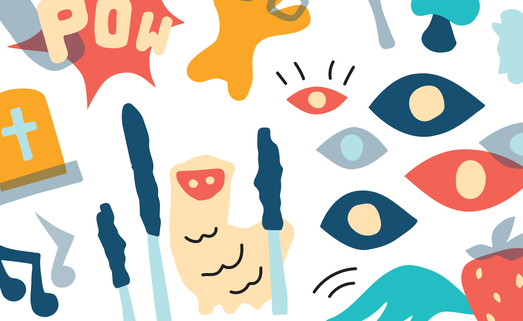
We created an 8-foot mural filled with inside jokes and personality quirks. Hand-cut shapes from construction paper were scanned, vectorized, colored, and collaged into a delightfully random wall that instantly became a conversation starter for anyone visiting the office.
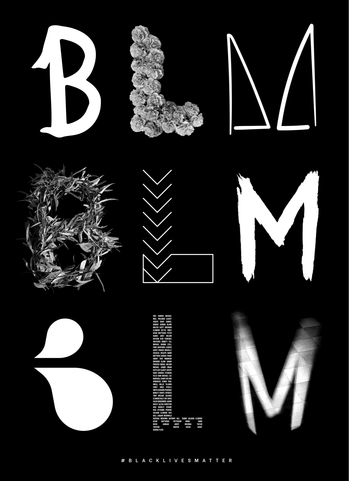
In support of Black Lives Matter, each designer crafted meaningful letterforms using different media, which we then brought together into a striking, unified poster.

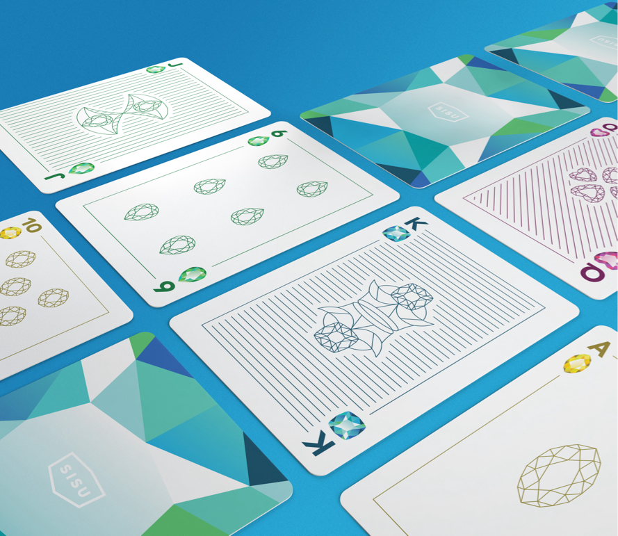
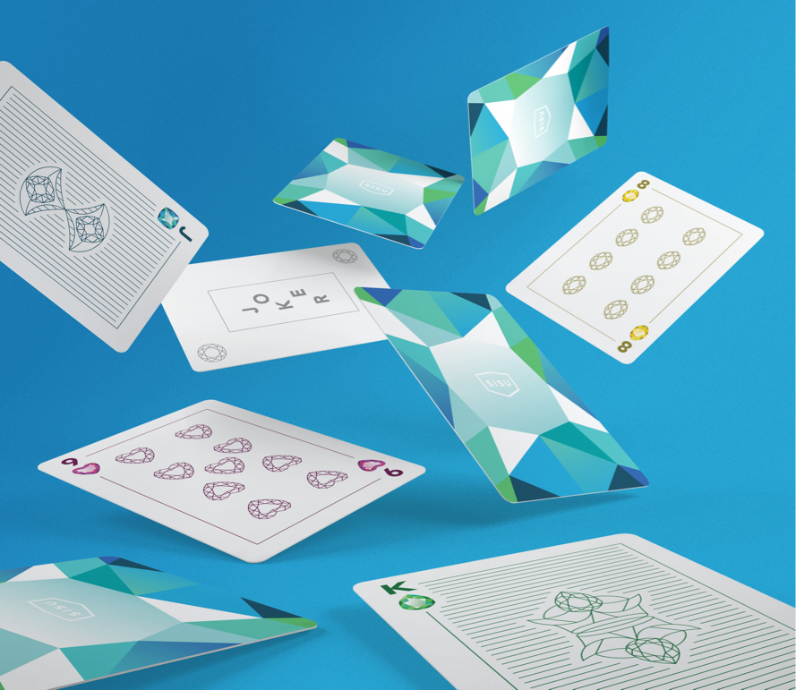
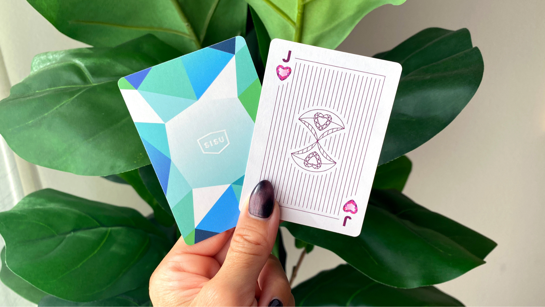
Each holiday season, we crafted unique gifts to honor our clients and their partnership. One year, I designed a custom deck of playing cards featuring gems as a nod to Sisu’s brand story.


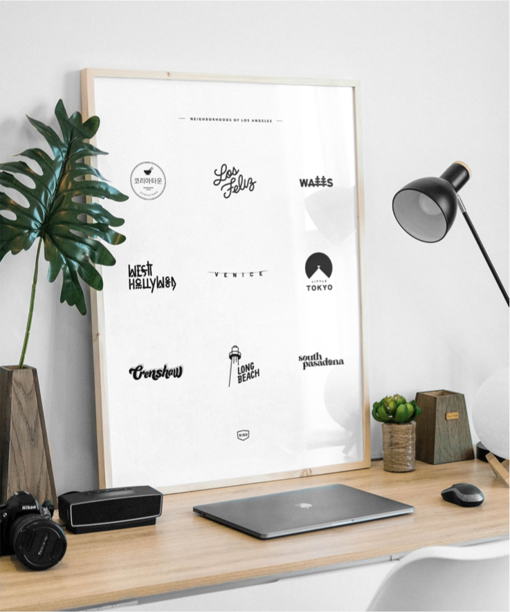
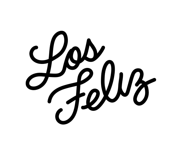
Los Angeles neighborhoods are as diverse as the people who call them home. Our team celebrated that richness by designing fresh logos for some of our favorite areas.


Our team thrived on creating for the joy of it. Introducing these internal projects sparked an energy that fueled the studio and pushed the company toward more imaginative client work.


Digital sketches: problem-solving through exploration.
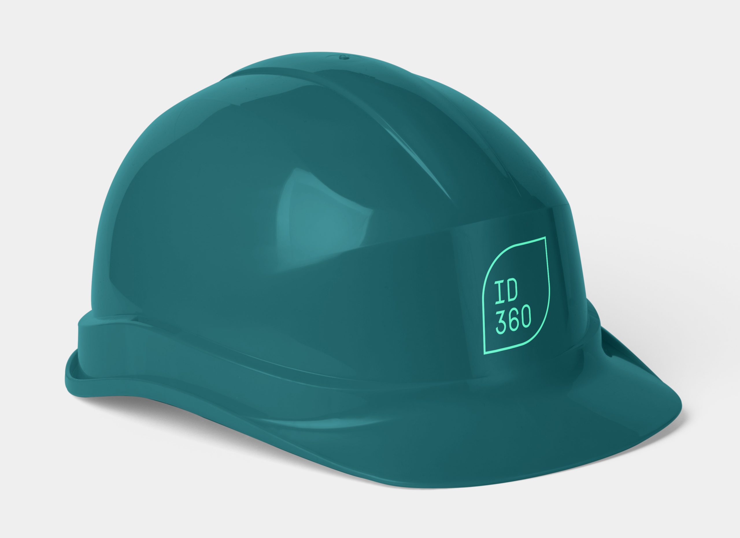
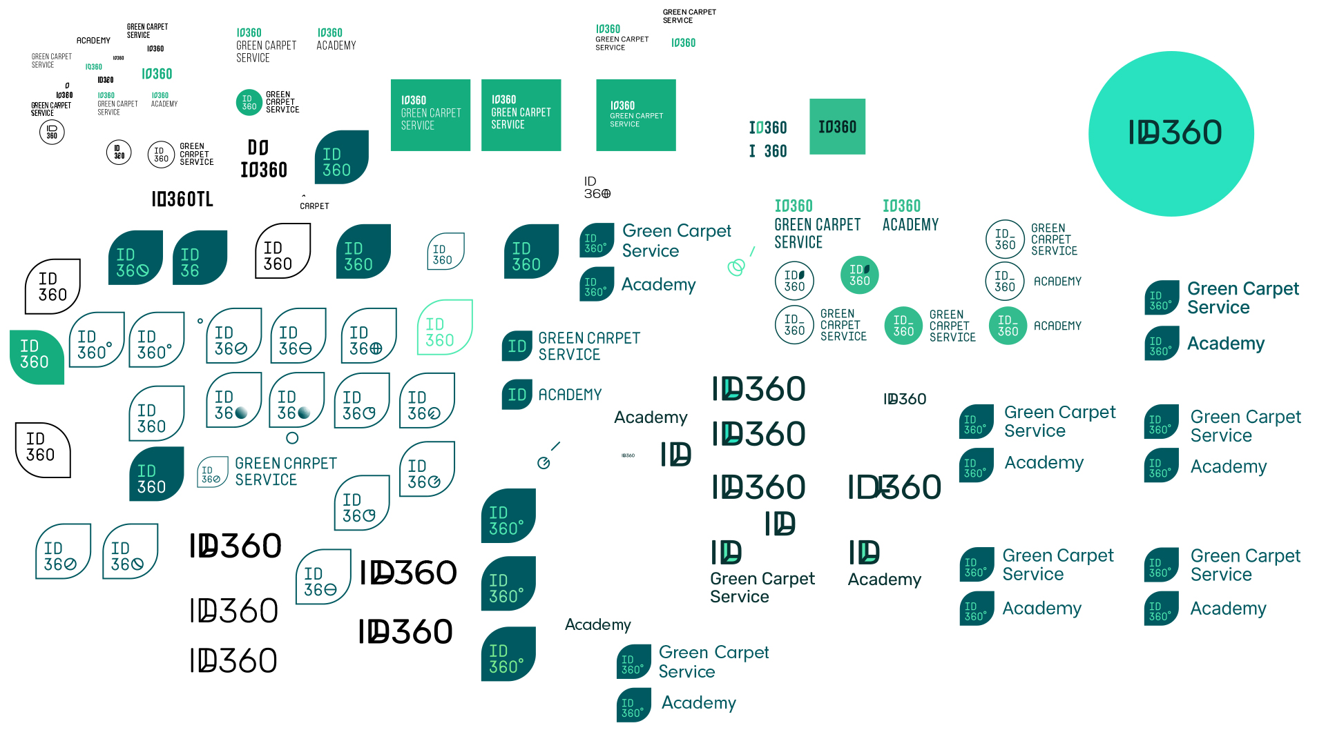
The company’s owners pride themselves on their hands-on experience working within construction sites. Creating a logo that looks slick on a hard hat was a no-brainer.
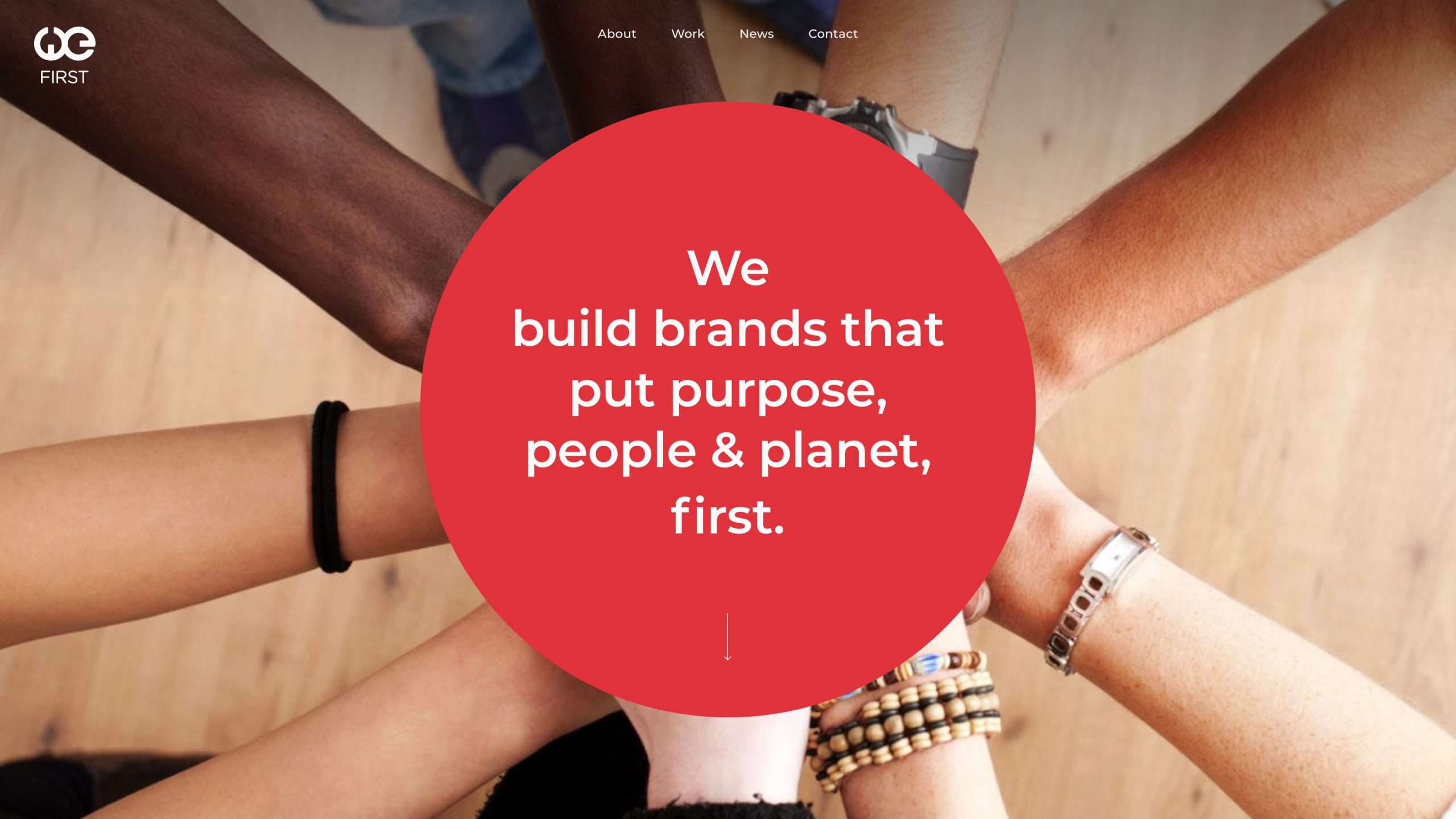
Building on the company’s circular logo, we extended the shape throughout the site as a symbol of collaboration for the common good—one of their core values. Bold, straightforward content transitions further reflect their commitment to both leadership and sustainability.