ARDEA PARTNERS

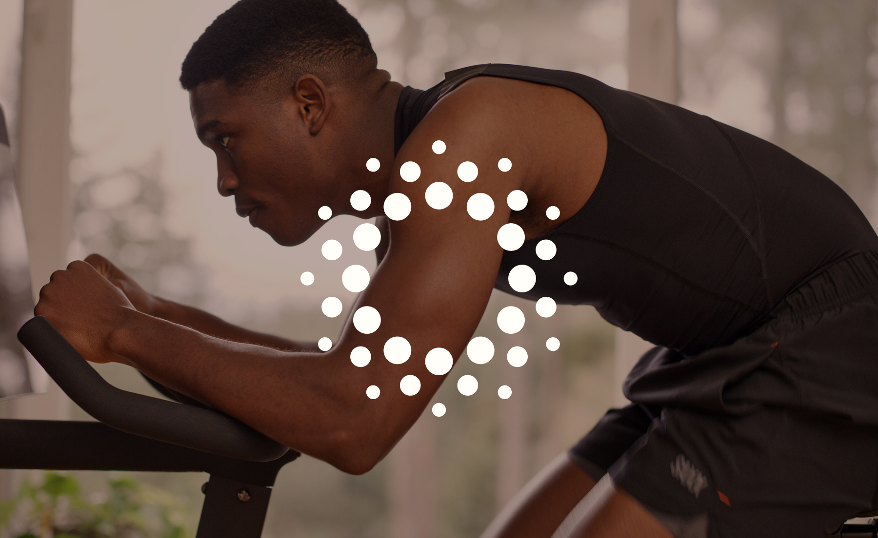
In the boutique investment space, Ardea Partners knew differentiation wouldn’t come from expertise alone. Their online presence needed to feel human—grounded in trust, partnership and long-term relationships.

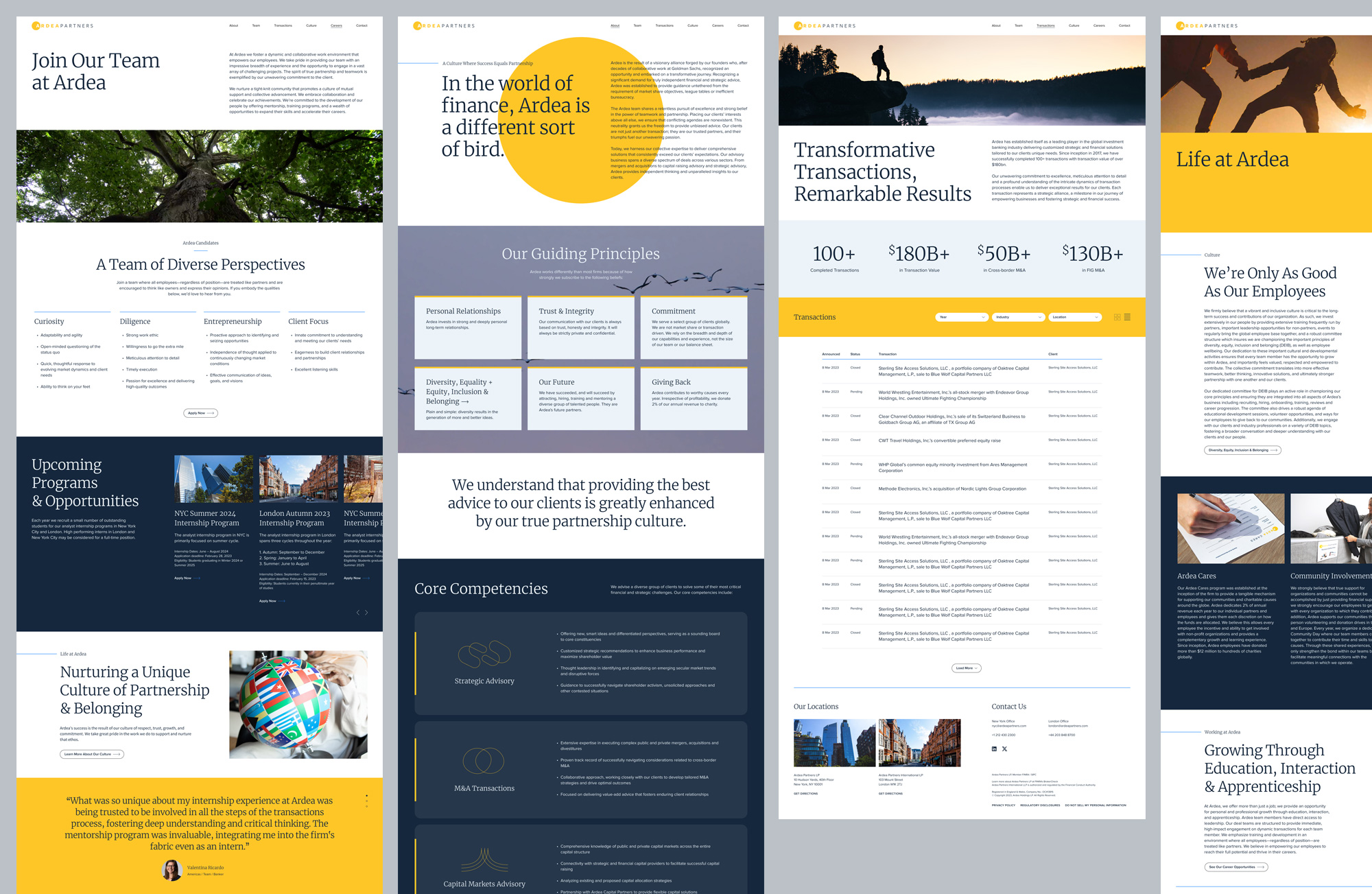
Named after the heron—a symbol of perseverance, integrity, transformation and good fortune—Ardea’s new brand experience was designed to reflect the meaning behind the name.

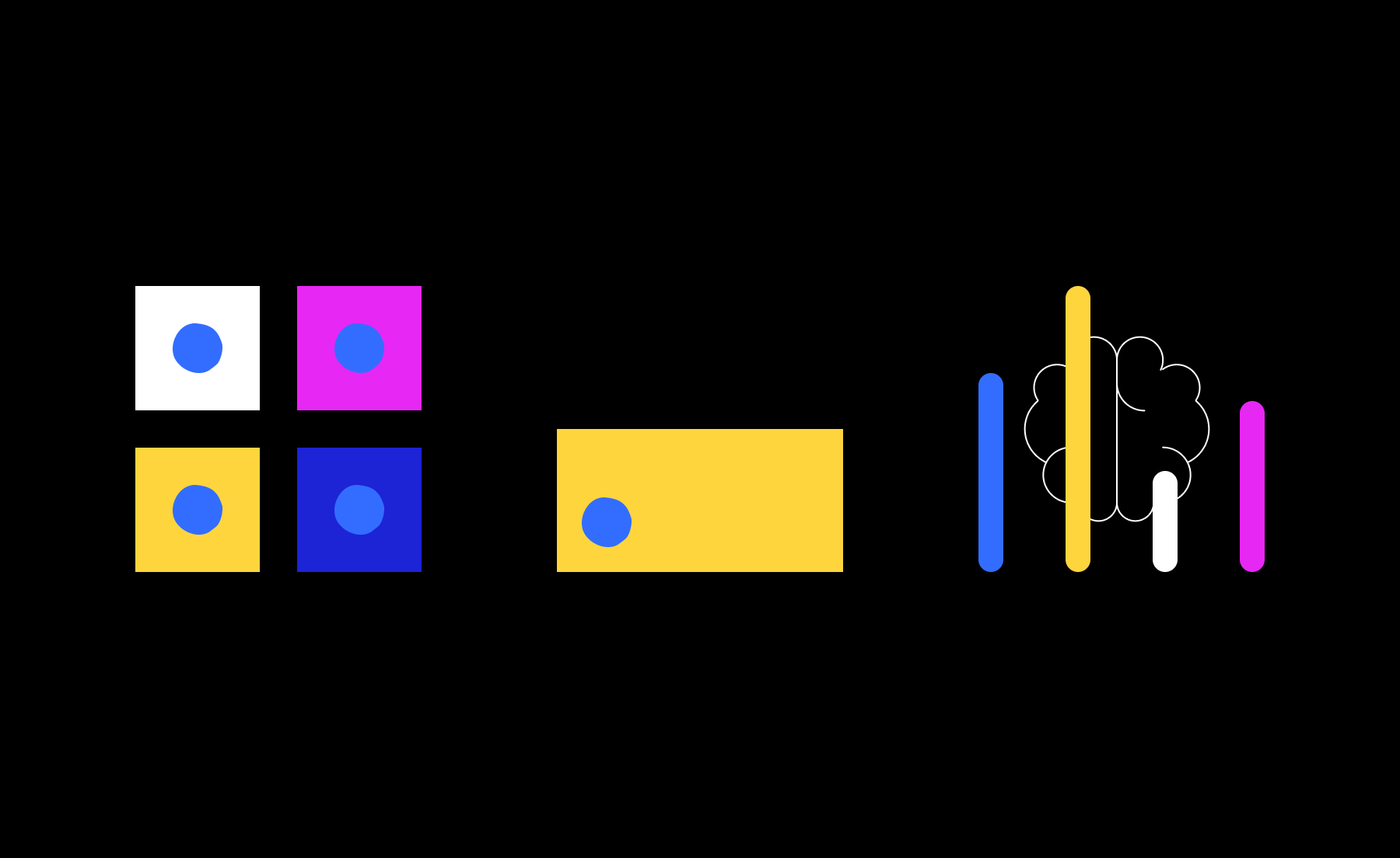
We created a modular system built for efficiency and scalability that was flexible enough to support a wide range of content while maintaining a refined, consistent aesthetic.
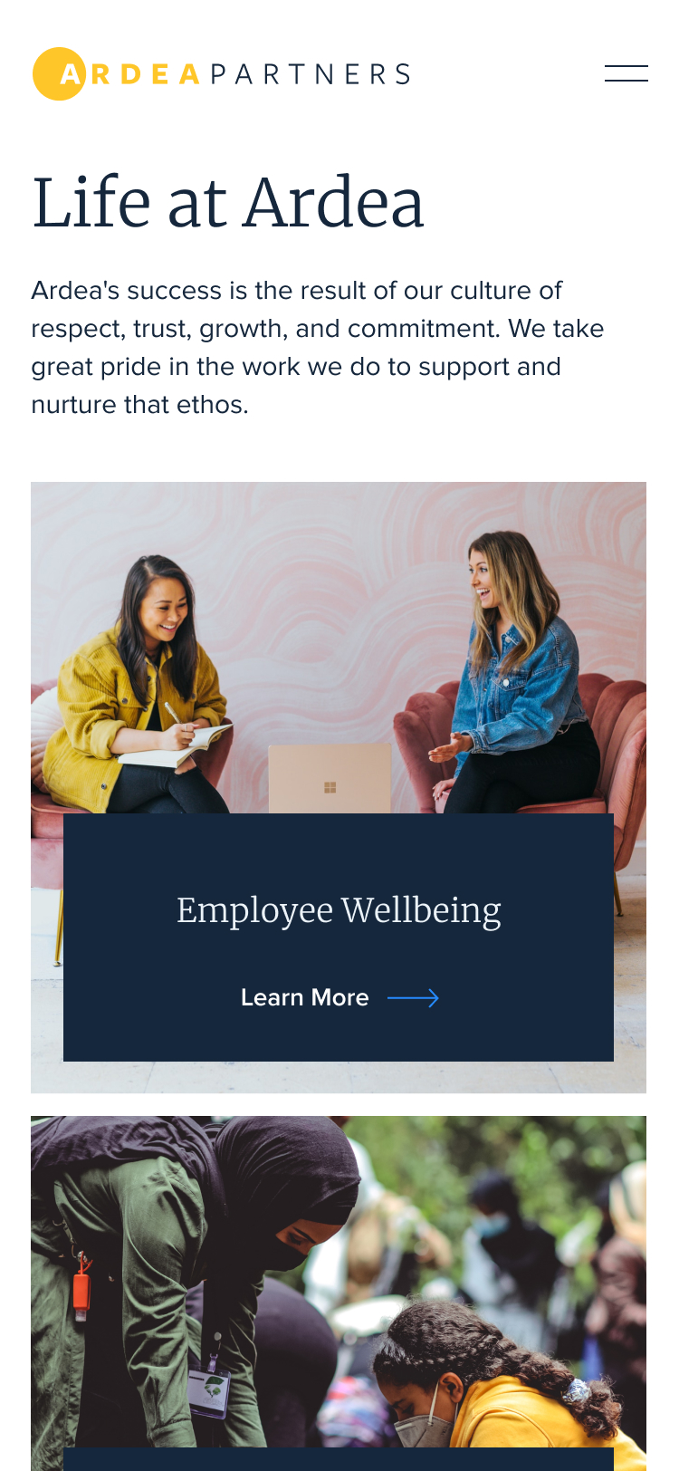

Knowing the client’s audience skewed slightly towards mobile, we made sure the site experience felt seamlessly intuitive and dynamic across all devices.

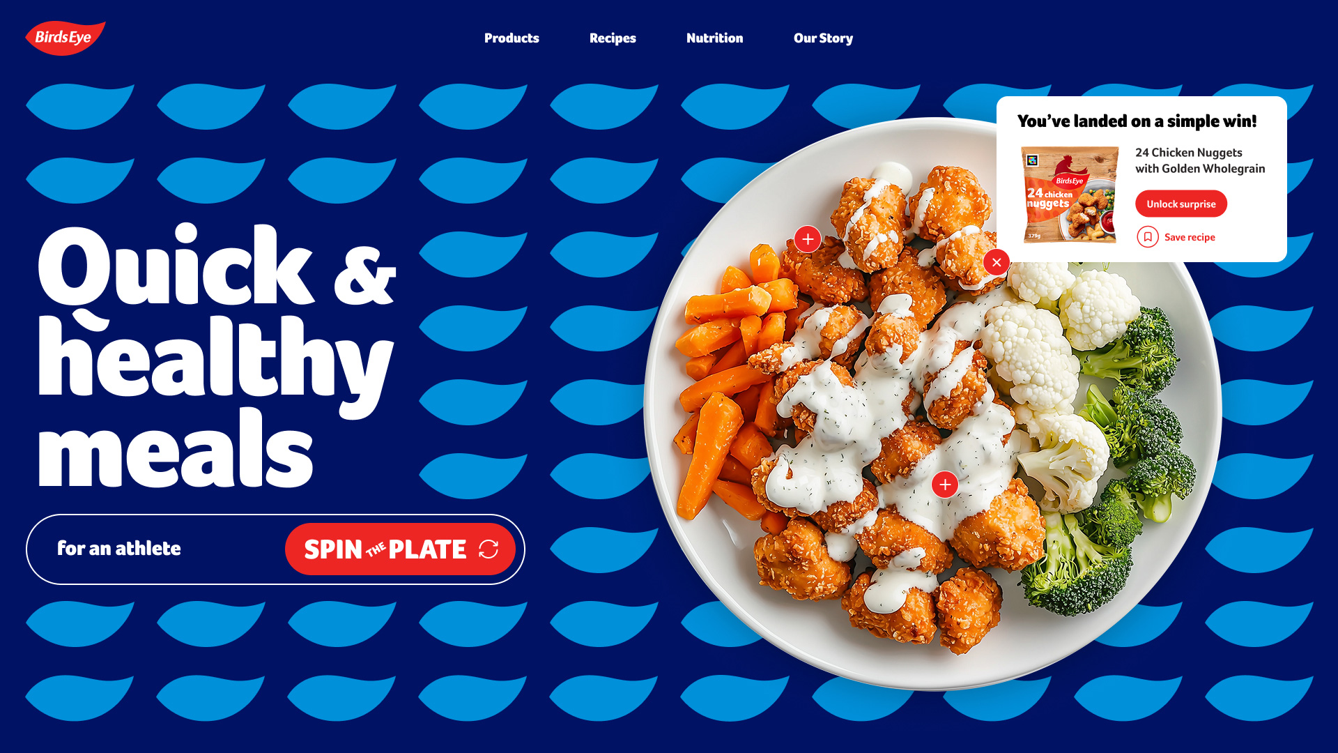
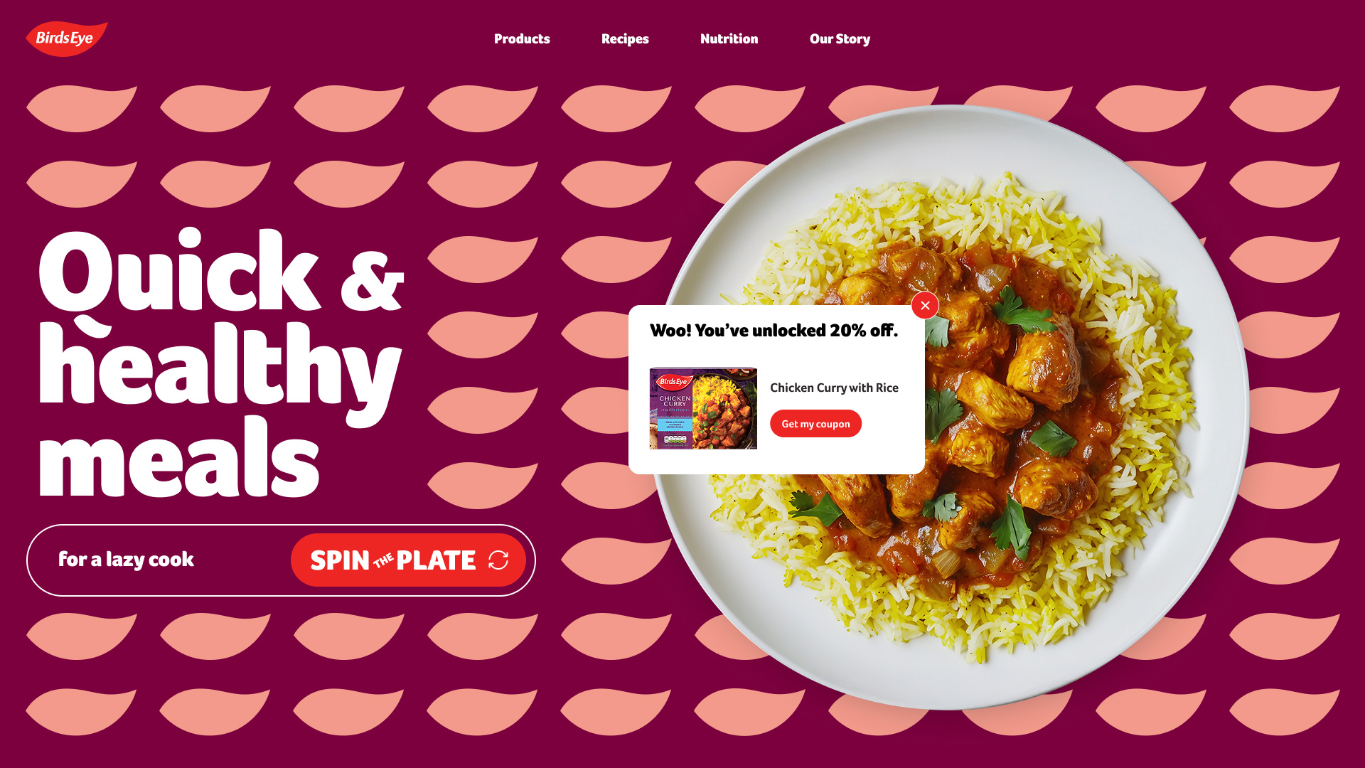
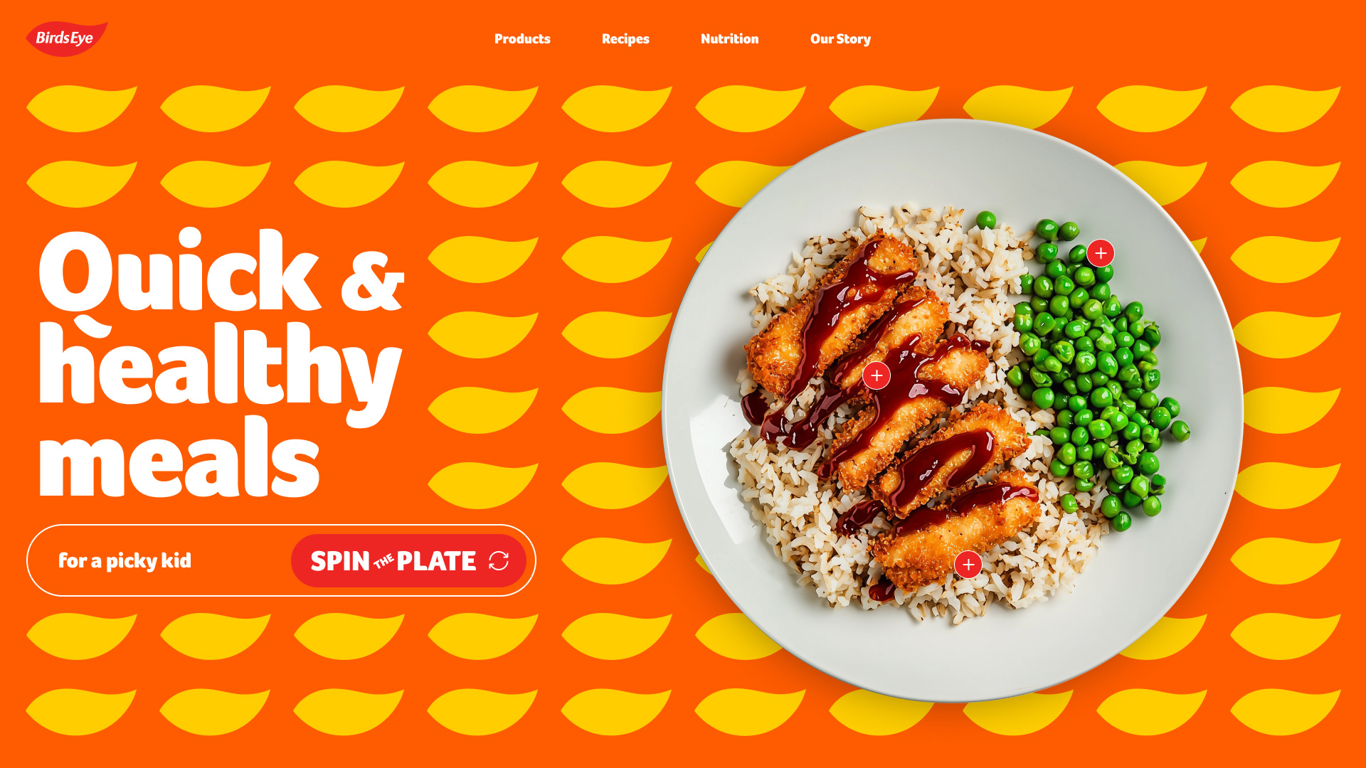
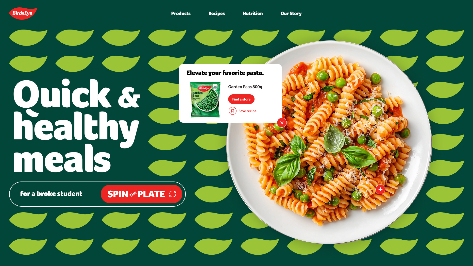
We brought the idea of ‘simple wins’ to life with our interactive plate spinner, leveraging AI to save time and money on plated food photography.

Whether you’re a busy parent with picky eaters or a college student on a budget, a quick spin served up healthy meal ideas and a chance to win coupons.

We redesigned the client’s site by turning traditional recipes into simple, step-by-step videos that match how people cook and learn online today. We also proposed AI integration for instant recipe modifications.

Community callouts and curated collections gave users more meaningful reasons to return to a frozen food site.

To spotlight Nomad’s top-selling frozen fish sticks, we also pitched a mobile ‘sauce generator’ offering quick, three-ingredient recipes. Using AI, our team built a working prototype the client could explore during and after the pitch.

What began as a celebration of ‘simple wins’ expanded into a system that strengthened loyalty, modernized discovery and created space for continuous innovation. By showing the breadth of this ecosystem, we also showed the client the depth of our commitment—designing not just for now, but for what’s next.

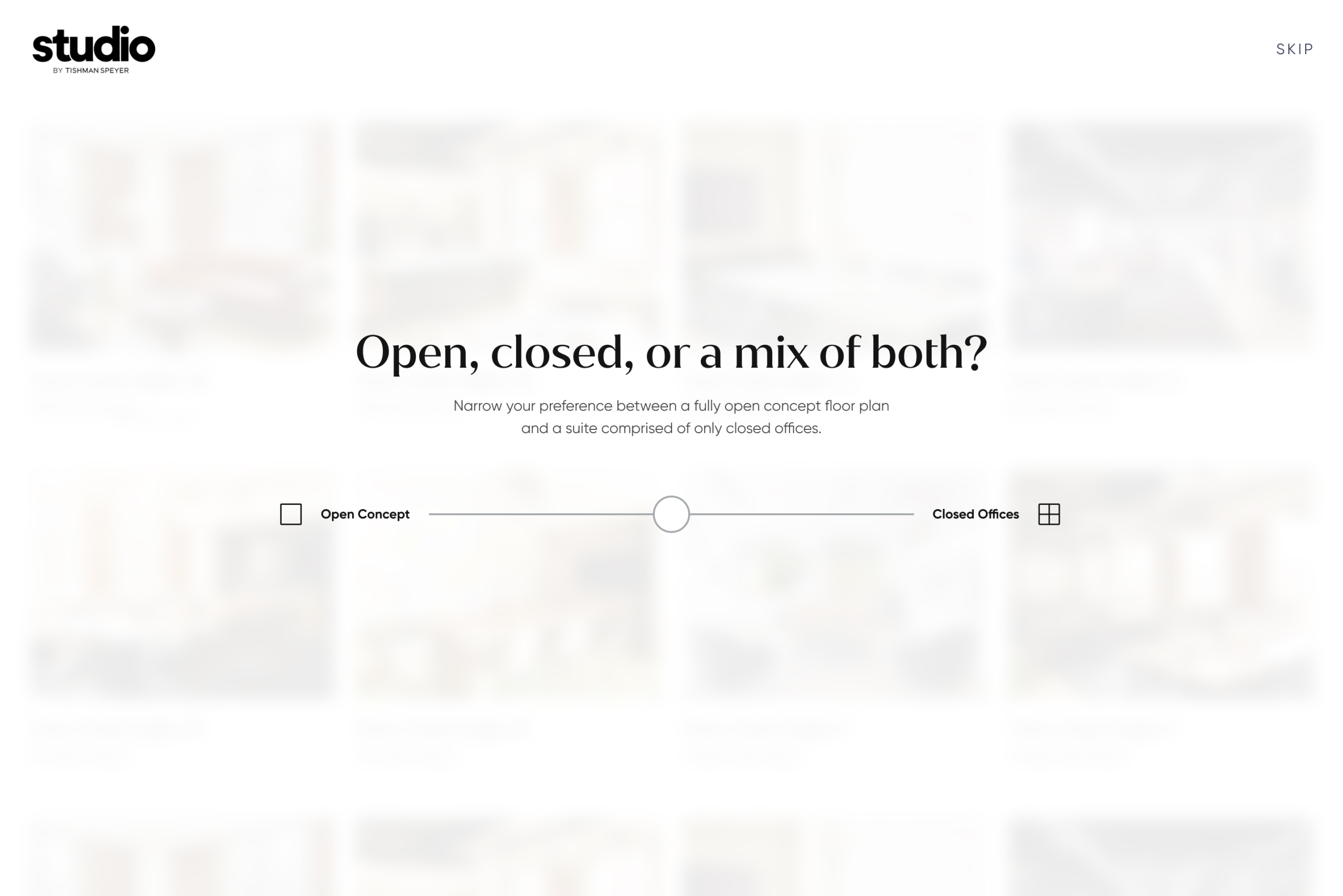
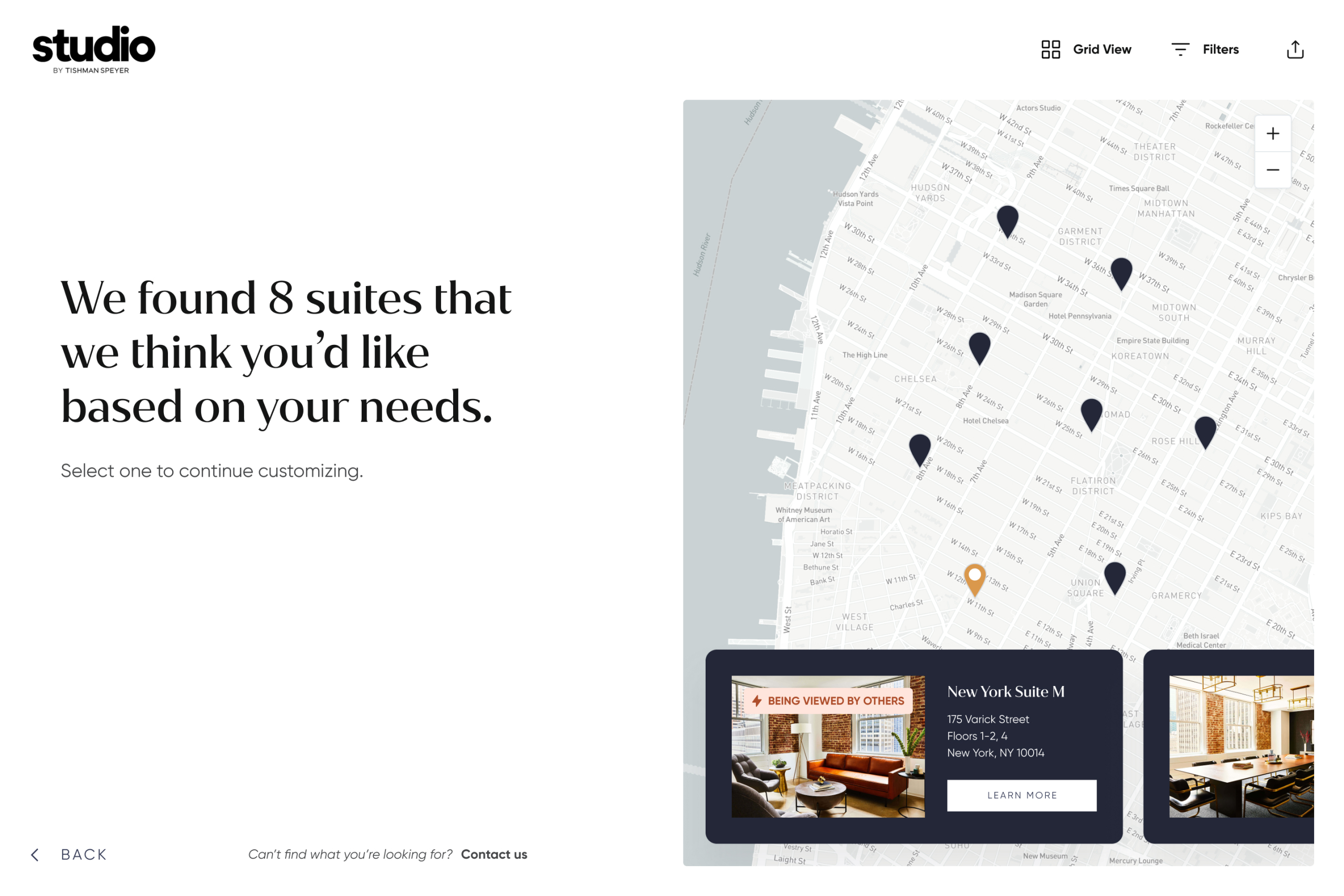
Stakeholder interviews clarified what tenants value most. Instead of a tedious onboarding quiz, we translated their needs into a fast, intuitive and visually driven way to define location and feature requirements.

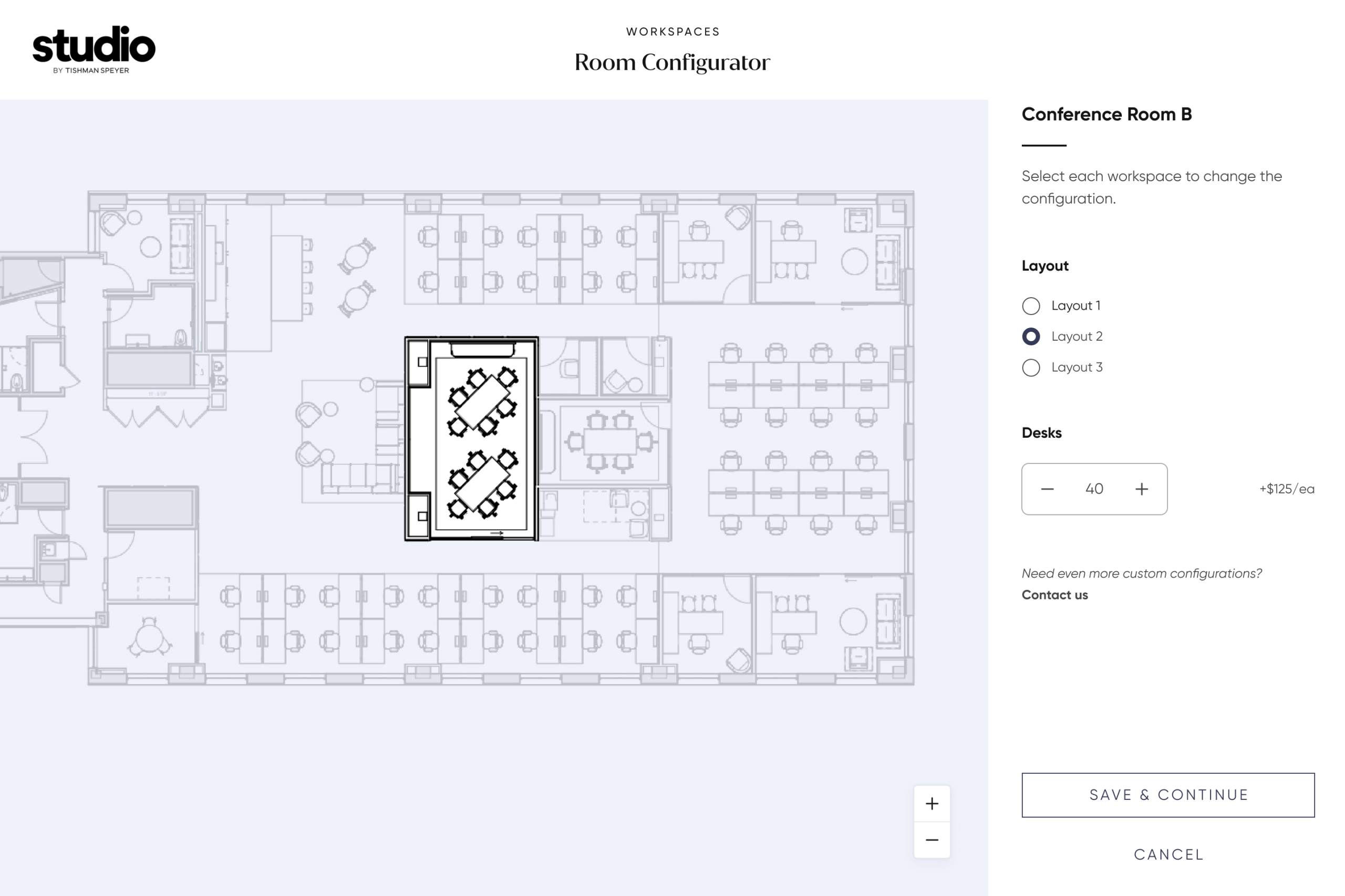
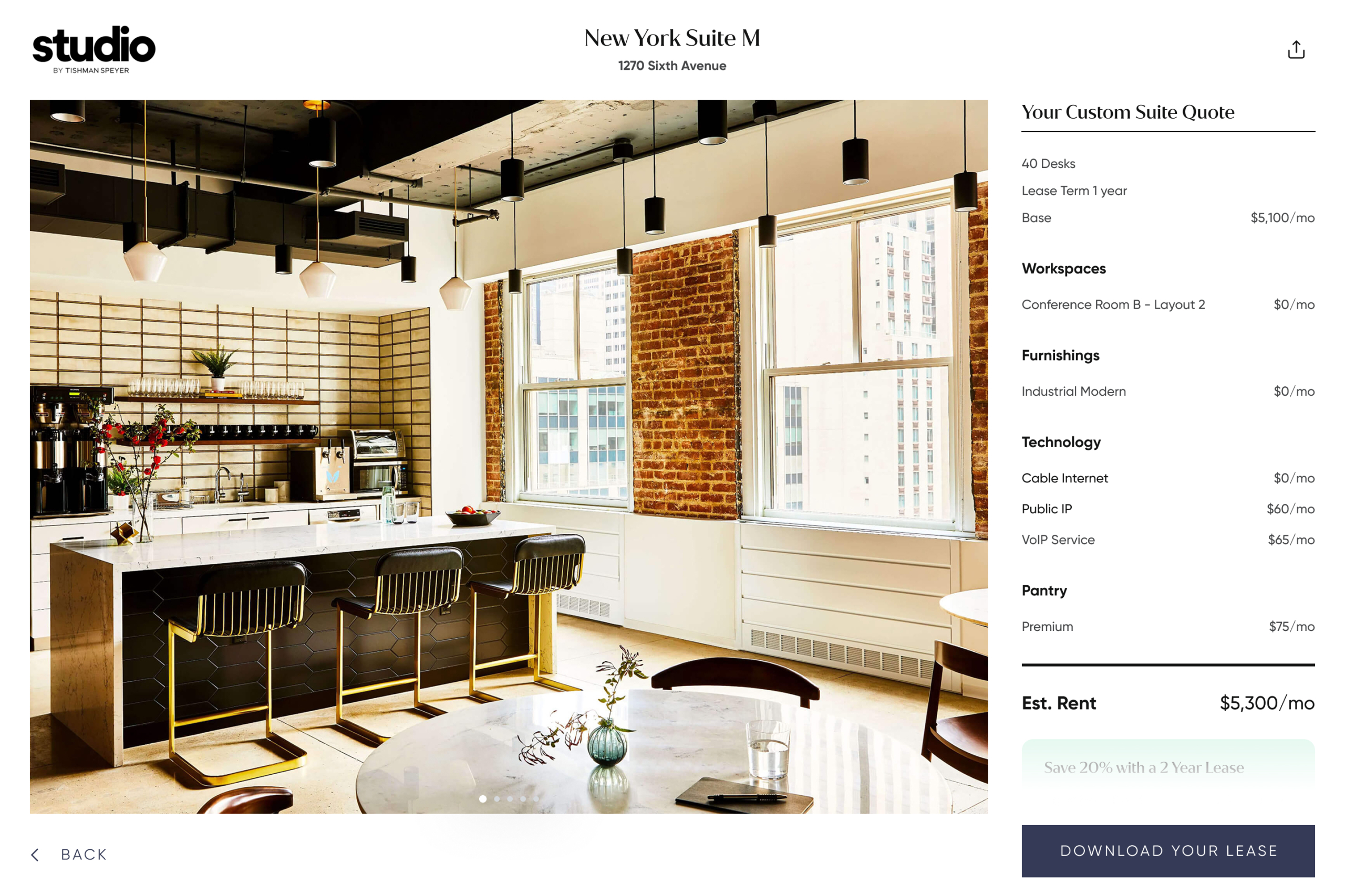
Although the configurator aimed to cut out the endless email and phone tag—a change the sales team was genuinely thrilled about—the tool still communicated the luxury, service and curation that Tishman Speyer’s clients have come to expect.

With a mobile-first mindset, we ensured fans of Focus Features content could quickly find when, where and what to watch.

The new site’s modernized user experience led to increased engagement and a more integrated platform for showcasing the studio’s cinematic films and shows.

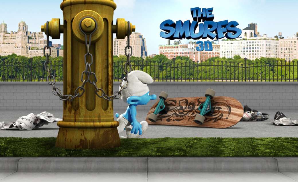
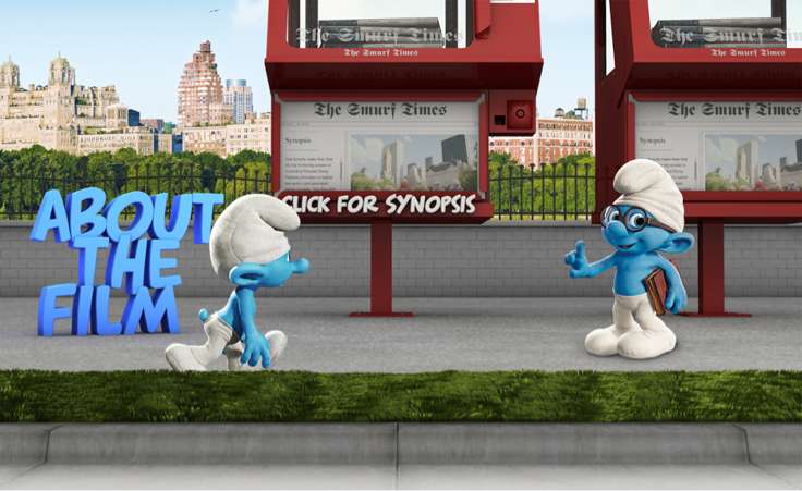
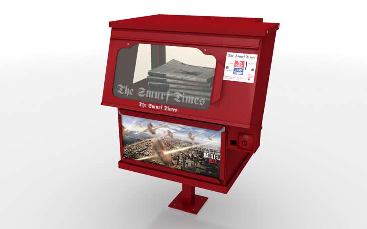
This project was a nostalgic throwback to my childhood as I challenged myself to design and model objects scaled to a Smurf. The experience let ‘Clumsy’ explore the streets of New York City while inviting visitors to dive deeper into the film.
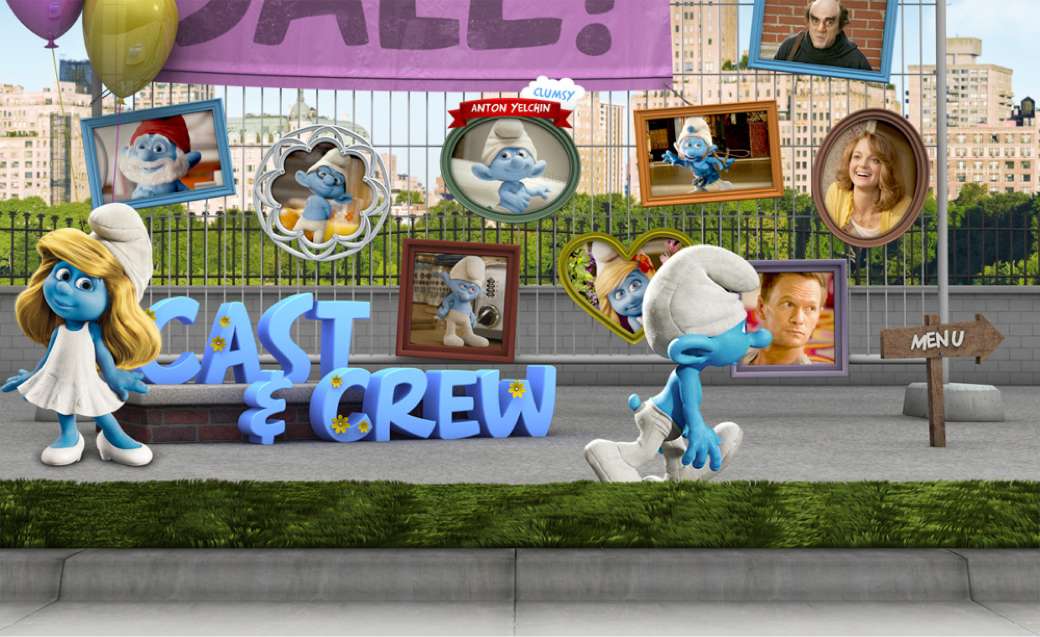
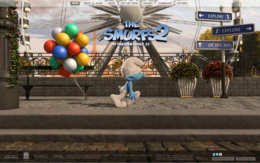
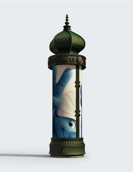
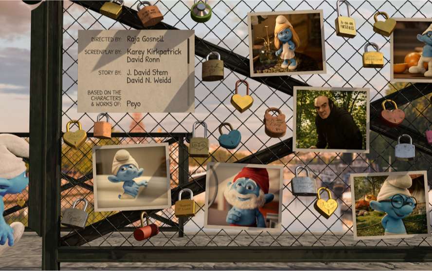
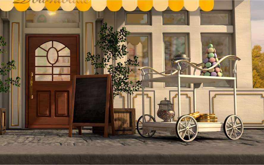
Building on the first site’s success, we set out to make the sequel even bigger and better. From a bridge of locks to a Parisian storefront filled with macarons, this time Clumsy wanders the dusk-lit cobblestone streets of Paris.

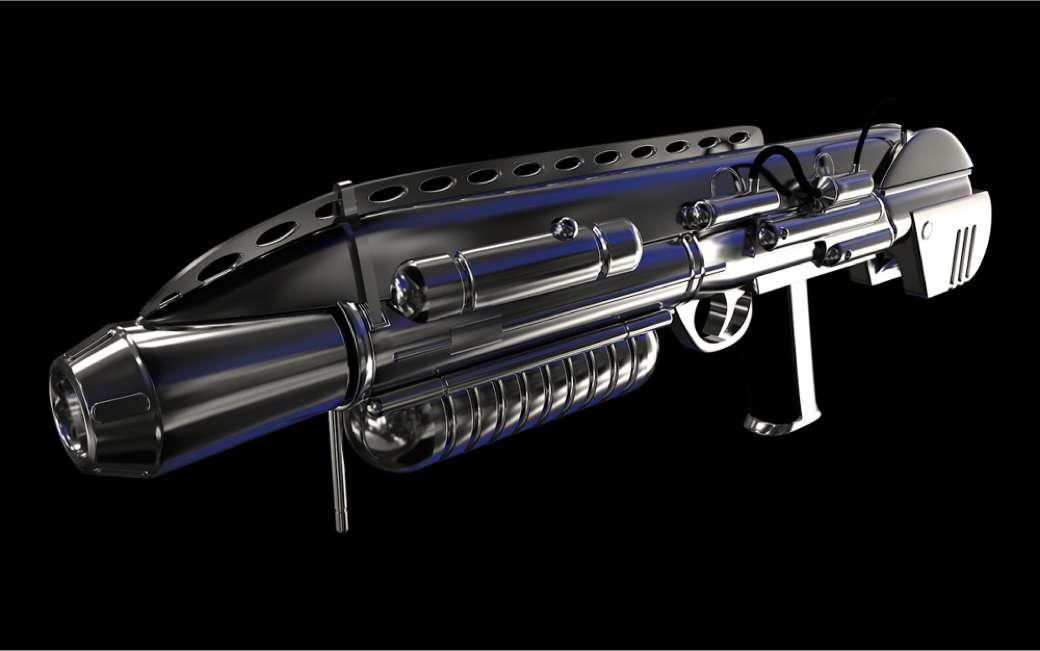
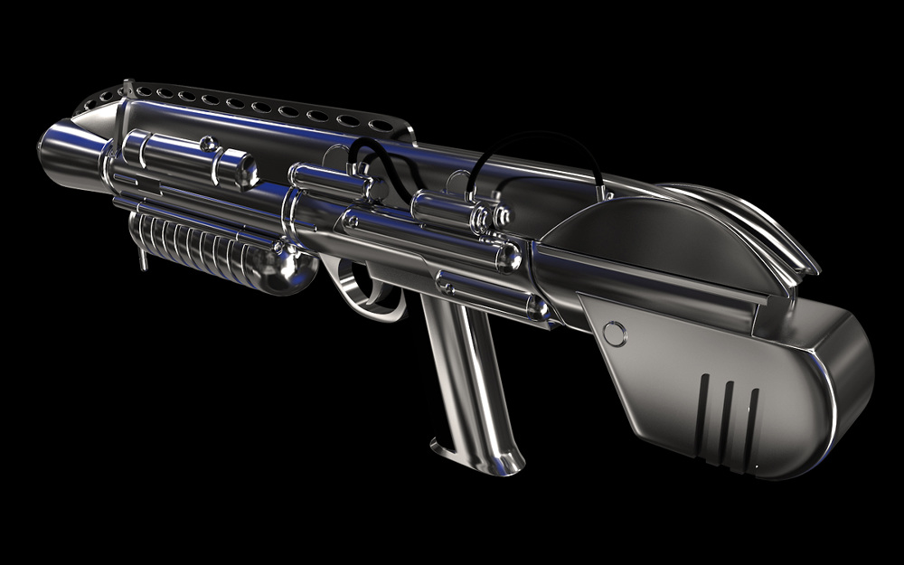
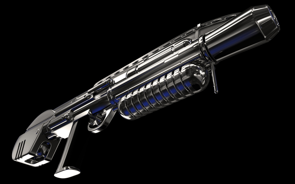
For the online game ‘Men in Black 3′, developers needed weapon assets that matched those from the film. Using reference photos, I recreated several of their iconic, futuristic guns.

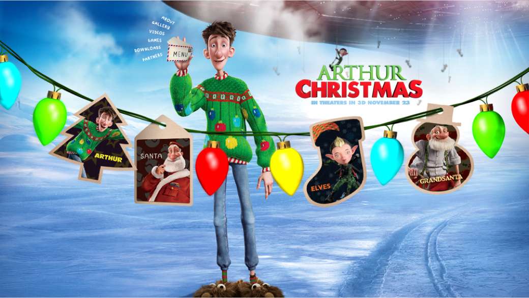
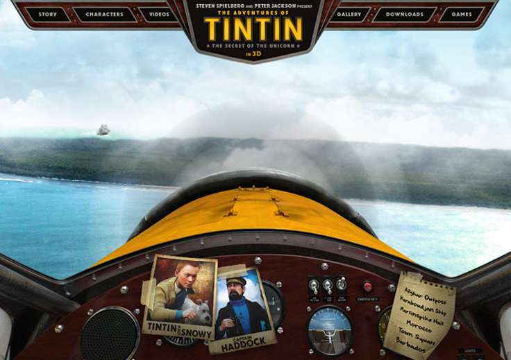
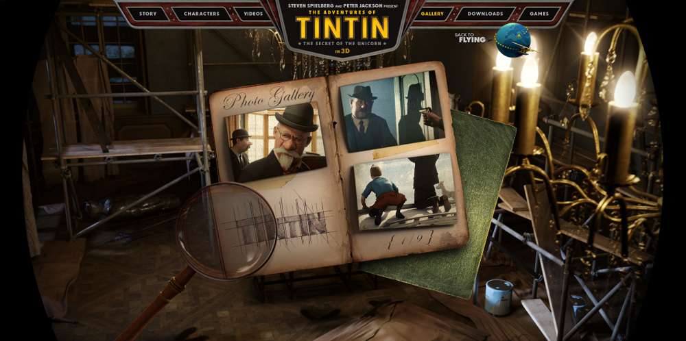
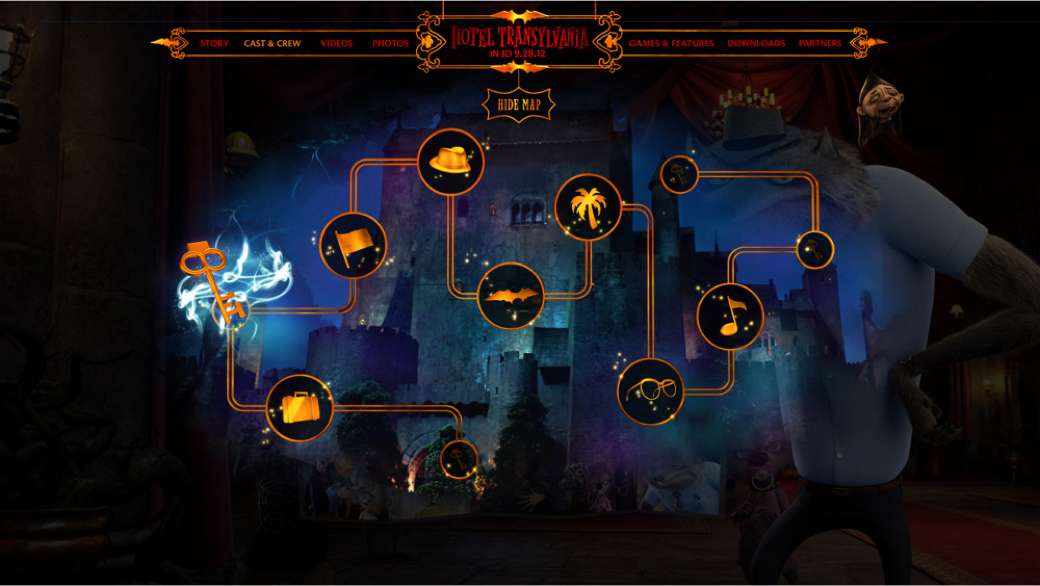
Minimal UI has its place, but fantastical animated features call for something far more playful. For these projects, that meant Christmas string lights, gold-plated magical icons and an old-fashioned cockpit.
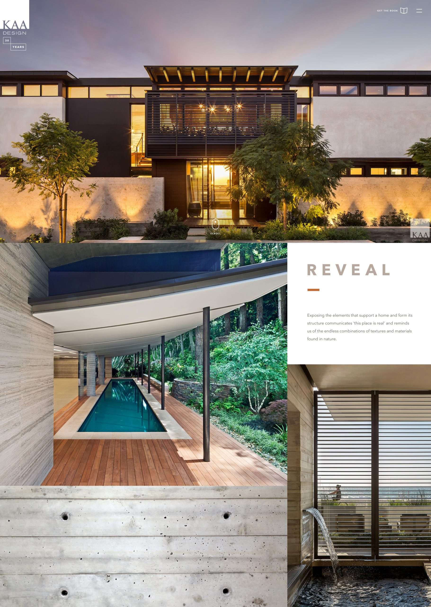
The dynamic homepage grid extends into the project detail pages, giving equal weight to narrative and luxe photography.

Infused with KAA’s California sensibility, the site feels modern, relaxed and built to timelessly spotlight the firm’s work.